Clarity
Jessica Ruffolo
See it On Campus: Level 2
John C. Kerr Chancellor Emeritus Awards for Excellence in Design — Winner

01: PROJECT OVERVIEW
Did you know that learning styles don’t actually exist?
¹TedX Talks. (2015, April 2). Learning styles & the importance of critical self-reflection | Tesia Marshik | TEDxUWLaCrosse. YouTube. https://www.youtube.com/watch?v=855Now8h5Rs
For those curious to learn more: this video contains a brief talk debunking the idea of learning styles, and discussing how concepts can become to be seen as truth if they are repeated often enough. Dissents against the idea that learning needs to be individualized to the extent that learning styles aim to do.
It’s what I discovered when I first set out to create my grad project. I have always considered myself a visual learner, and often found myself struggling to understand more numbers/text heavy subjects in school. I wanted to create a study tool to help people like me: something that plays into the strengths of the visual learning style rather than working against it.
As it turns out, there have been no studies that show that some people have a predisposition to receiving information better in a specific way.¹ In all instances, the most effective method of learning pertained to what technique was most relevant to the content at hand, not the users preferred modality of learning.
I realized this framework of telling people that they were built for a certain type of learning, and consequently, not built for other kinds, could become a self-fulfilling prophecy in which people think that they simply cannot learn effectively in a certain way. It is easy to see how this mindset would be detrimental one’s perceived academic ability, and therefore, learning outcomes.
This is the problem space that Clarity sits in. I wanted to create a toolkit for young students that encourages learners, regardless of their preferred learning method, to experiment and learn to be confident using many methods of study.
The final result is a self-guided toolkit consisting of a notebook and a deck of prompted study cards. Please read on for an in-depth examination of Clarity.
02: METHODOLOGY
I distilled my concept of guided study prompts into a system that utilizes three broad categories of learning.
To create a study system that was accessible and understandable, I knew I needed to simplify my concept of “try to learn in every way possible” into something more succinct.
So, I created three categories to sort each proposed learning method into: Writing, Speaking, and Playing.
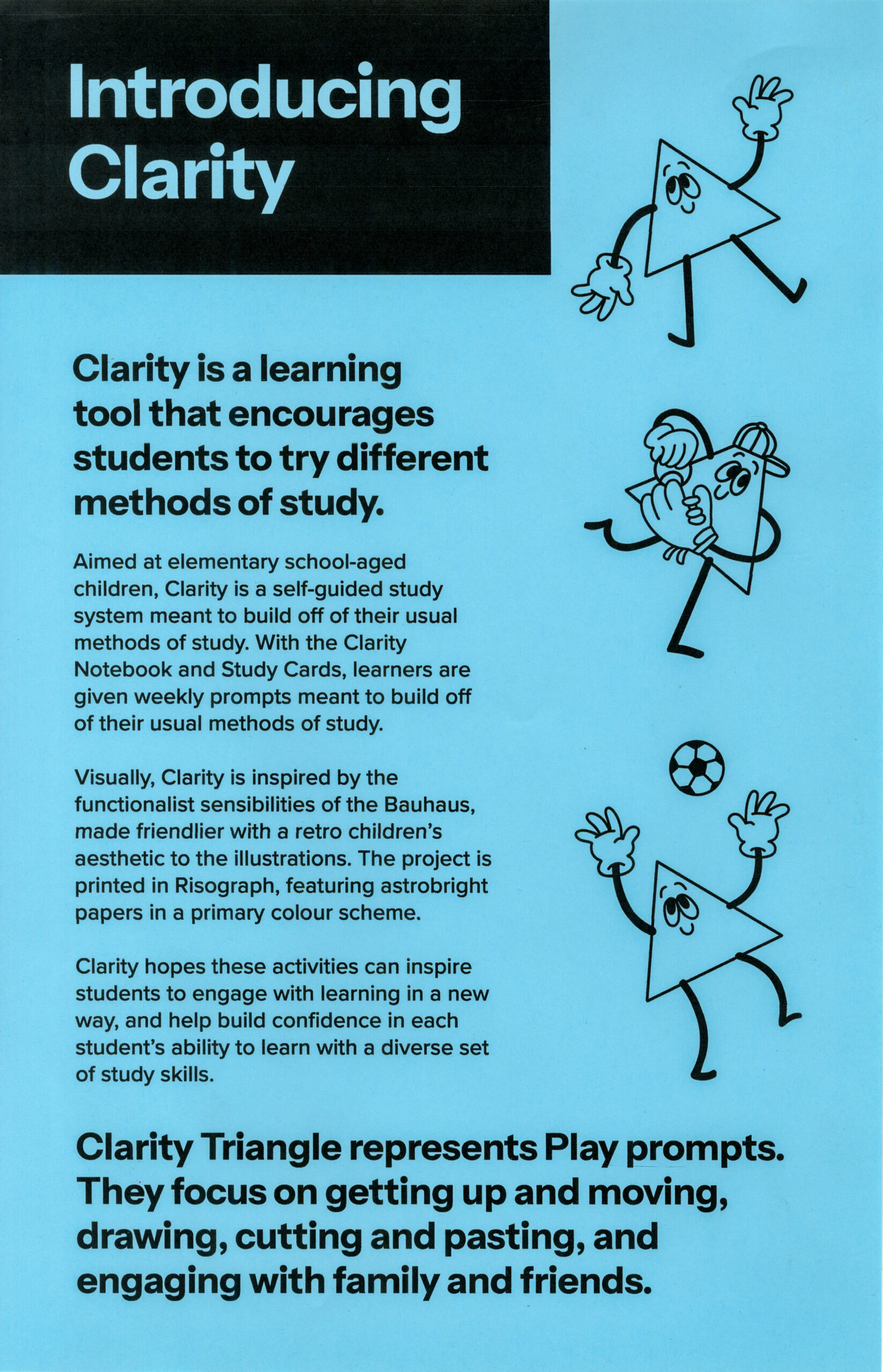
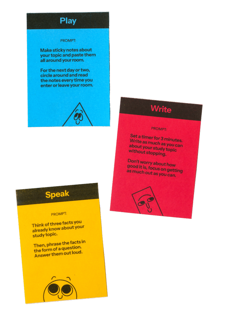
The Play prompts would focus on getting up and moving, drawing, cutting and pasting, and engaging with family and friends.
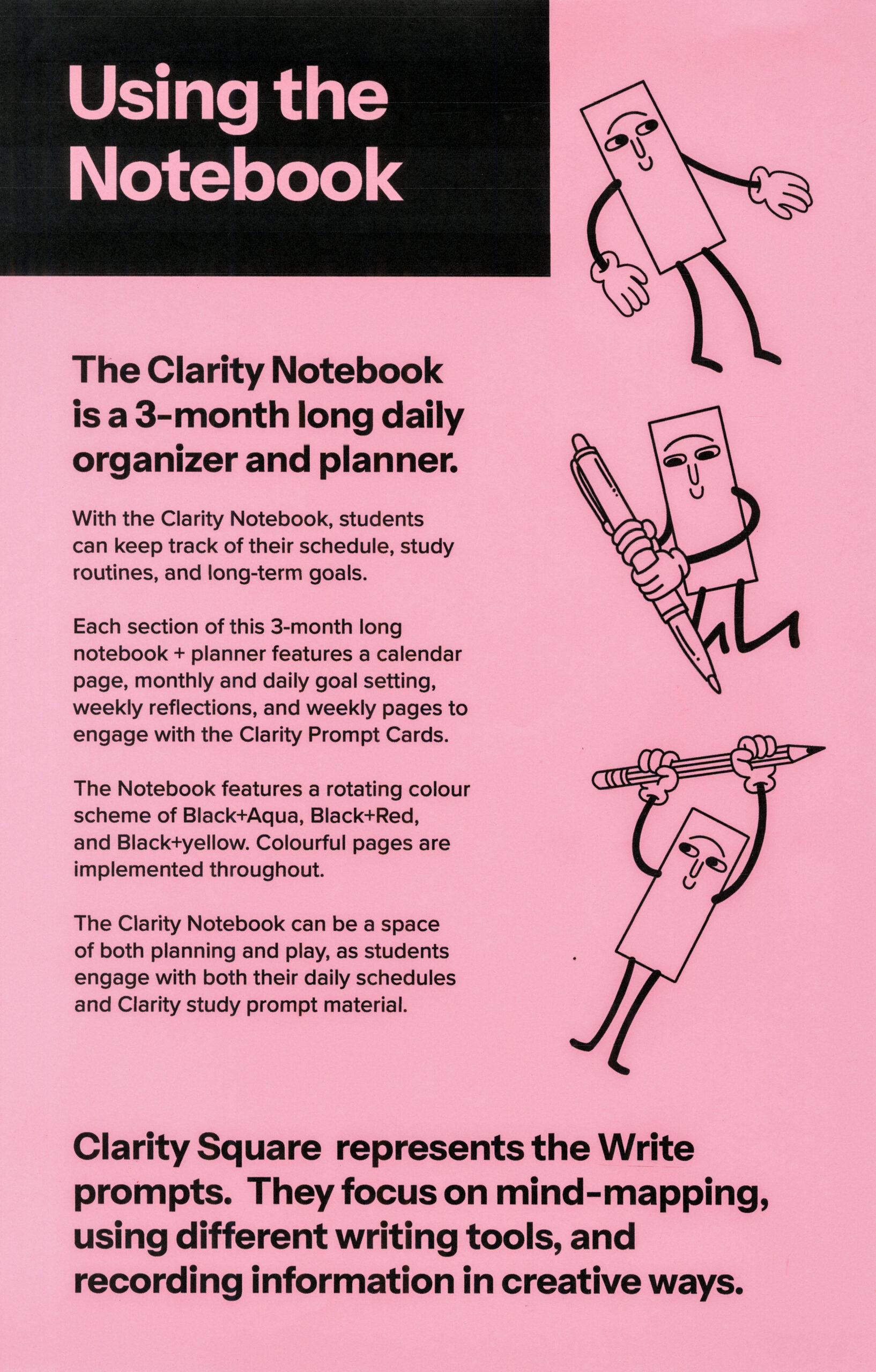
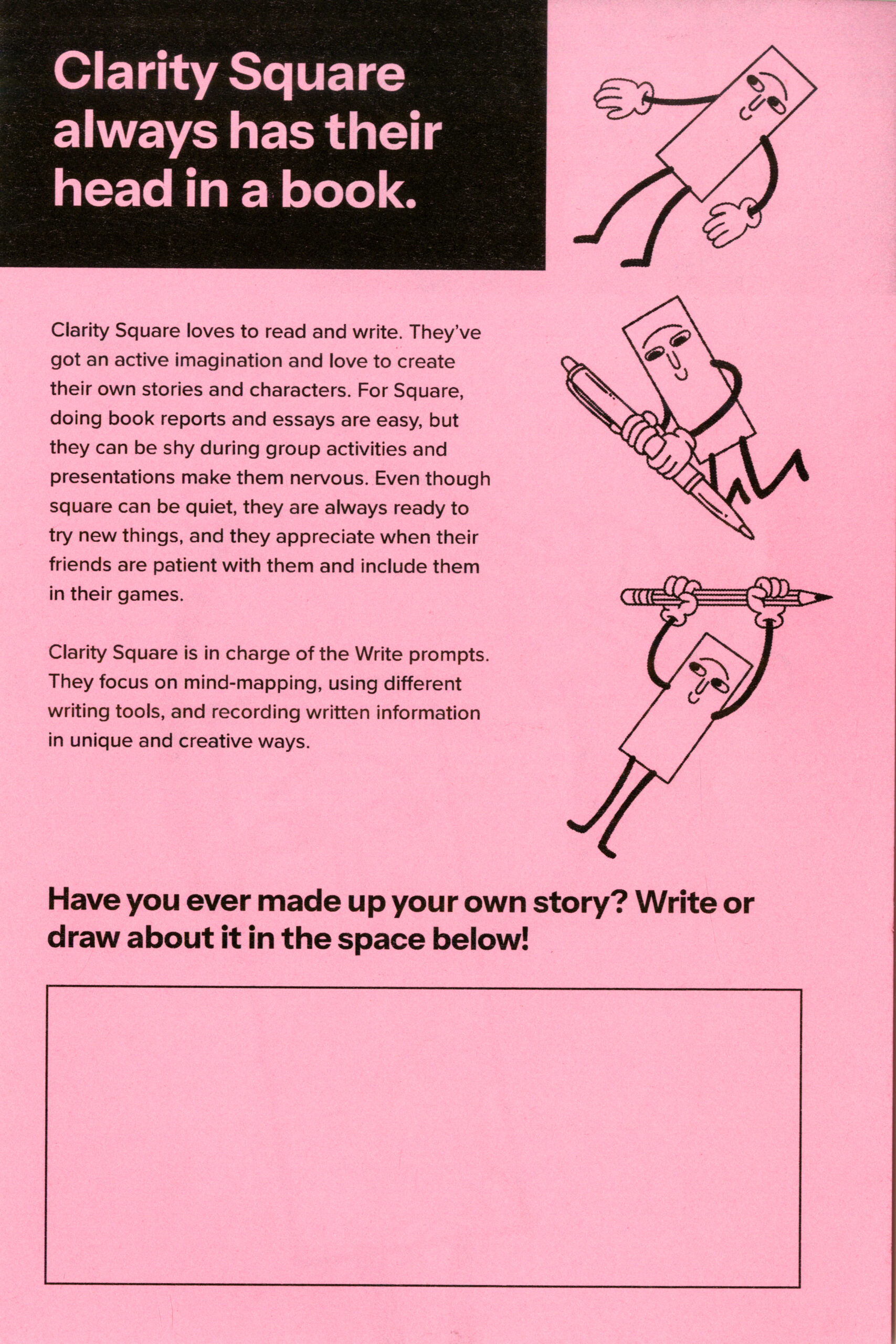
The Write prompts would focus on mind-mapping, using different writing tools & mediums, and recording written information in unique and creative ways.
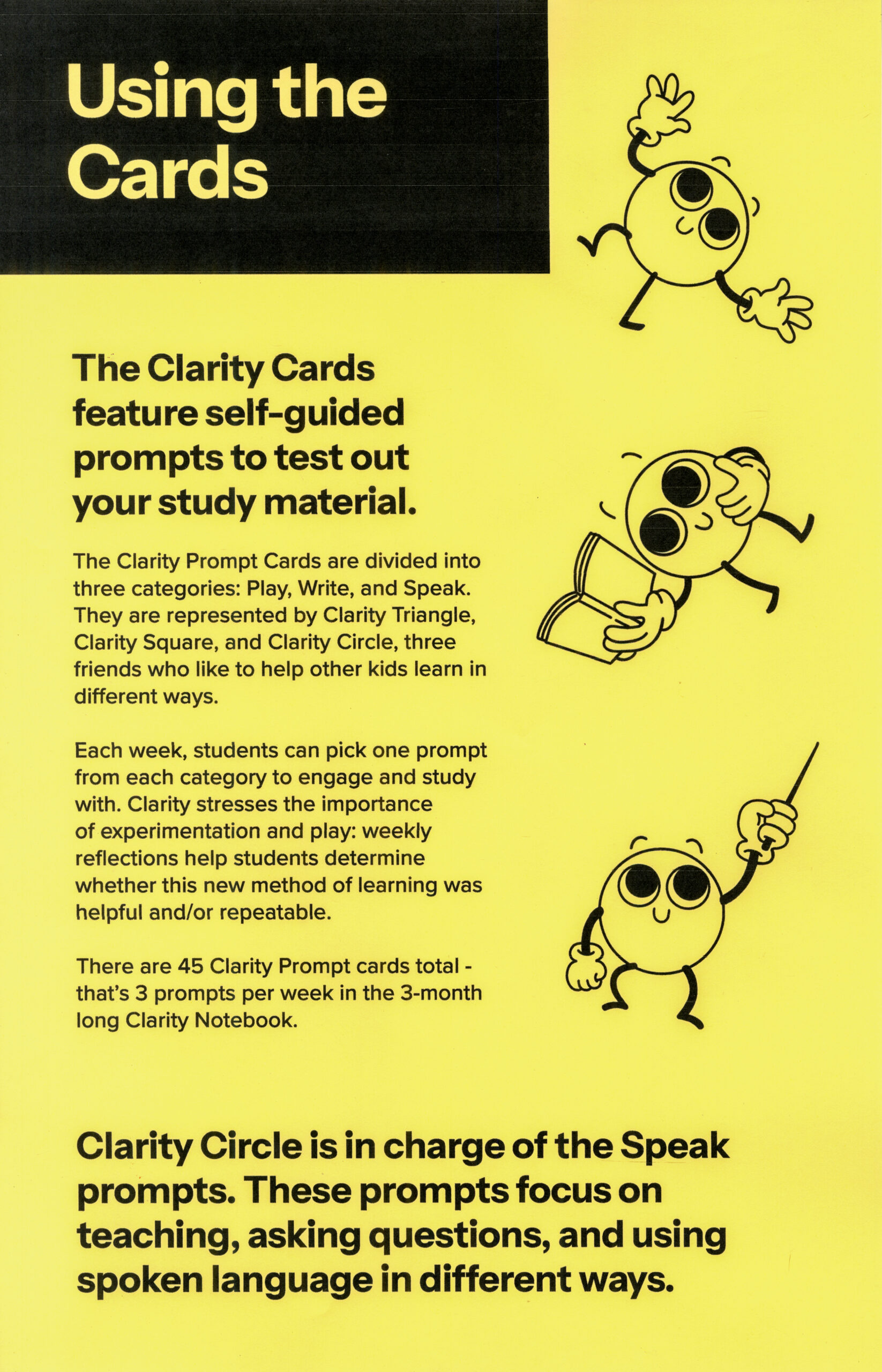
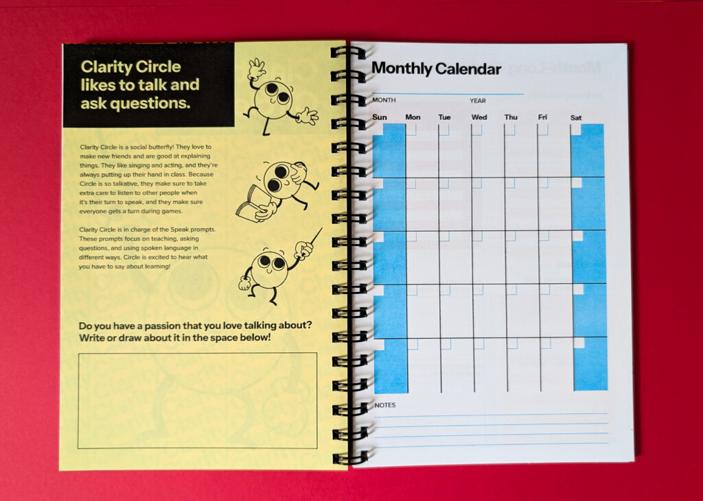
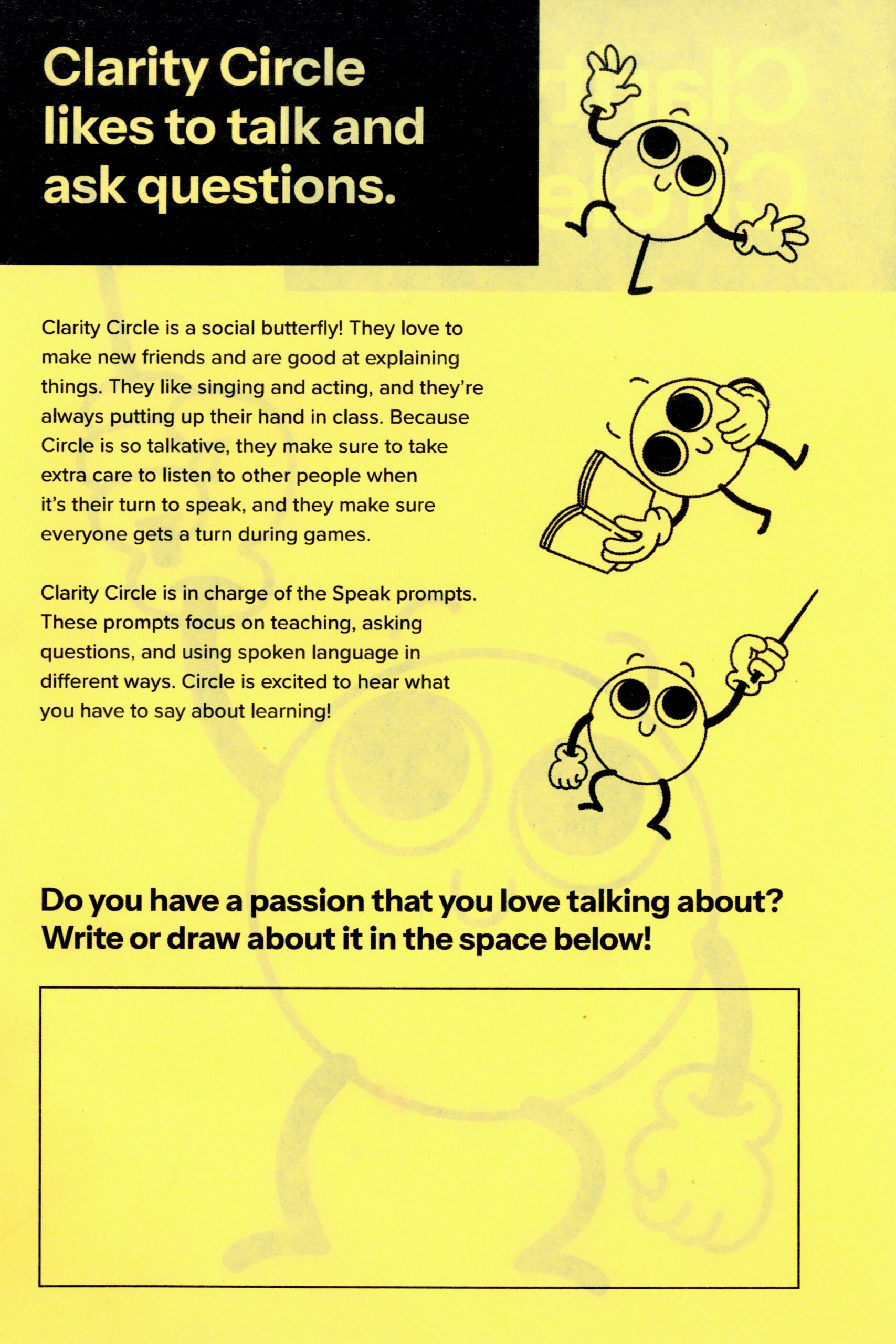
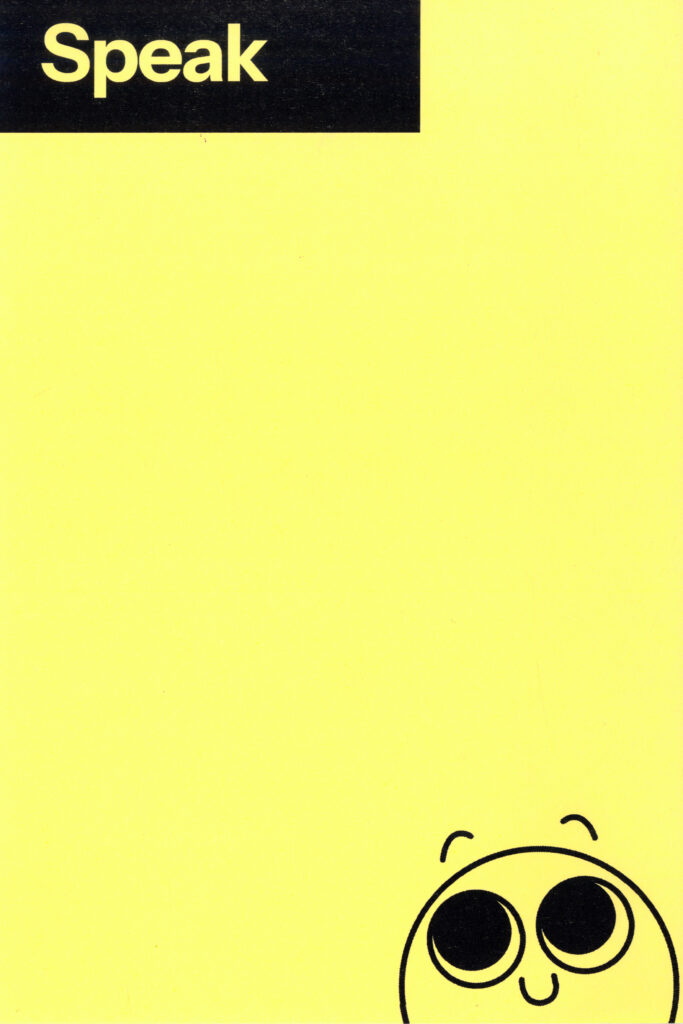
The Speak prompts would focus on teaching, asking questions, and using spoken language in multiple ways.
03: BRAND IDENTITY
Clarity’s brand identity revolves around the concept of building upon the basics to create something bigger.
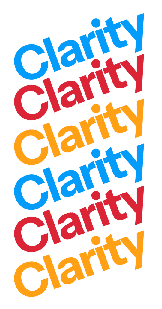
I decided to name my project Clarity, to evoke the feeling of finally understanding something after studying it for a long time.
The central motif of Clarity’s brand identity is the concept of building upon a foundation to create something bigger, or attain greater knowledge. Therefore, the branding largely utilizes “the basics” in terms of colour, shapes, and visual aesthetics.
Because these are learning tools, I wanted the branding to be clear and readable above all else, while also retaining a style that is approachable for children. I thought of the sensibilities of The Bauhaus, but with a more playful and childlike pageantry to it.
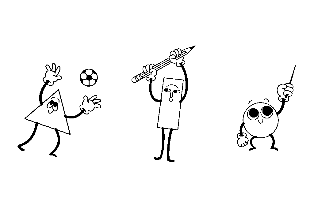
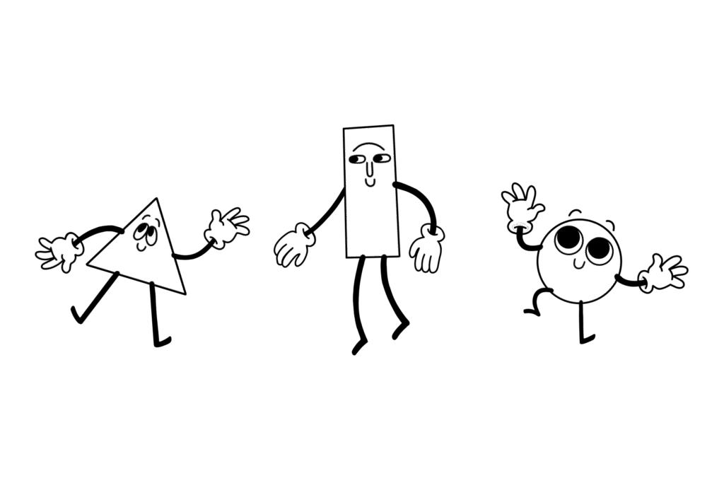
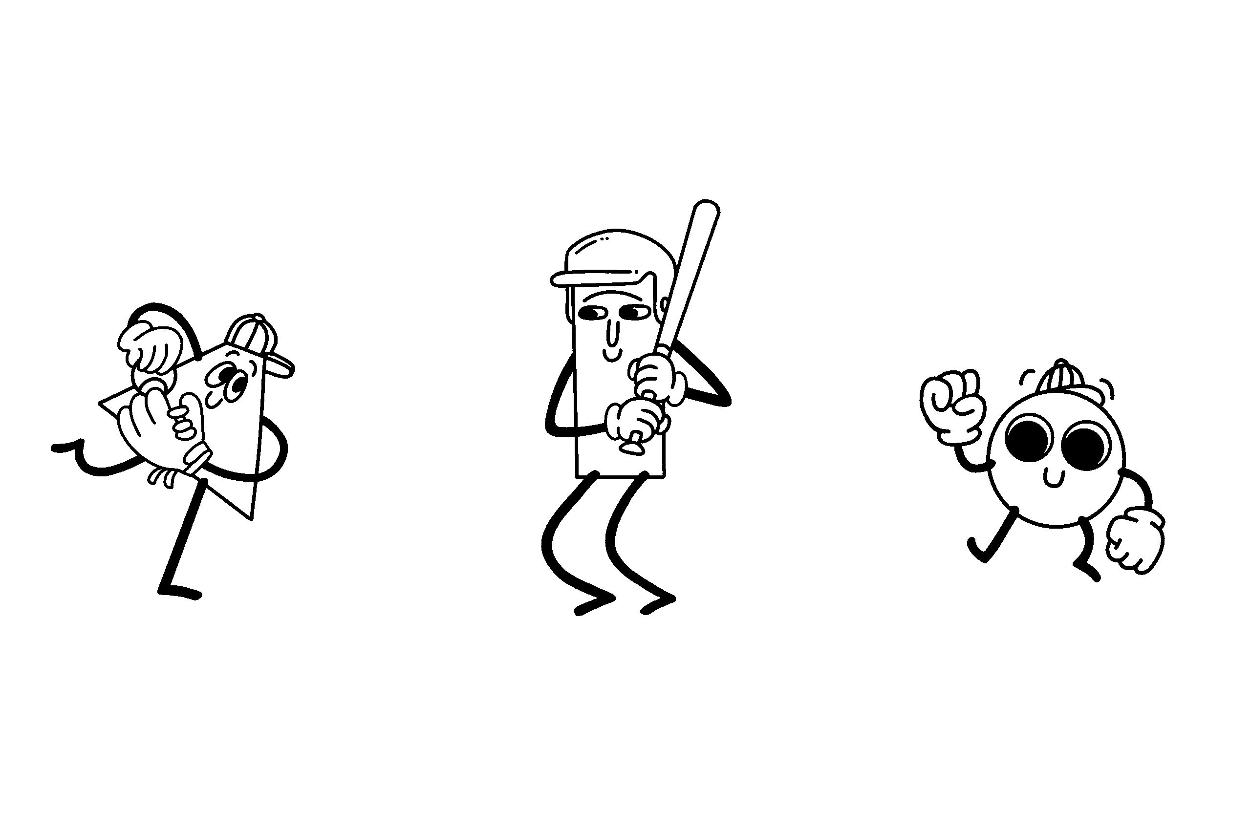
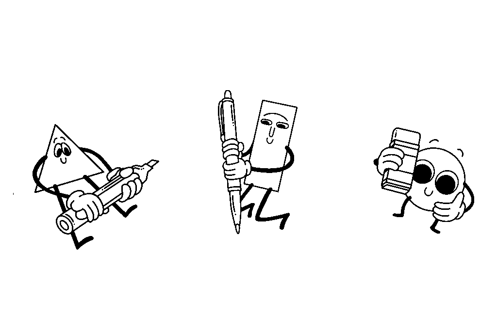
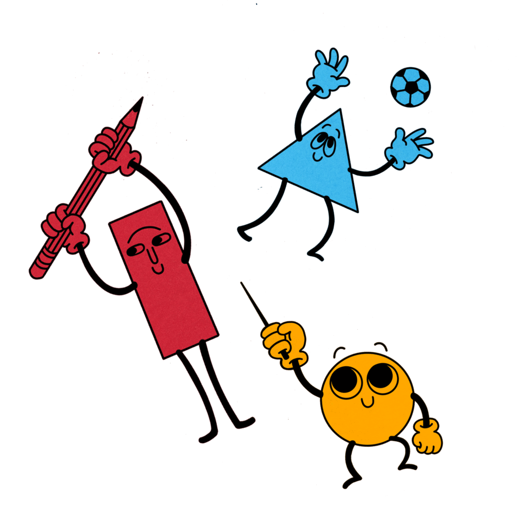
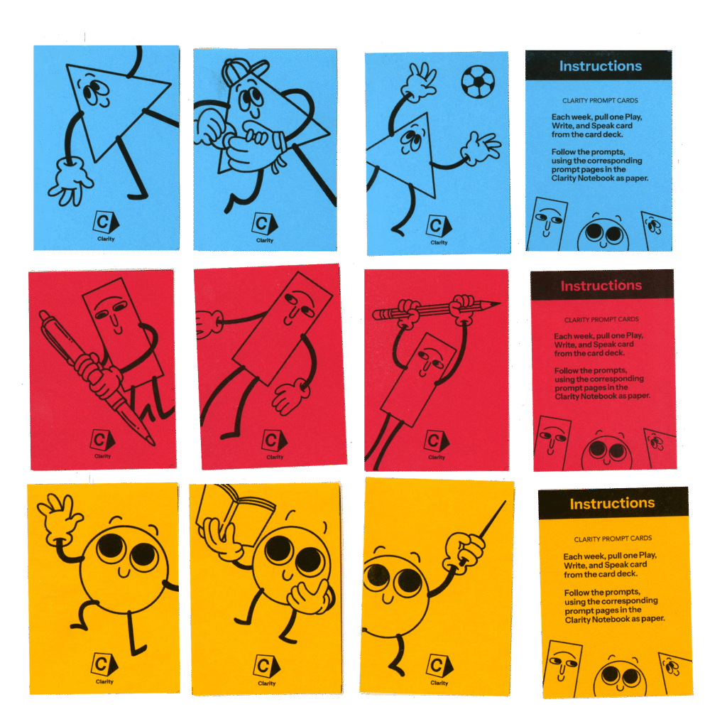
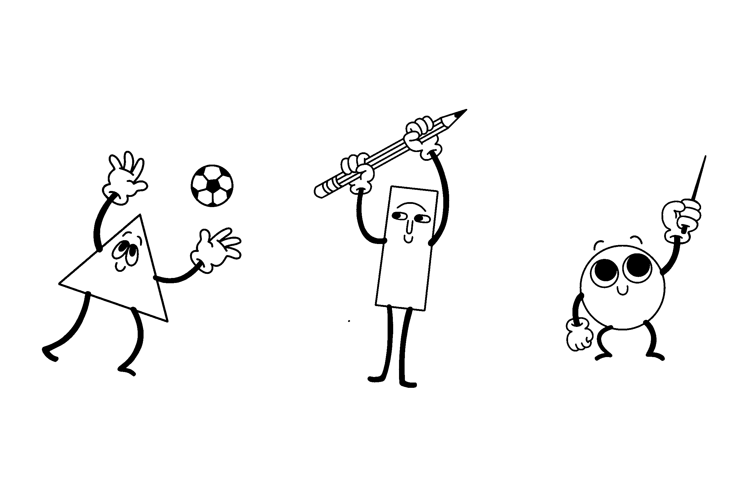
To enforce the group of three, the branding utilizes the three primary colours (blue, red, and yellow) and has three mascots built out of simple shapes (a triangle, square, and a circle.) Each colour and shape corresponds to one of the three learning methods.
Overall, the project aims to have a retro “back to school” aesthetic that is clear, playful, and functional.
I created a monogram that includes the three integrated mascot shapes, and stylistically feels as though it is a part of the Clarity brand identity.
It is evocative of a building block, enforcing the ‘foundational’ theme and making it feel like it is something playful and for children.
The Clarity wordmark and all titles are typeset in Instrument Sans, which describes itself as being based on straight lines and simple circles. I used the alternate rounded dot glyphs for periods and lowercase ‘i’s, as I thought it looked more playful and retro than square dots.
04: THE MASCOTS
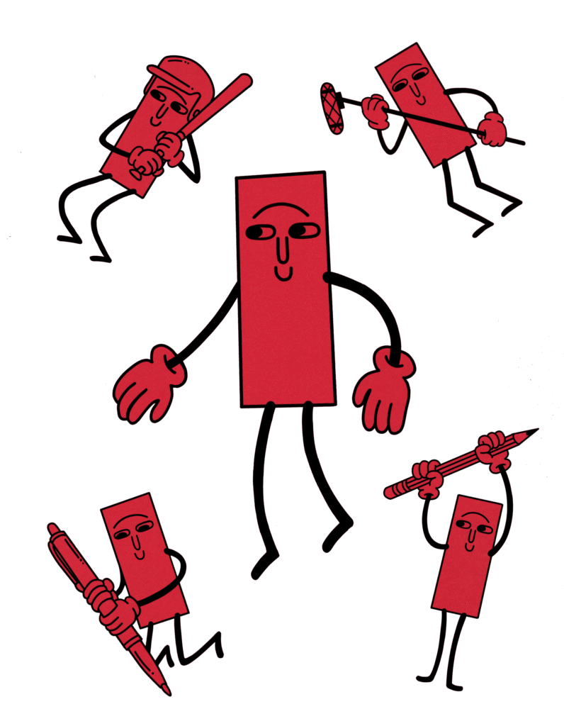
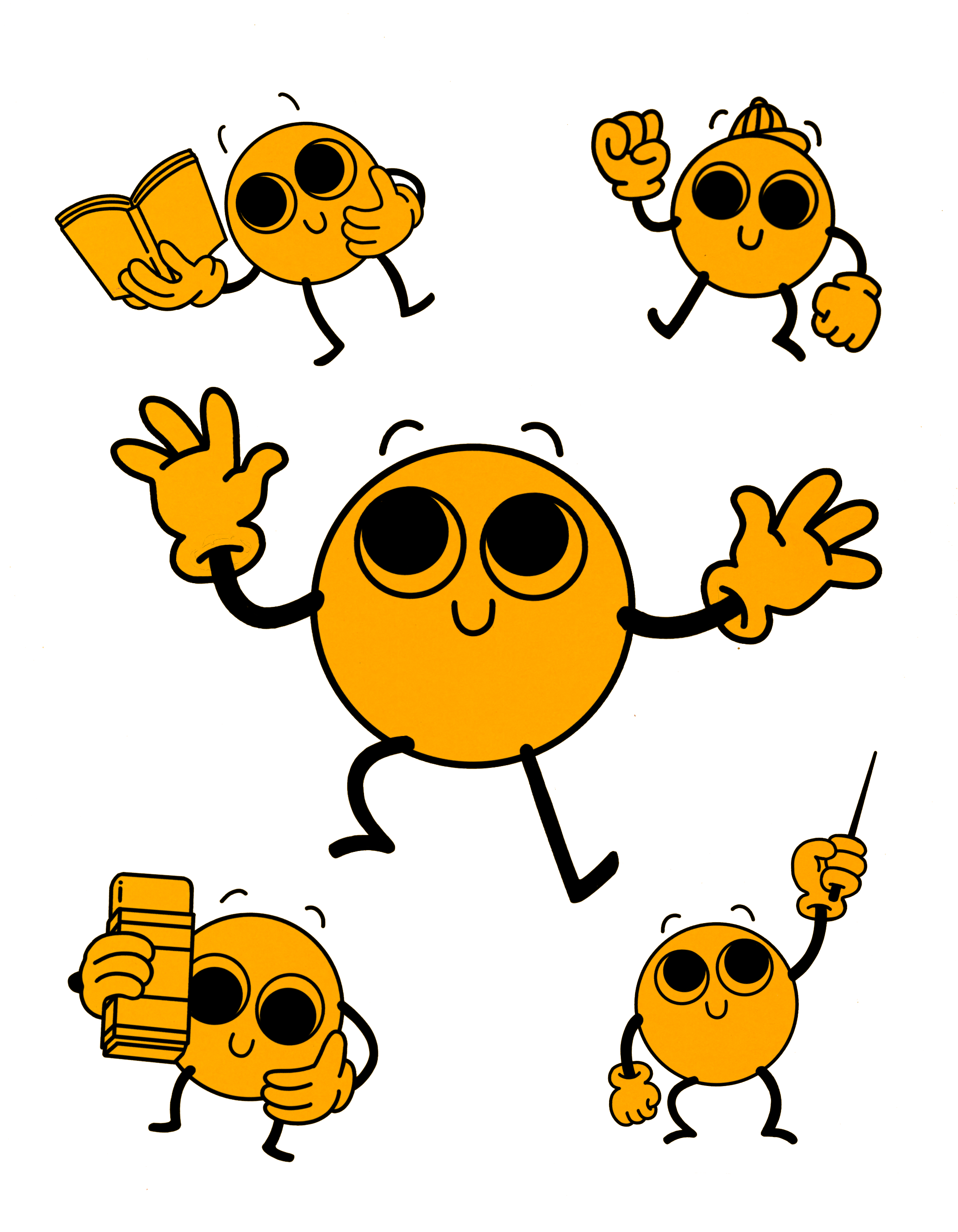
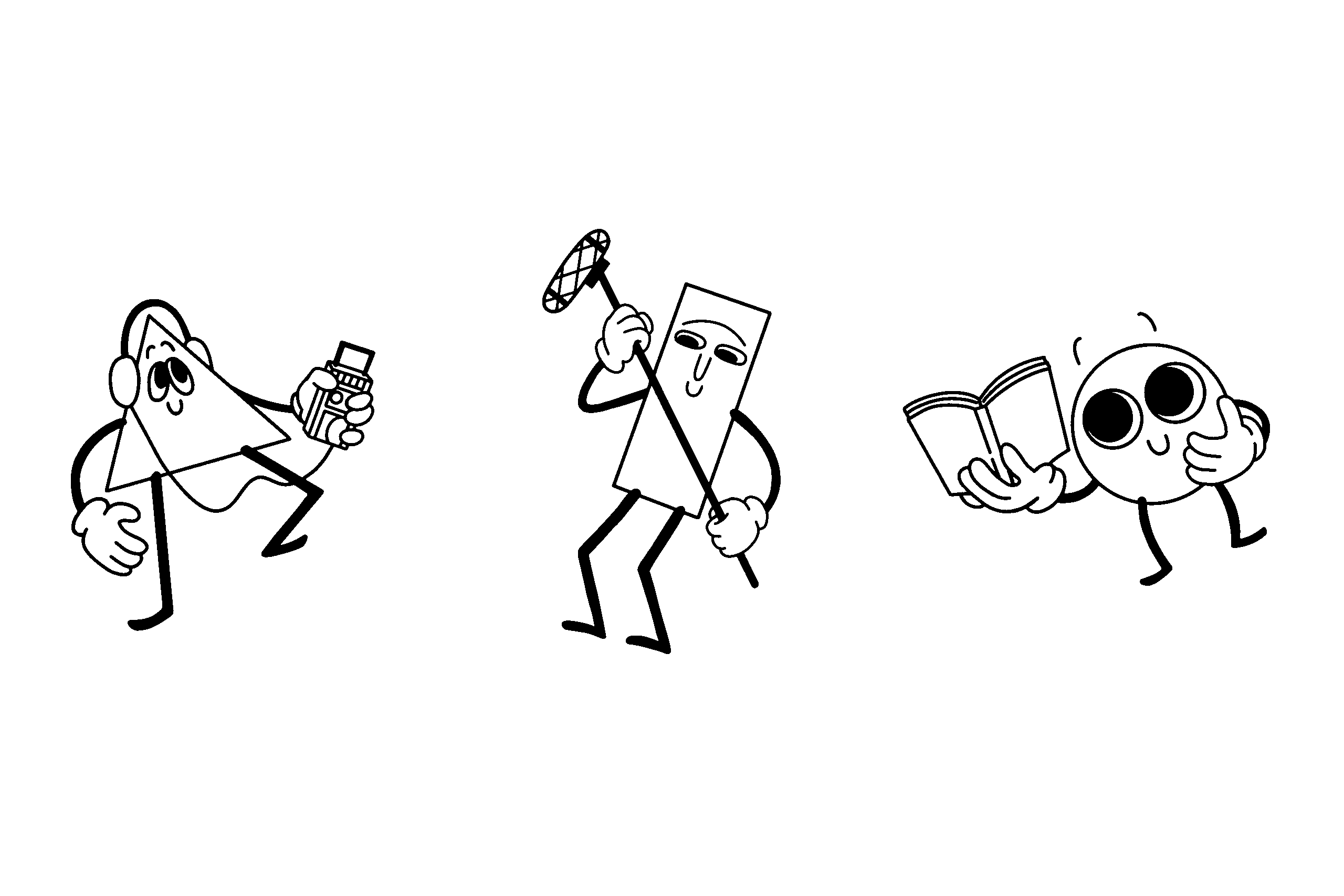
The Clarity mascots represent both the user of the toolkit and a modality of learning.
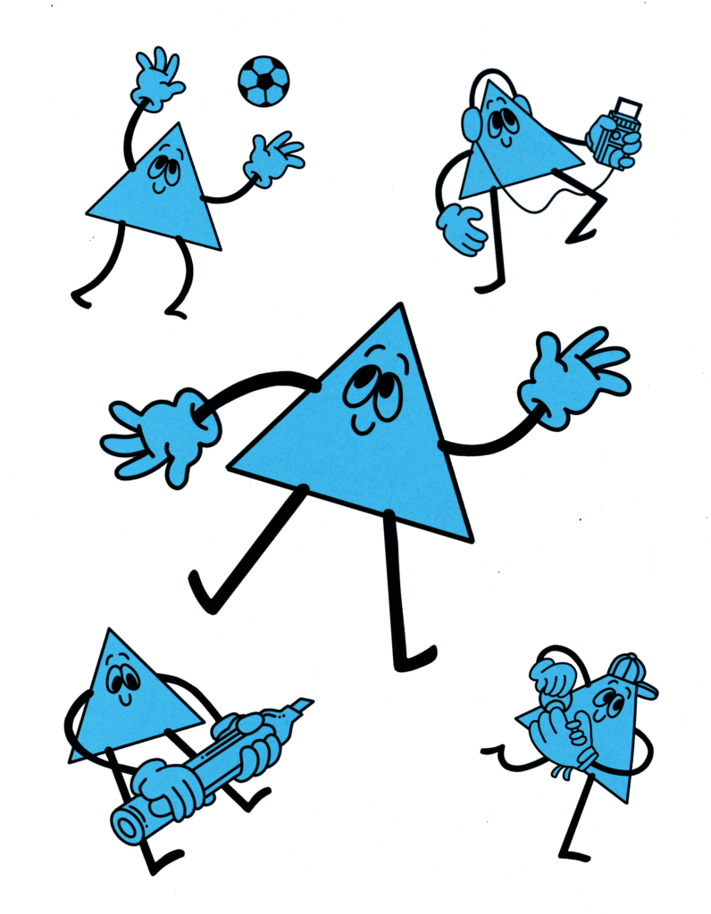
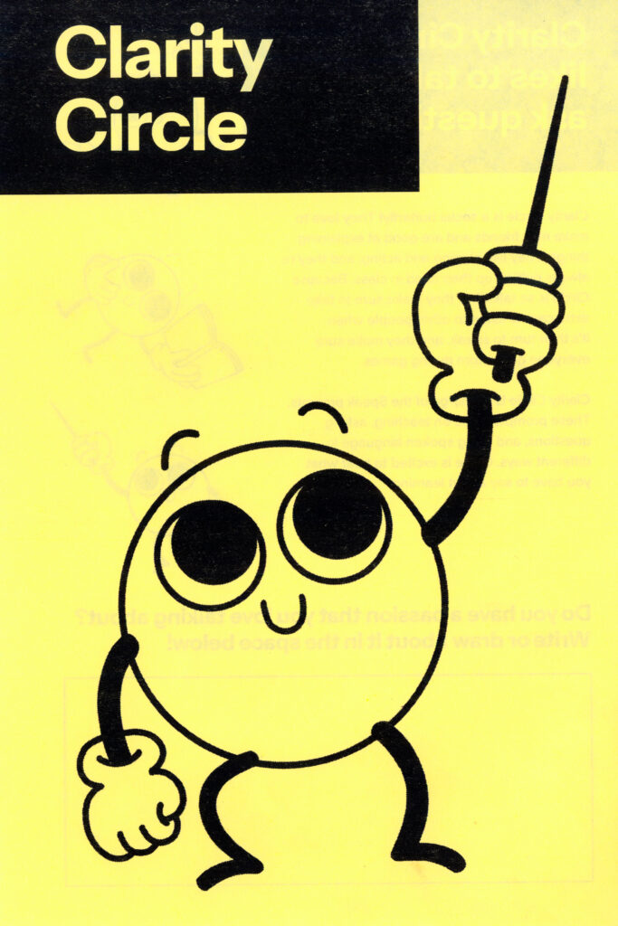
Because the project is aimed at elementary-aged children, I had designed characters that would be the mascots of the project. Each mascot represents one of the three modalities of learning and is tied to one of the three primary colours.
They are made from simple shapes, to once again enforce the concept of foundation/building blocks/deconstruction of learning methods.
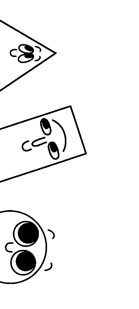
I molded each characters’ facial features to be evocative of their body shape, while keeping consistencies throughout all of them like their hand and mouth shapes. They have ‘mickey mouse’ glove hands to enforce the retro aesthetic of the project.
The mascots are intended to be universal, humanoid characters that each possess relatable characteristics and hobbies that children tend to have (see their ‘bio’ pages later for further detail). They are referred to as “kids” and “students” to denote a target age range and are referred to with gender neutral pronouns.
Their official names are Clarity Triangle, Clarity Square and Clarity Circle to retain an ambiguous gender and background.
05: THE PROMPT CARDS
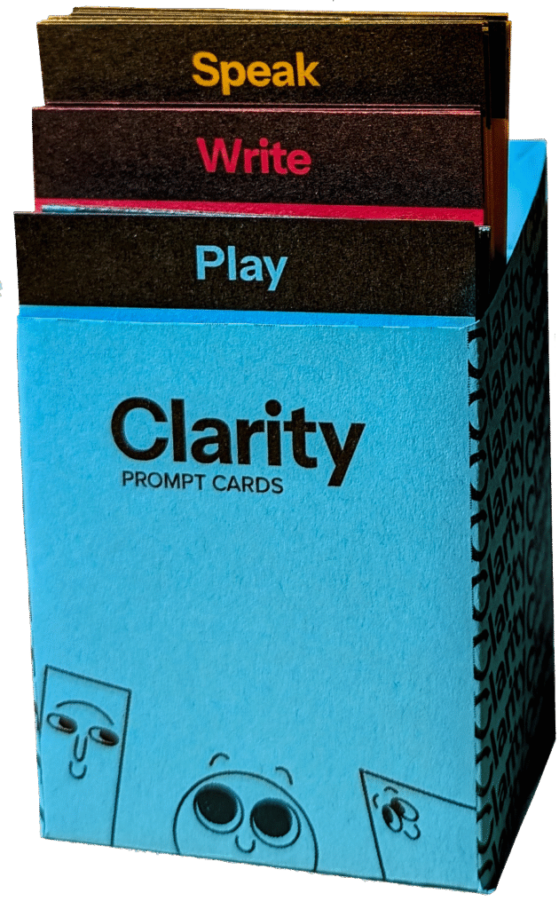
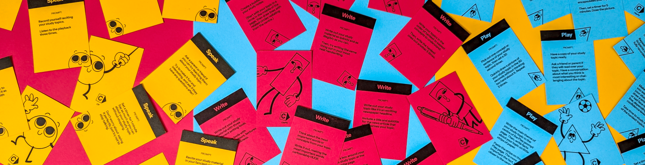
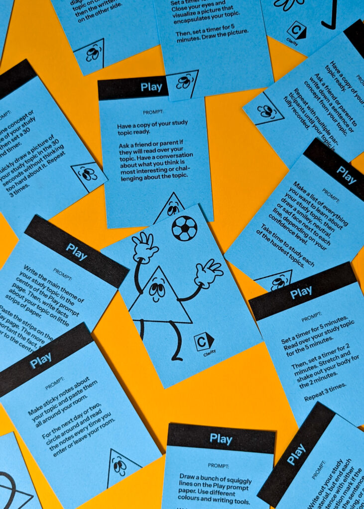
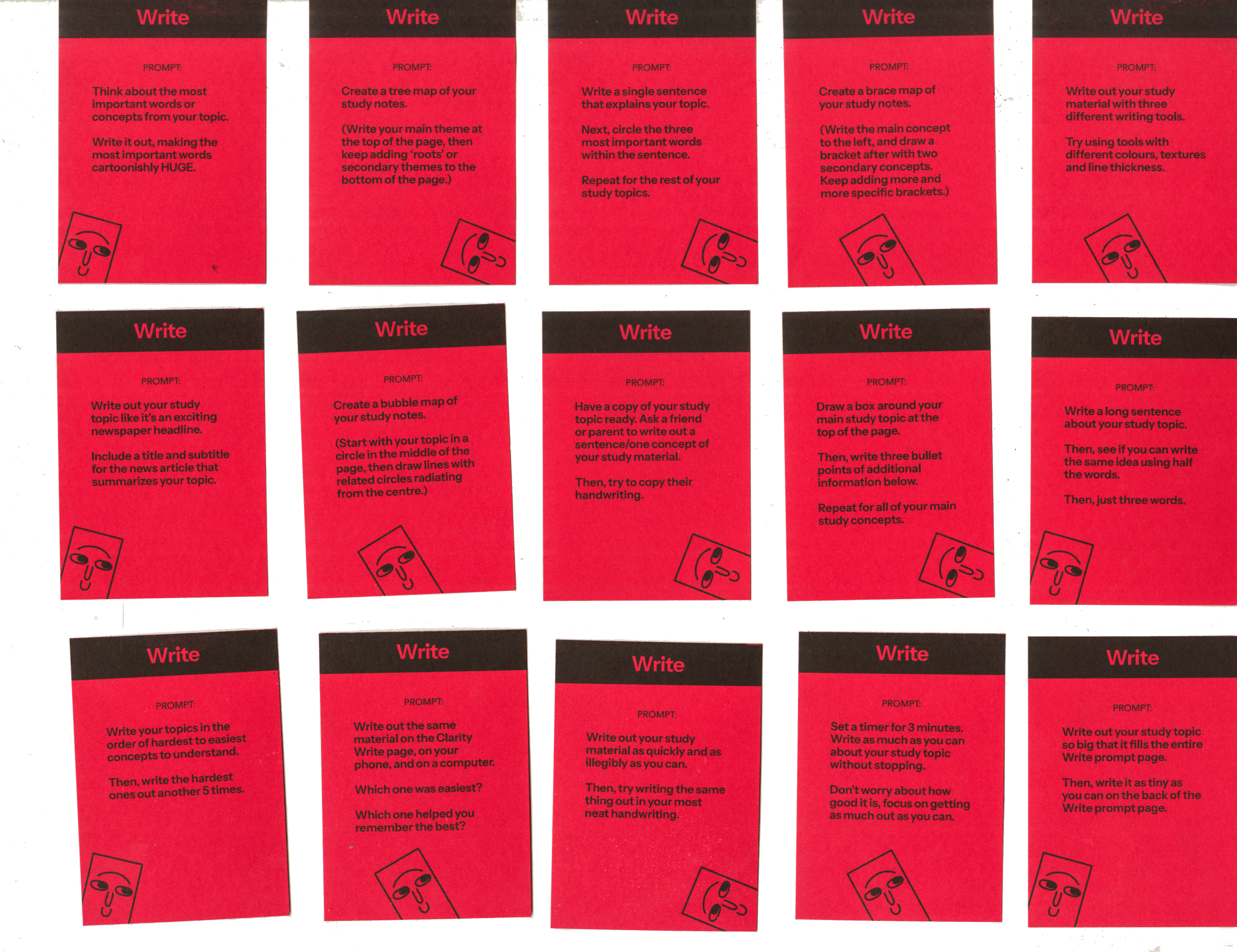
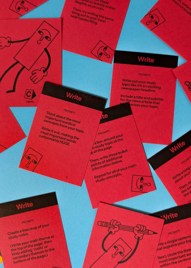
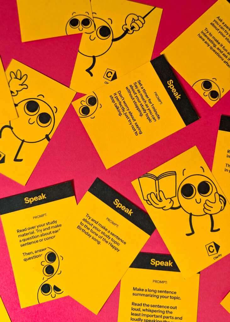
The Clarity Prompt Cards feature self-guided prompts to implement on the user’s chosen study material.
The Clarity Prompt Cards offer weekly suggestions for a new method of study and are to be completed in tandem with the Clarity Notebook. The complete deck consists of 45 cards, enough for 1 prompt from each of the three genres, every week, for the duration of the notebook.
Once a card is drawn, users can execute the prompt using designated pages in the Clarity Notebook.
The prompts are worded in a way that they can be applied to the student’s chosen study material, making them ultimately self-guided in how they are implemented.
The ultimate goal of the prompts is to help students get out of their comfort zone and build confidence in trying new things, not be perfect at the prompts. Therefore, emphasis is placed on experimentation and playfulness.
06: THE PACKAGING
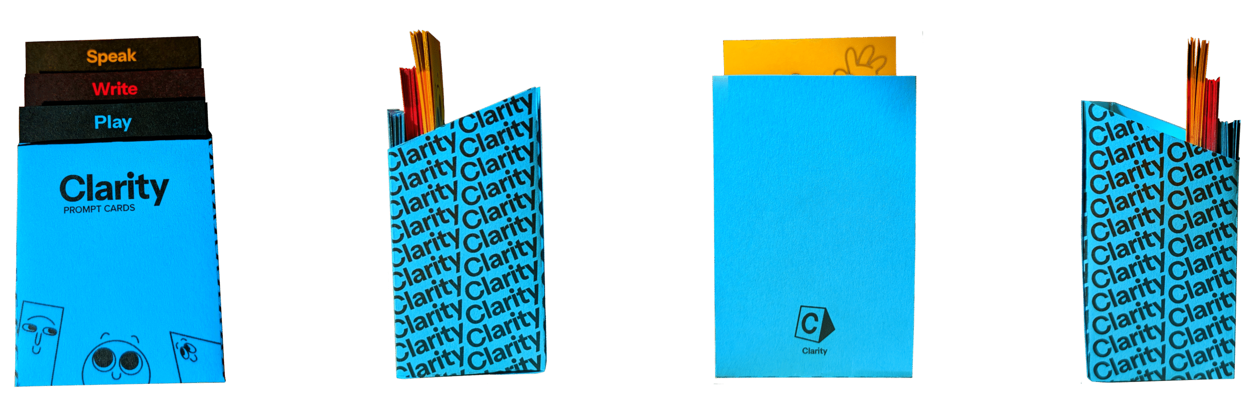
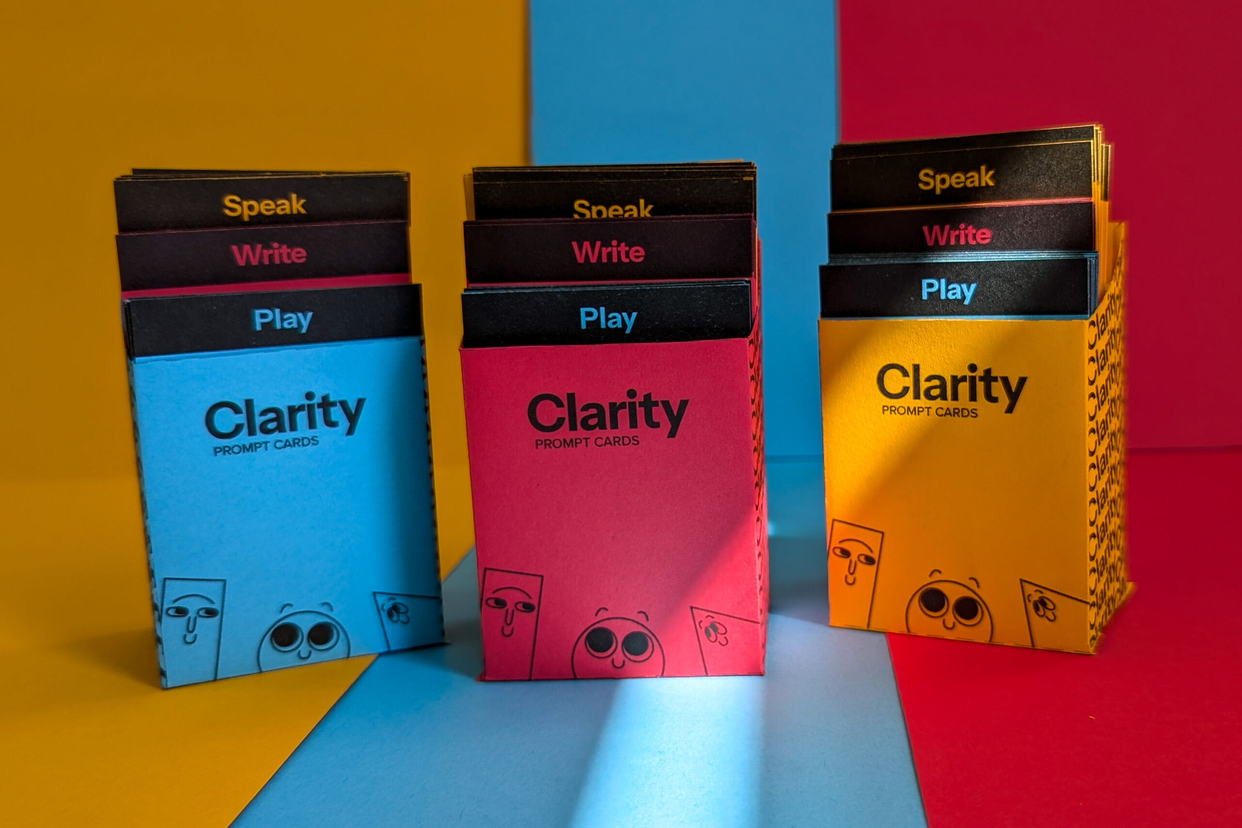
The Prompt Card packaging
comes in three colours and displays each of the three prompt suits at once.
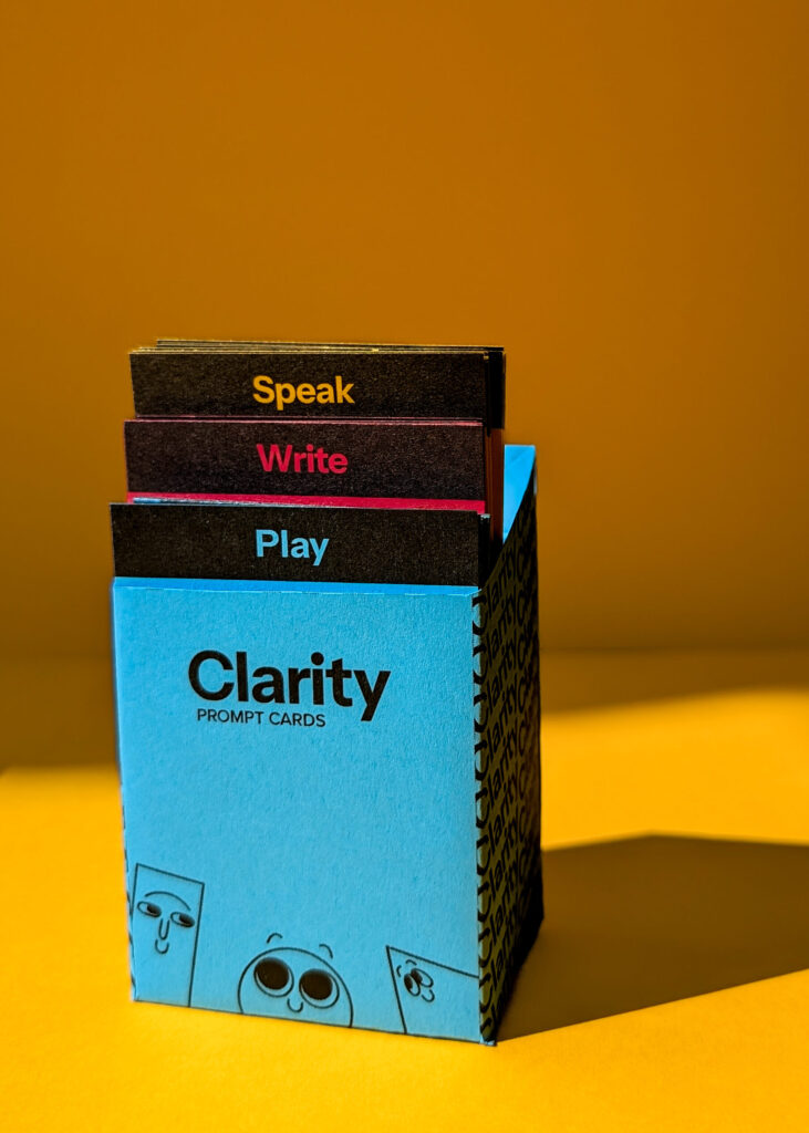
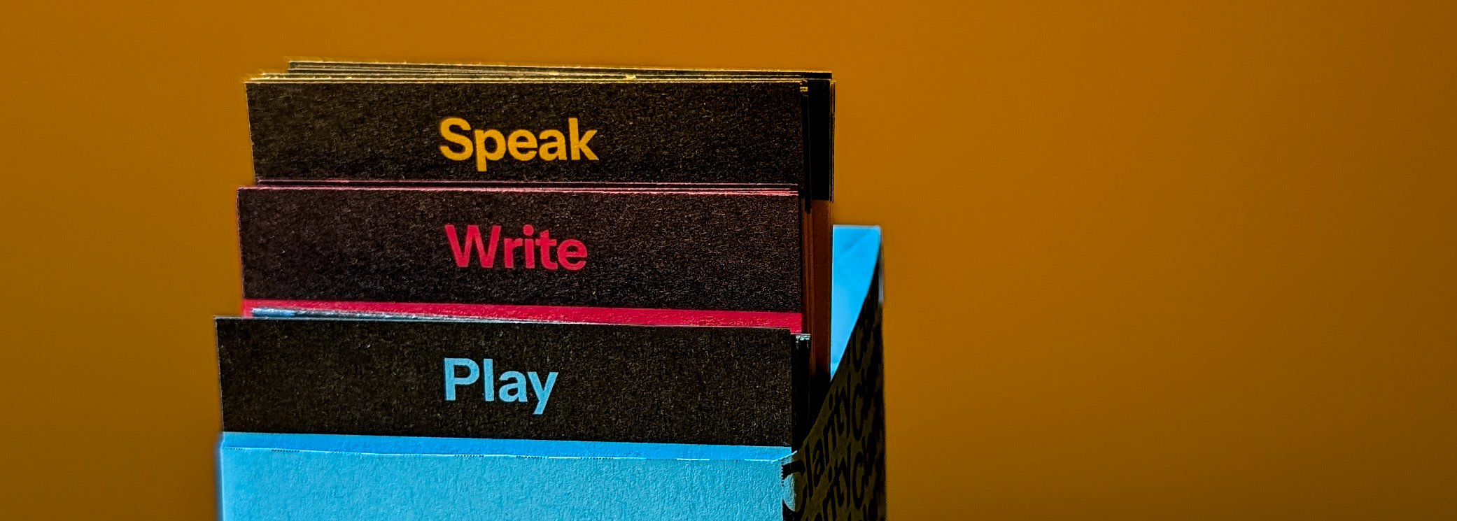
Because the prompt cards are such an important part of the toolkit, I wanted them to be displayed in a prominent and interesting way. So, I created an open-box design that divides each of the three suits in a clear and visible way.
Each suite of cards are held up by an insert, each about 0.5 inches higher than the next. I also added a slant to the sides of the box to mimic the ascending card suits. The packaging features the three mascots as well as a typographic pattern of the wordmark on the sides. The monogram is displayed on the back.
07: THE NOTEBOOK
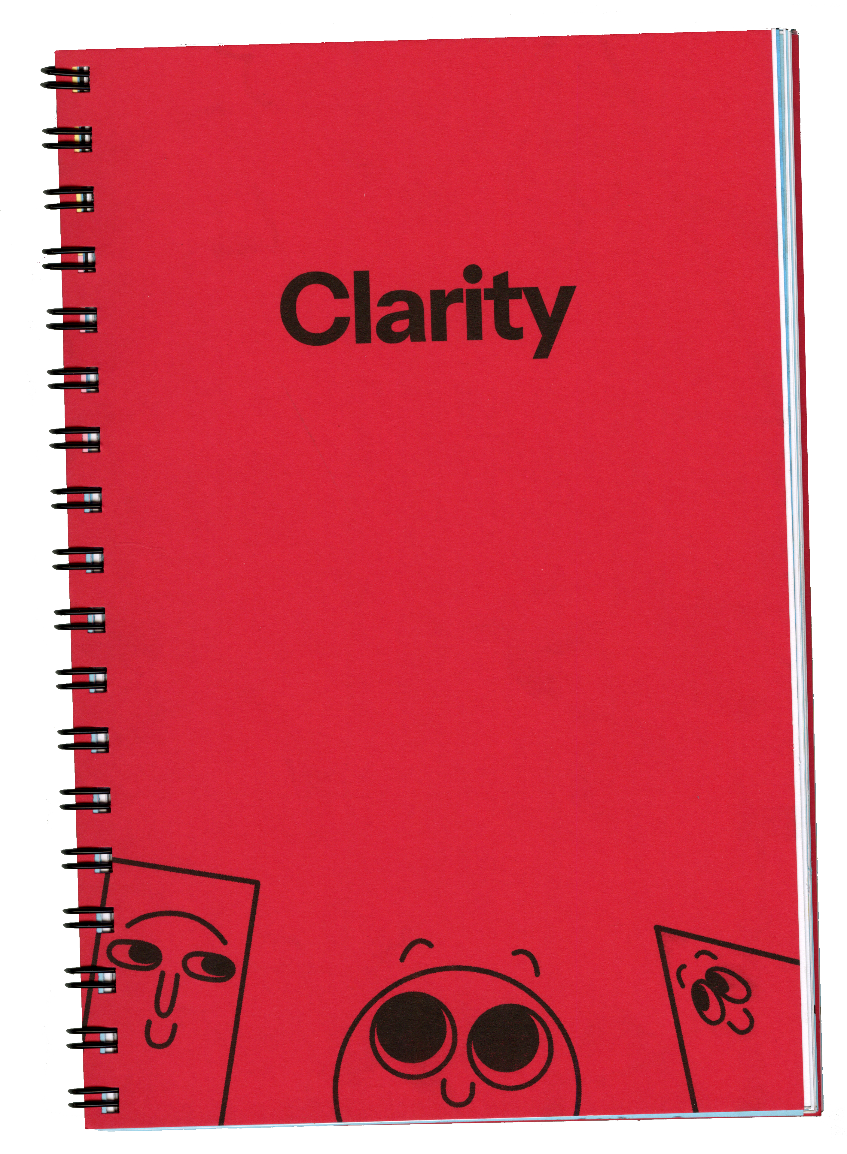
The Clarity Notebook is a three-month long daily organizer and study planner.
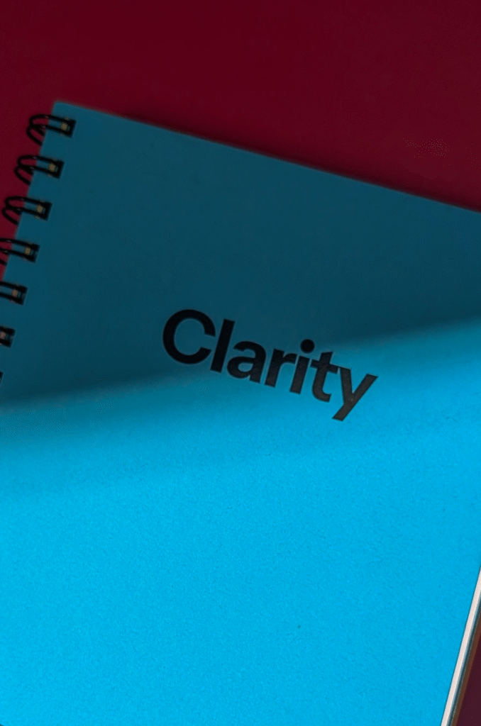
The Clarity Notebook is a planner and study journal where users can both stay organized and test out the Clarity Prompts Cards.
The Notebook covers three months of weekly content, and are roughly 200 pages each.
The Notebook comes in three coloured covers, with the insides all featuring a rotating black + primary colour colour scheme. It is printed in risograph to attain the maximum amount of colour brightness and saturation, and for the grainy, vintage-looking print quality.
The notebook prominently features thick Astrobrights Coloured Paper for covers and title pages, and thinner coloured paper is utilized for mascot and prompt card-related pages.
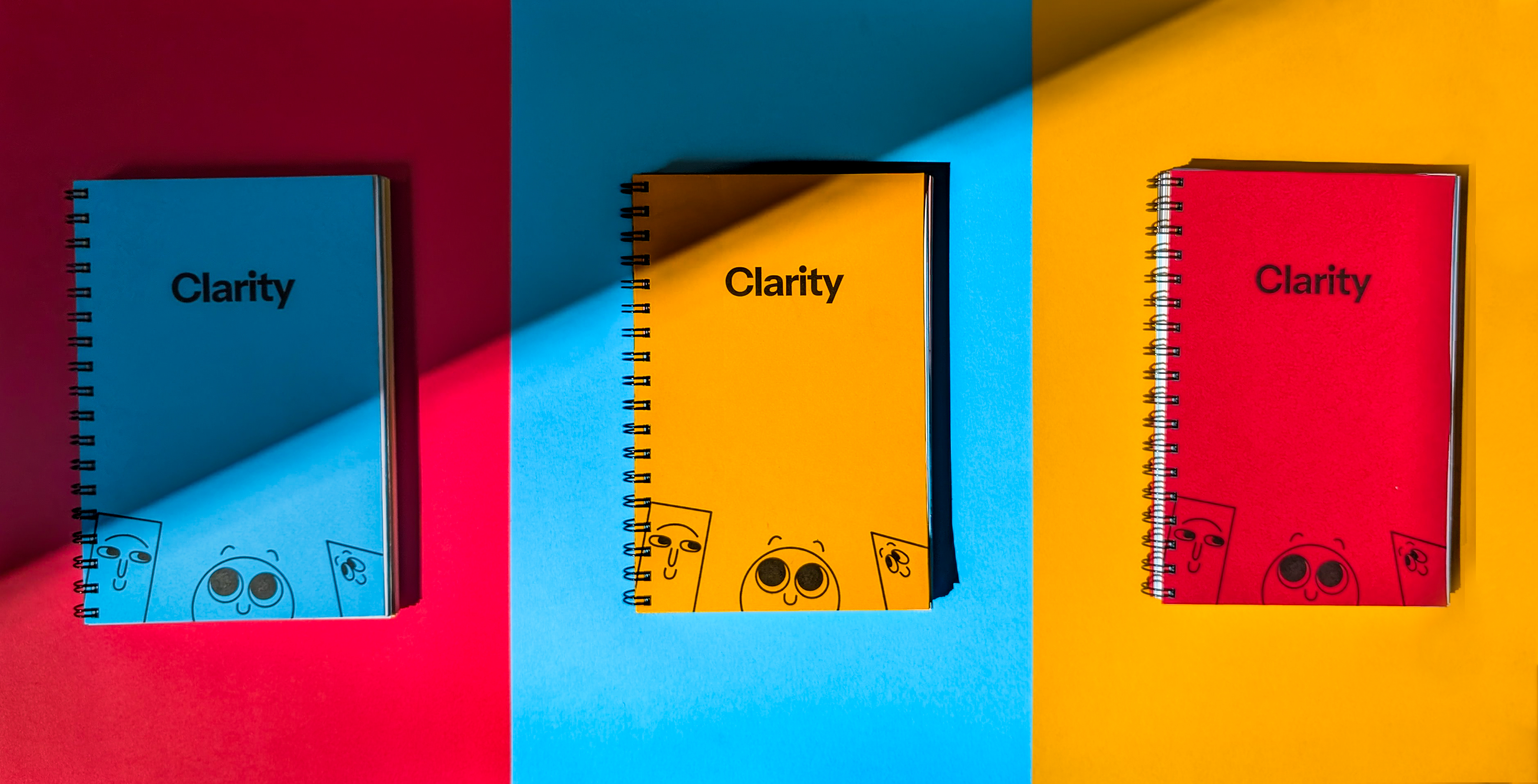
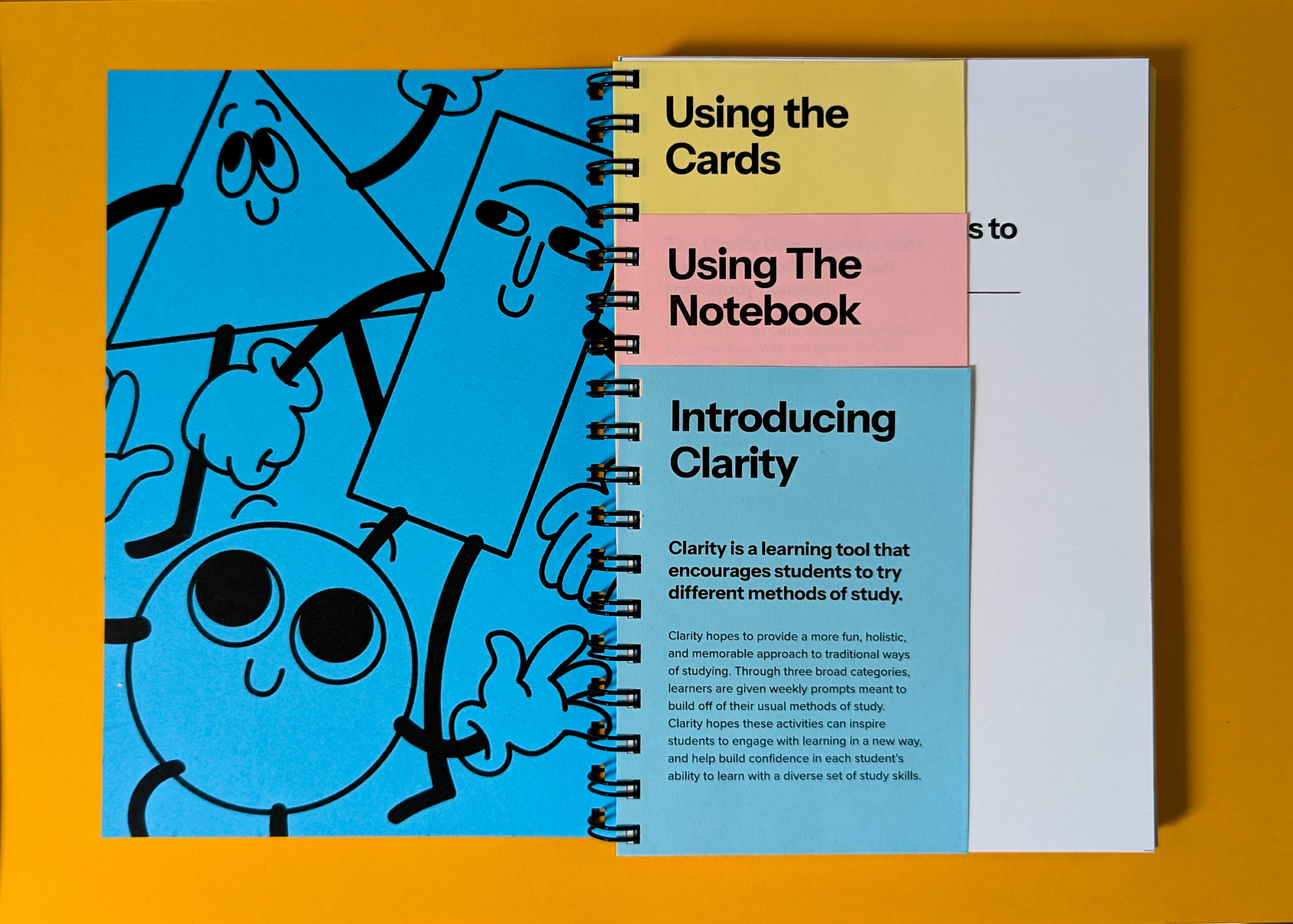
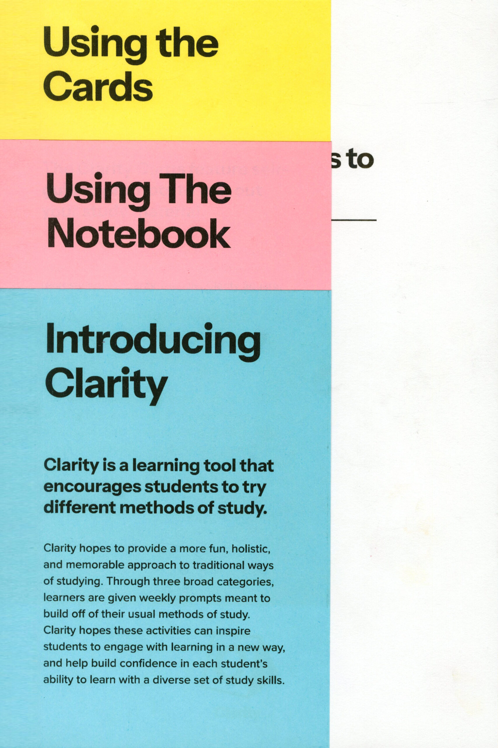
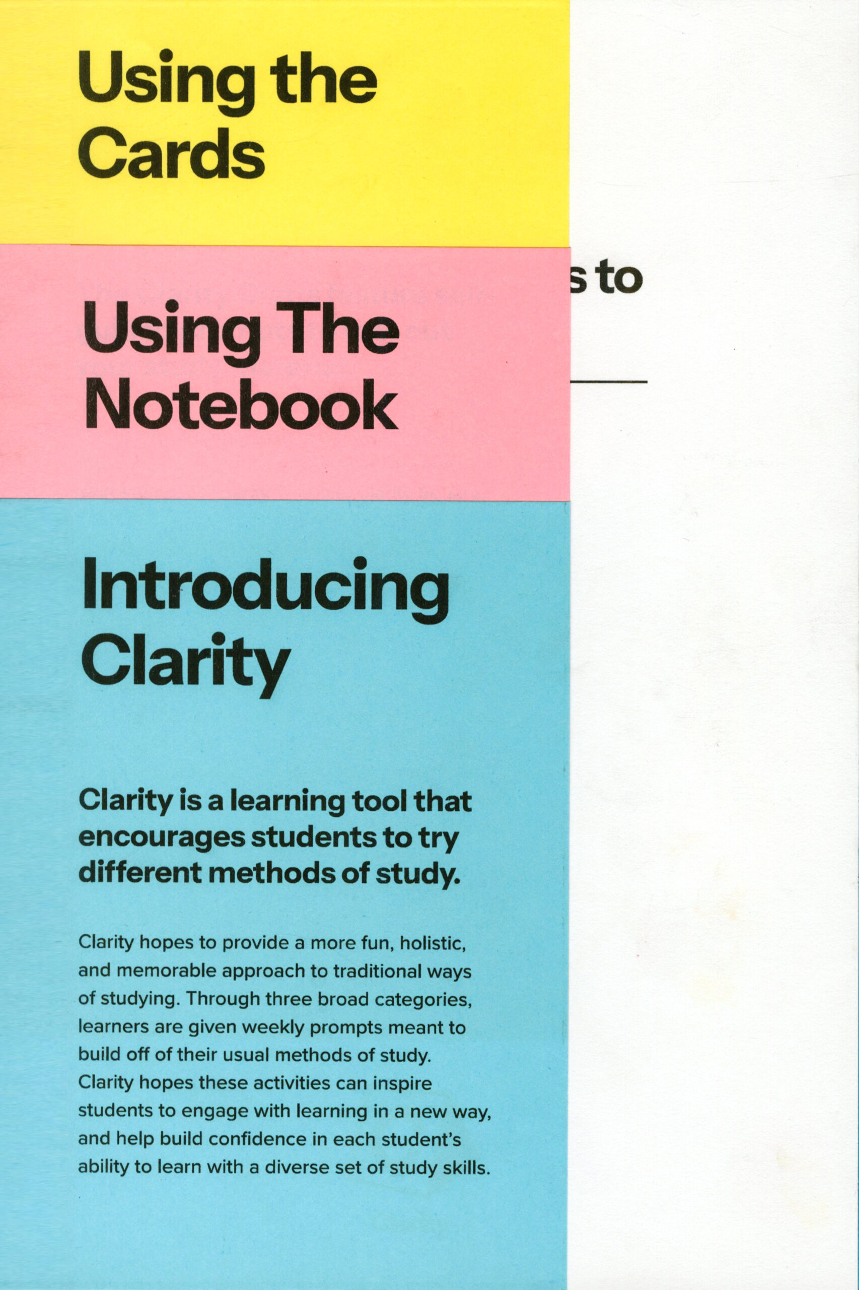
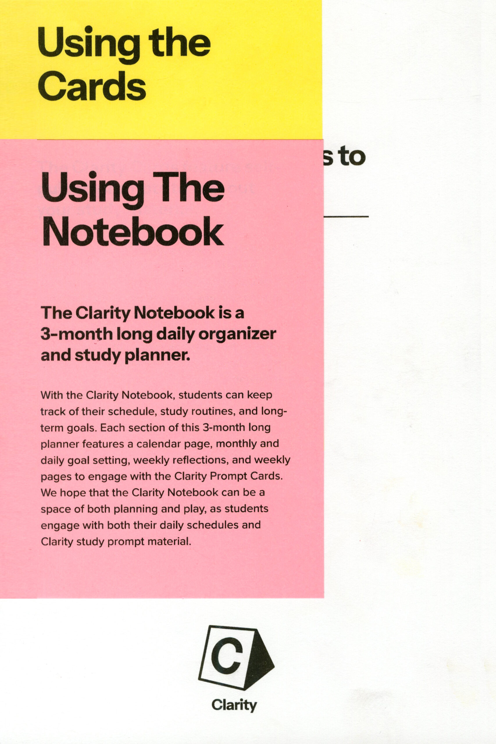
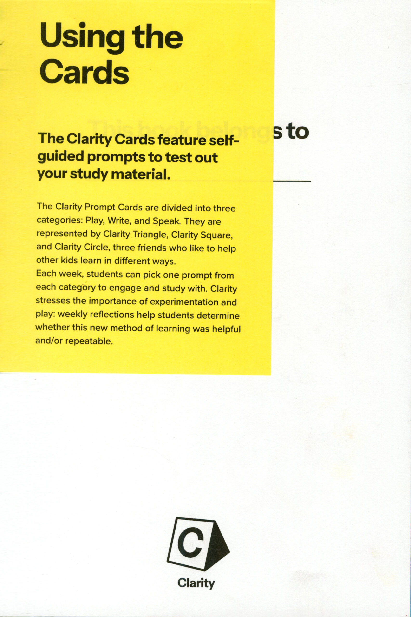
Each notebook opens up to insert pages that explain the concept of the toolkit, as well as how to use the notebook and prompt cards in tandem with each other. It also introduces the primary colour scheme and system of threes.
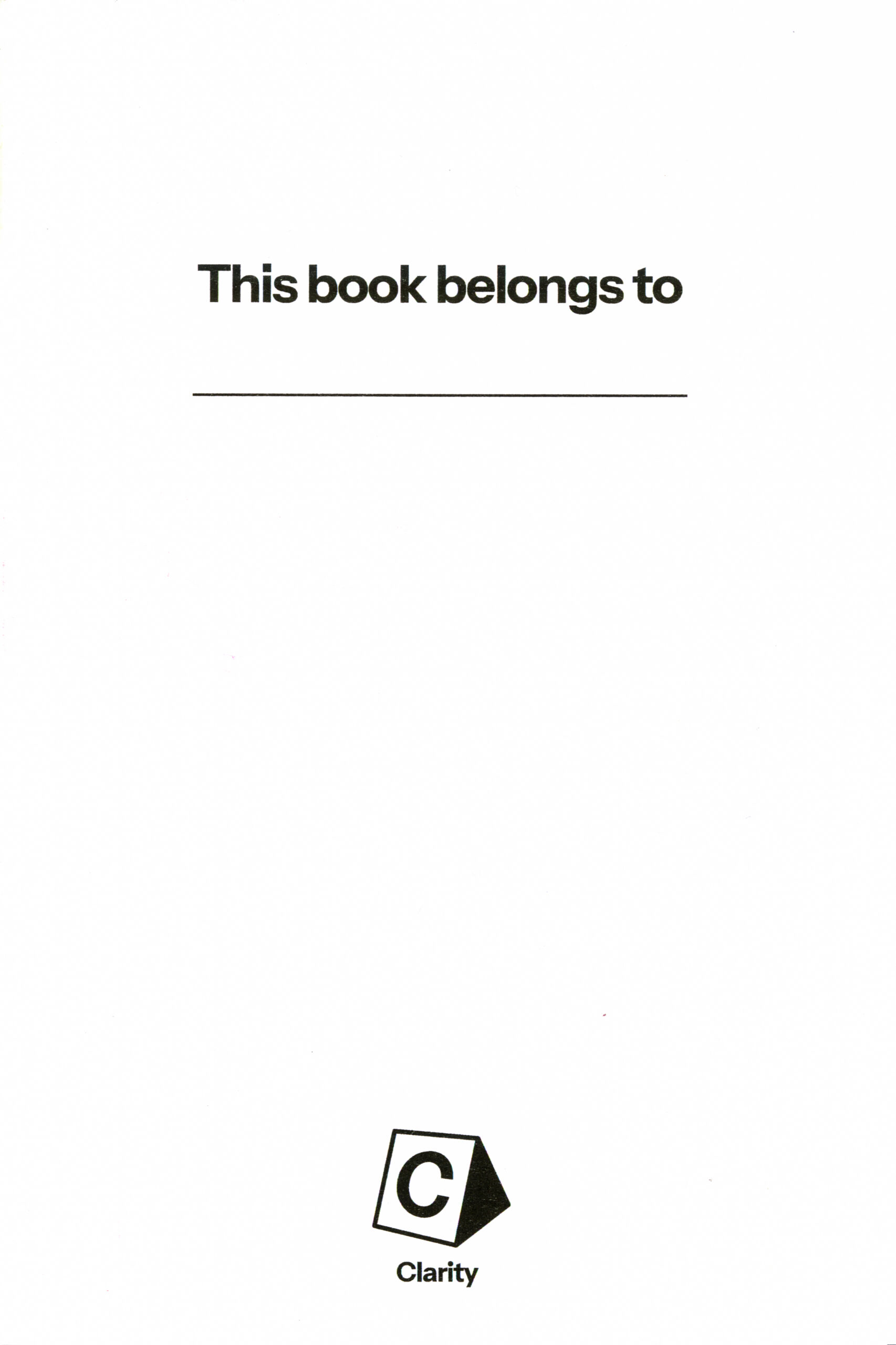
After that, the opening page lets students personalize their notebook by writing their name inside.
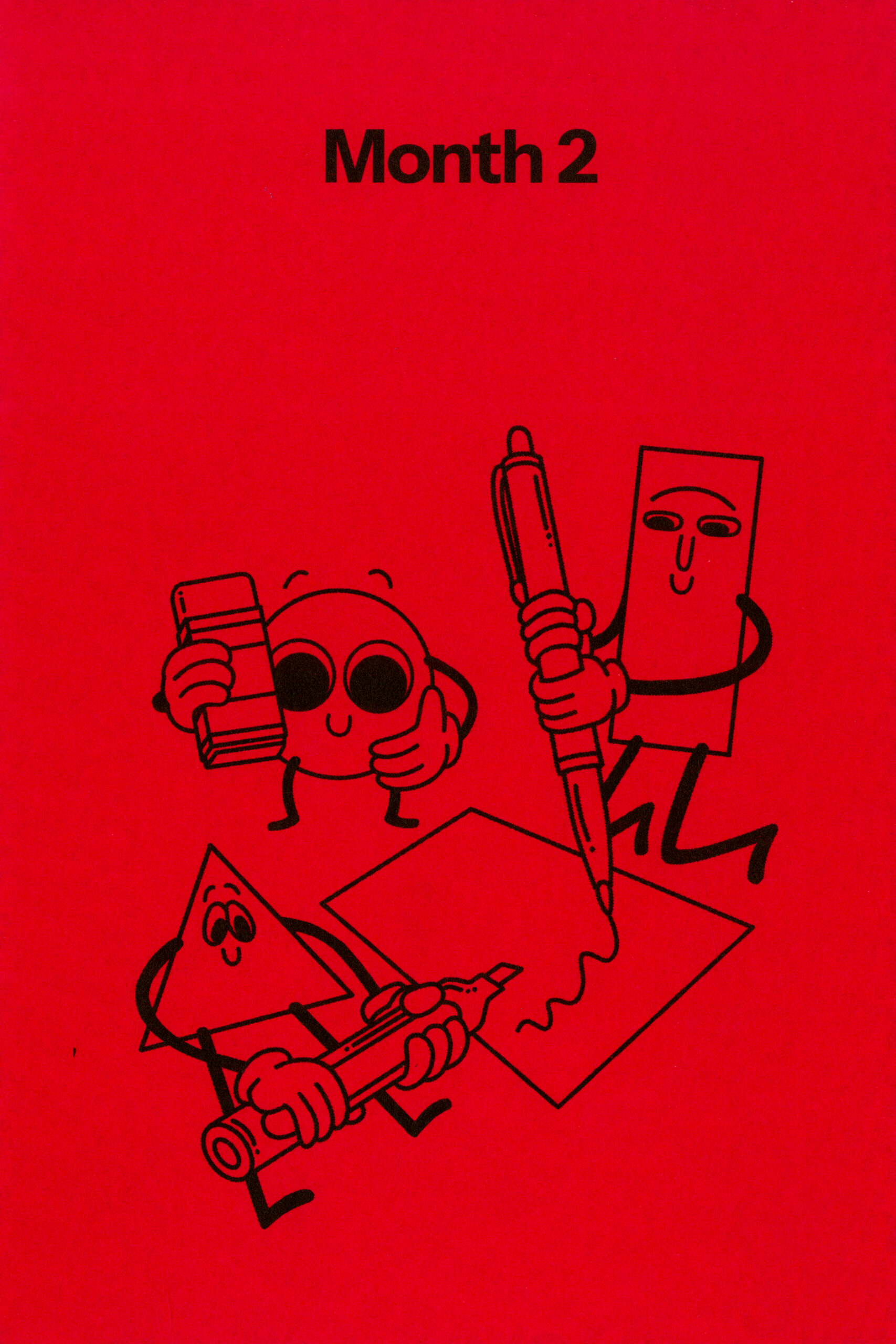
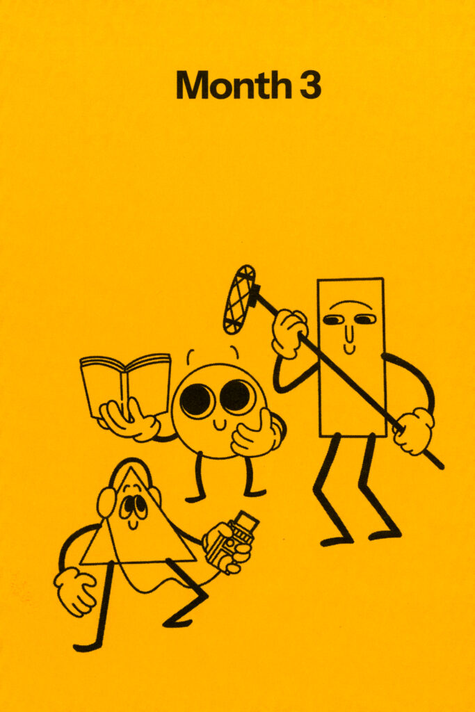
Each month of the Clarity Notebook starts with an illustration of the mascots playing together on Astrobrights paper. Each activity is themed after the prompt colour the page is associated with.
I thought it was important to show the mascots trying different methods of study, to be coherent with the thesis of the project. I also wanted to show the mascots being friends who collaborate and help each other.
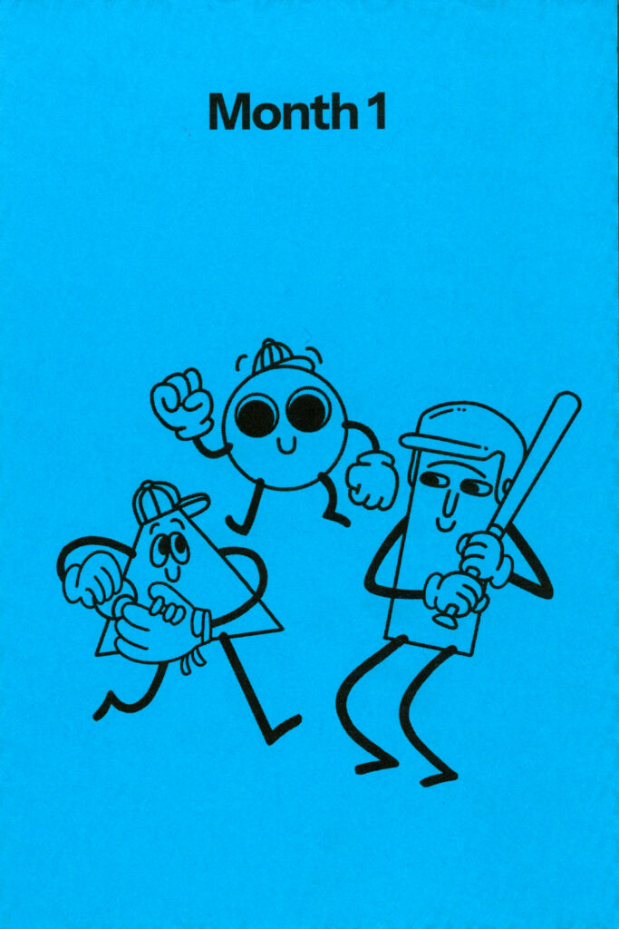
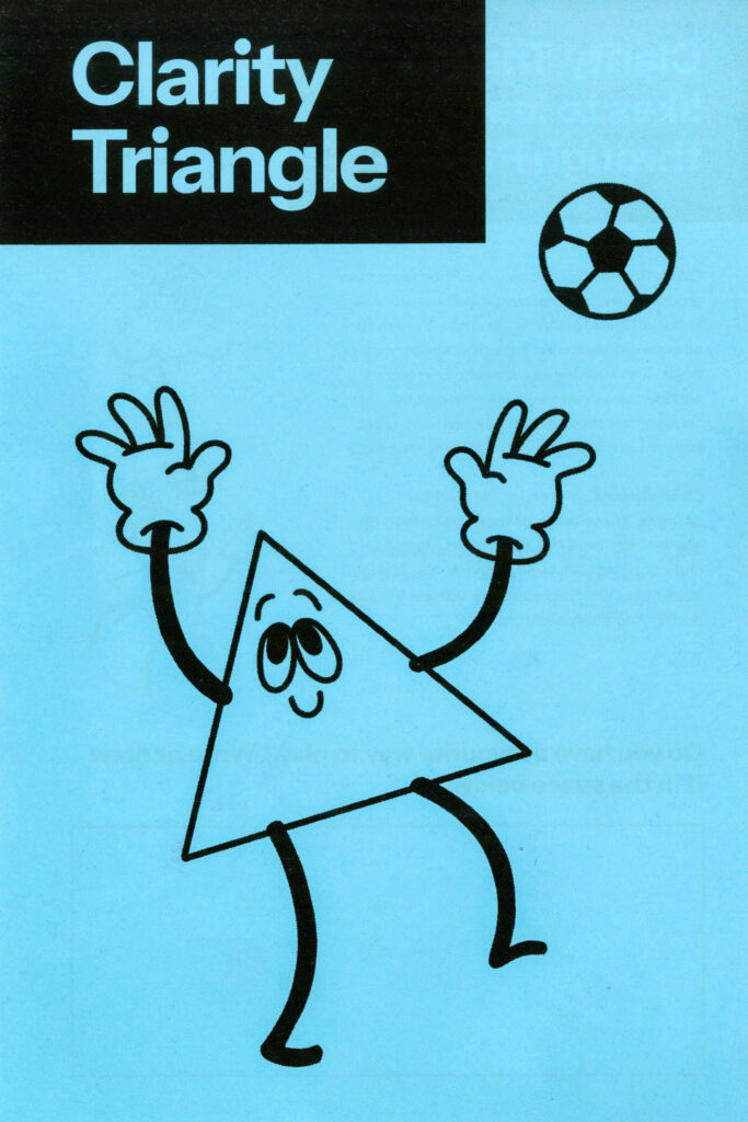
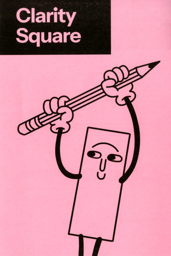
Each month, there is a mascot cover page corresponding with the colour of the month.
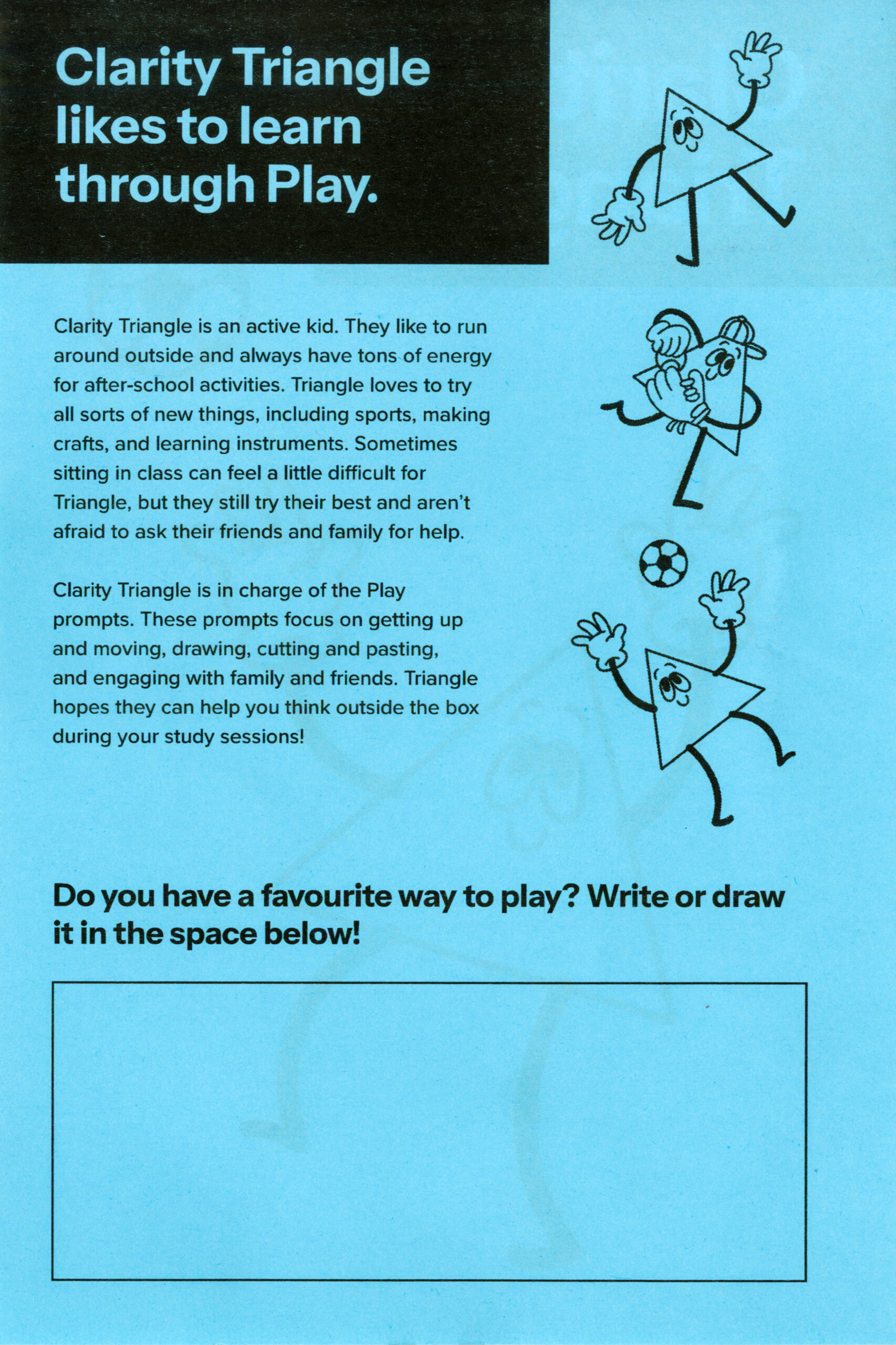
On the backside of the cover, there is a ‘bio’ page for each mascot. The bios talk about the mascot’s personalities, what school subjects and hobbies they’re good at, what they struggle with, and how they overcome their challenges. I tried to model them after personality types children tend to have.
There is also a paragraph explaining how each mascot represents a specific prompt in the cards, and a brief explanation of what each card suit is about. Then, there is a space to draw or write your own experience with the featured learning modality.
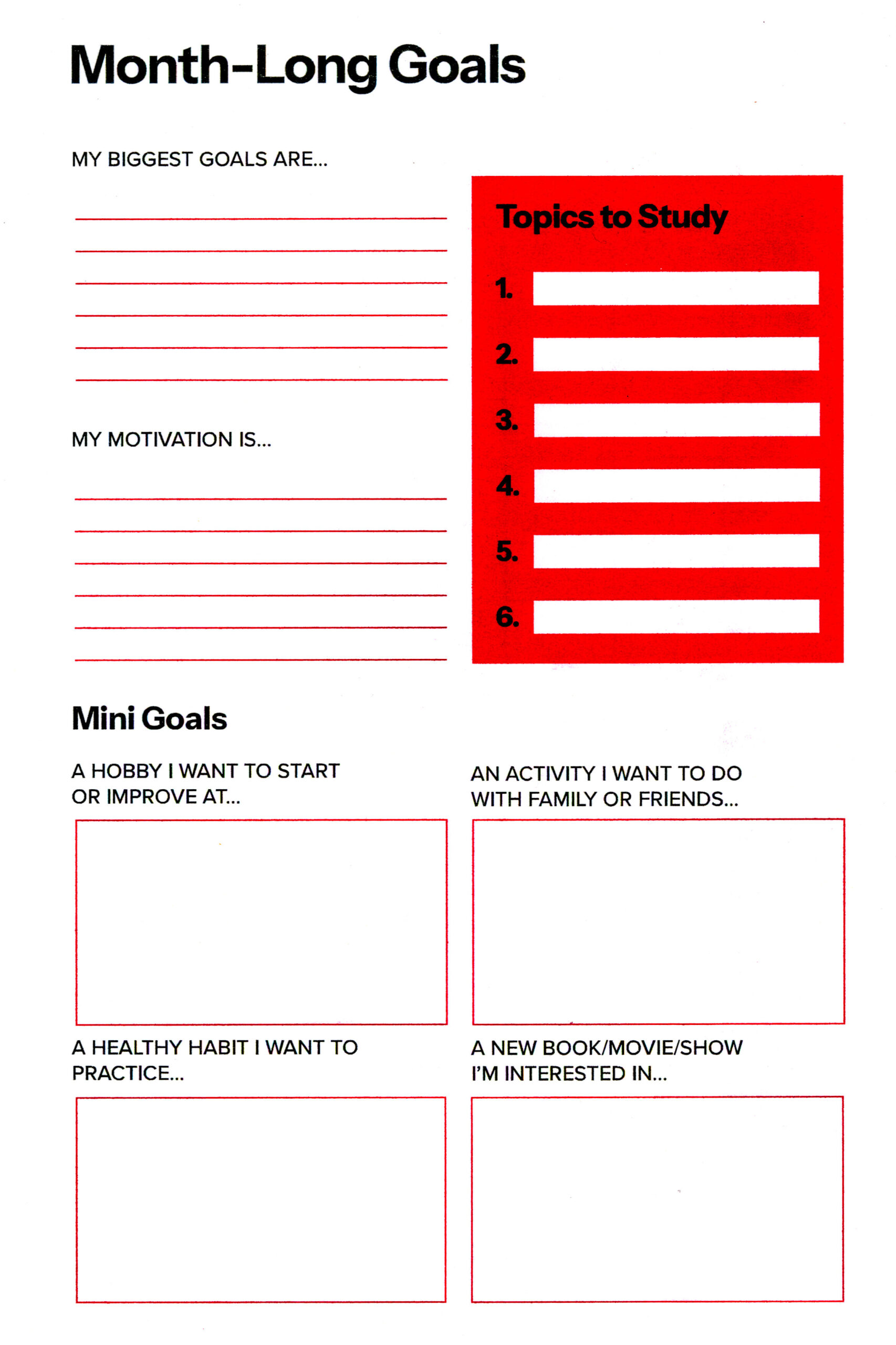
After the cover and mascot pages, there is a monthly calendar and goal section with guided prompts encouraging students to try new things, or start new healthy habits.
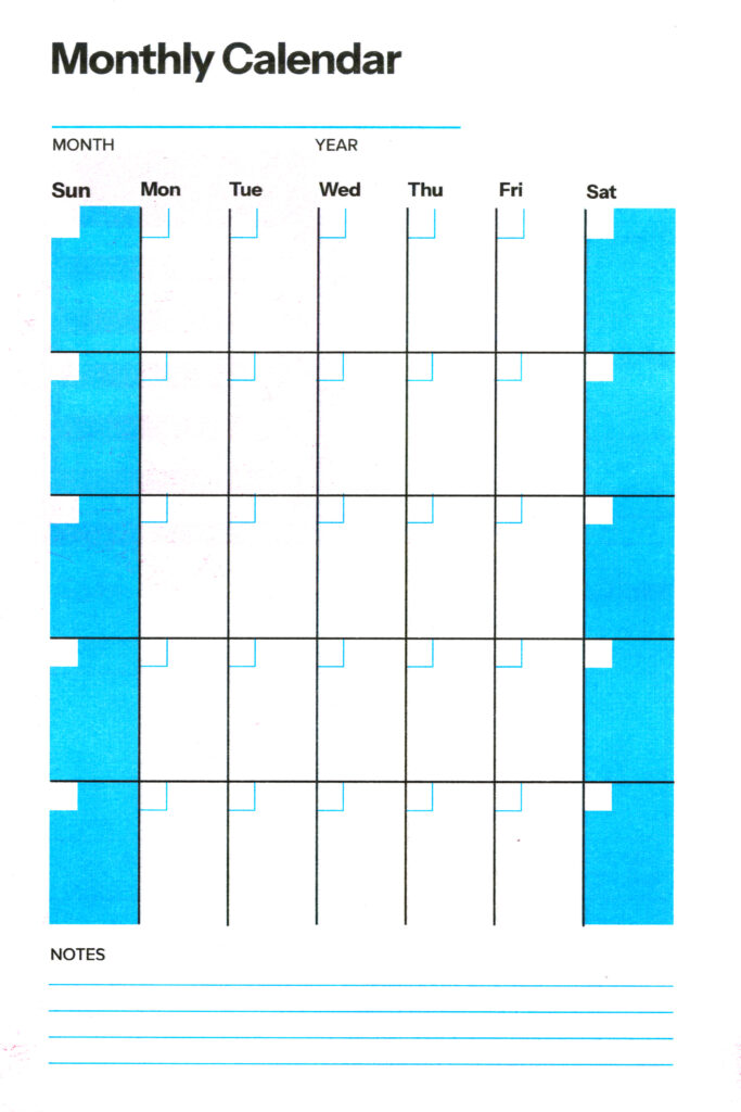
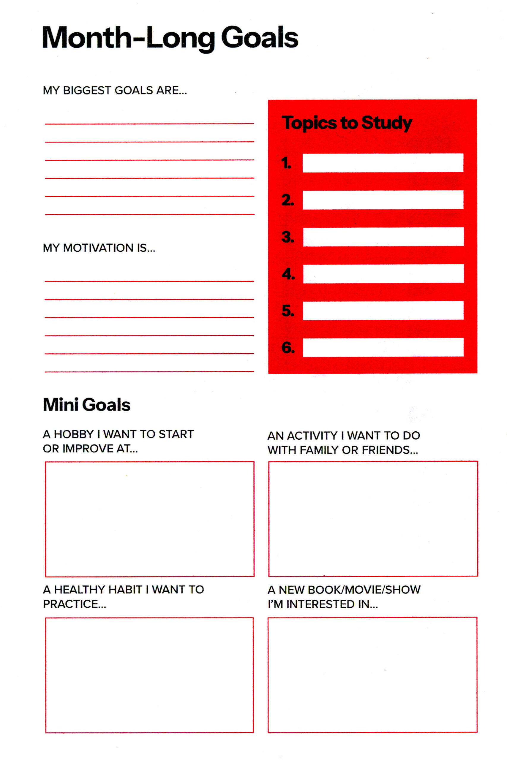
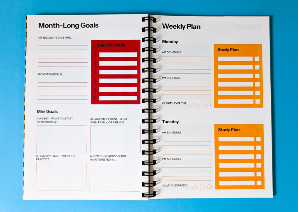
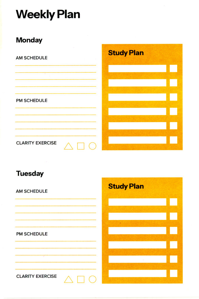
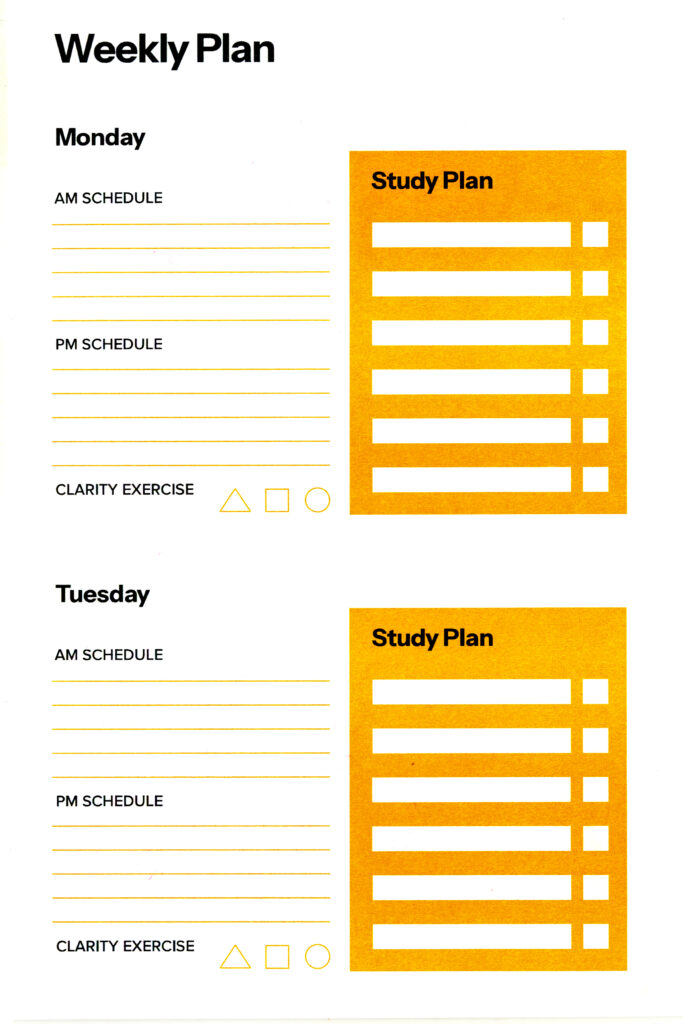
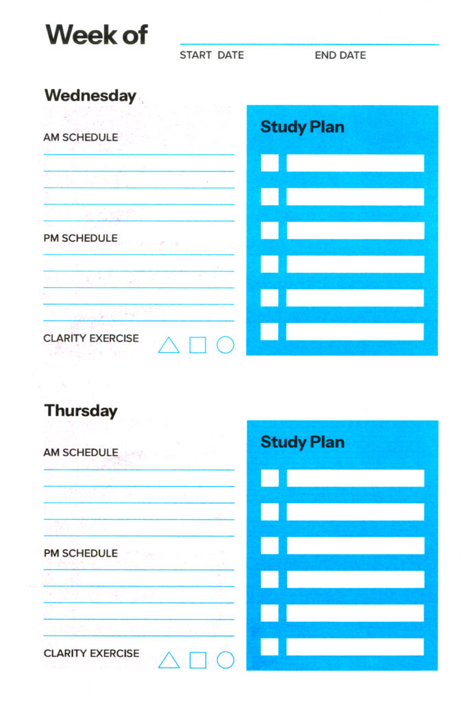
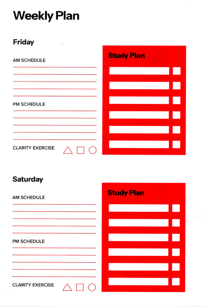
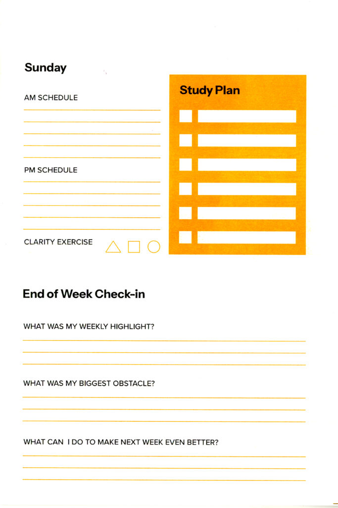
Each week of the Clarity Notebook consists of a daily schedule section, three pages to test out the Clarity Prompt Cards, and weekly reflection.
The weekly plan section features a rotating colour scheme of black + primary accent colour. Users can write down their overall daily schedule, as well as their study schedule. There is a space to plan out which clarity exercise will be practiced on which day. The final weekly plan page features a check-in prompting users to reflect on their weekly highlight, biggest obstacle, and an action plan for the upcoming week.
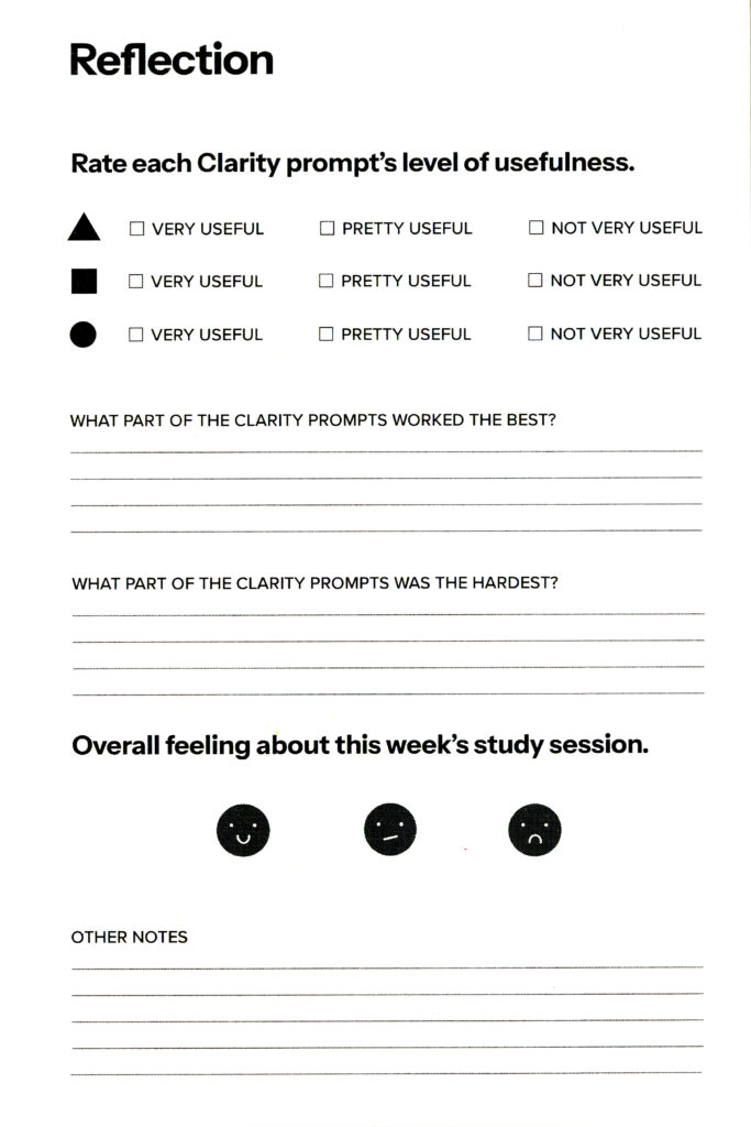
After the weekly plan and the Clarity prompt pages (described in further detail below), there is a page where users can reflect on how useful each Clarity prompt was to their study, and how they feel about their overall study progress that week.
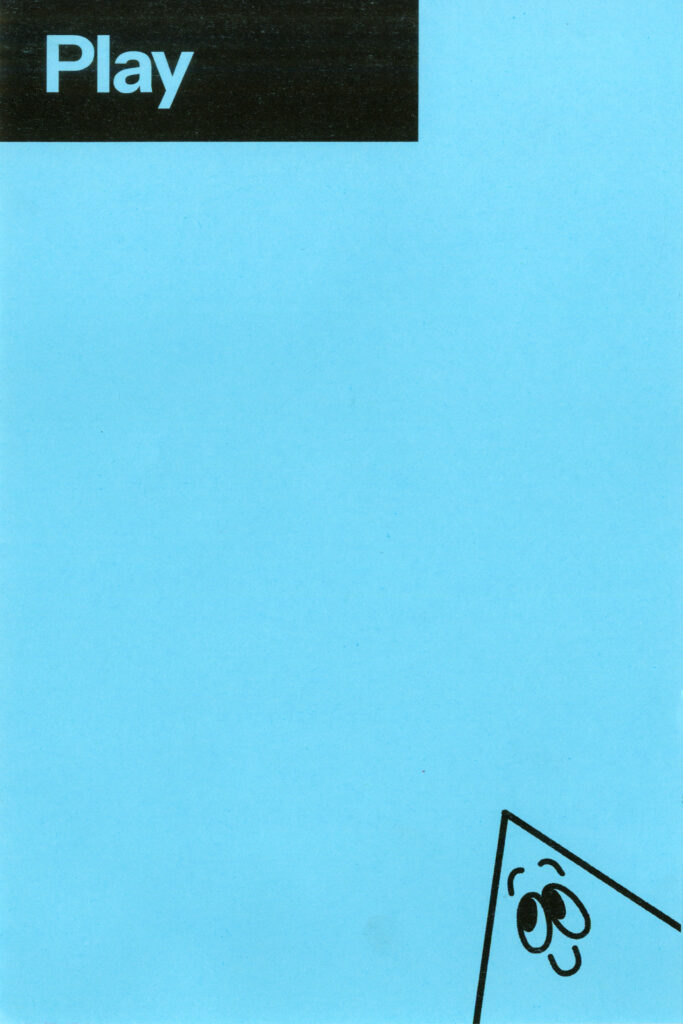
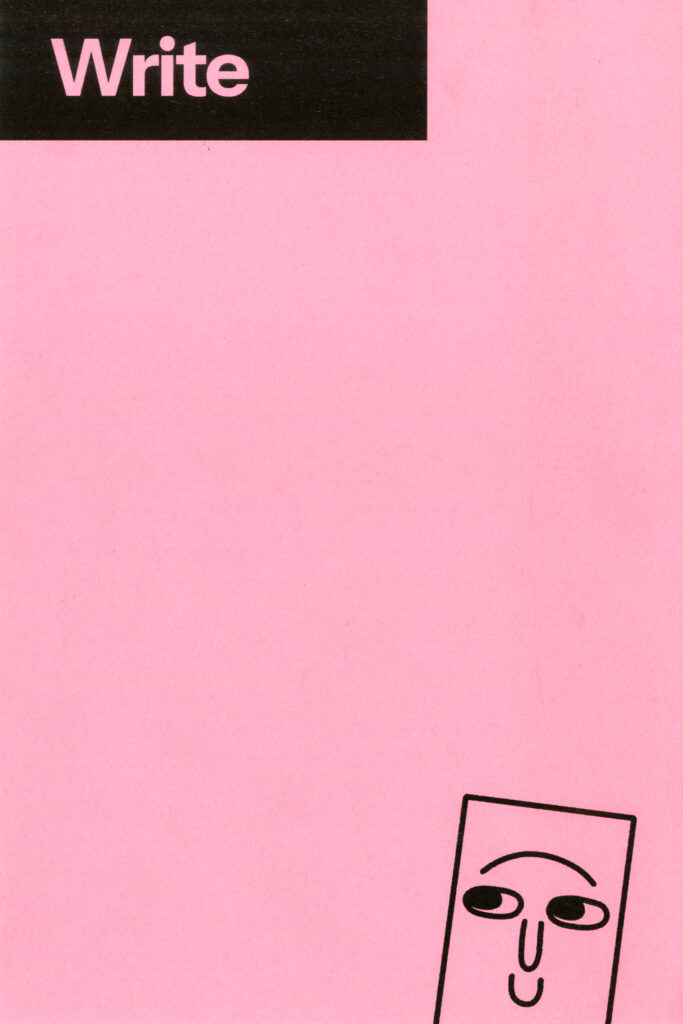
After the weekly plan section, there are three coloured pages where users can engage with each of the three prompt genres.
The backs of the prompt pages are left blank, so students have plenty of room to experiment as they need.
If you would like to take a digital flip-through of the Clarity Notebook, you can see what the first two weeks of the notebook look like! The unique monthly title page and mascot bio spreads have been added to the back, in order to show what each individual spread looks like in its printed format.
08: EXTRAS
Here is some bonus ephemera created to compliment the Clarity Toolkit, and help explain the project.
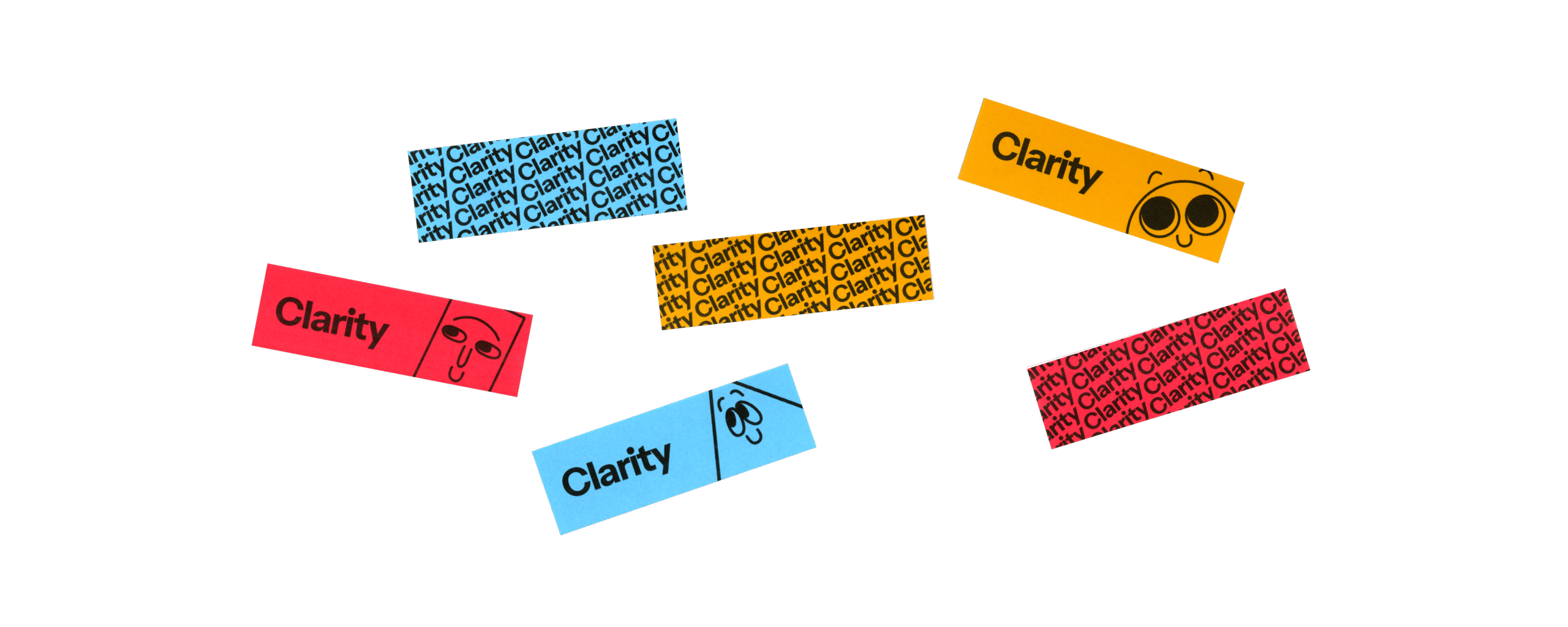
I made small bookmarks featuring the Clarity Mascots as well as a repeating pattern featuring the wordmark.
I created three posters summarizing the project and into be displayed with the toolkit.
I hope you have enjoyed learning about Clarity!