Co-op: Creative Social Network
Angelina Rudakova
See it On Campus: Level 2
By Angelina Rudakova
Overview
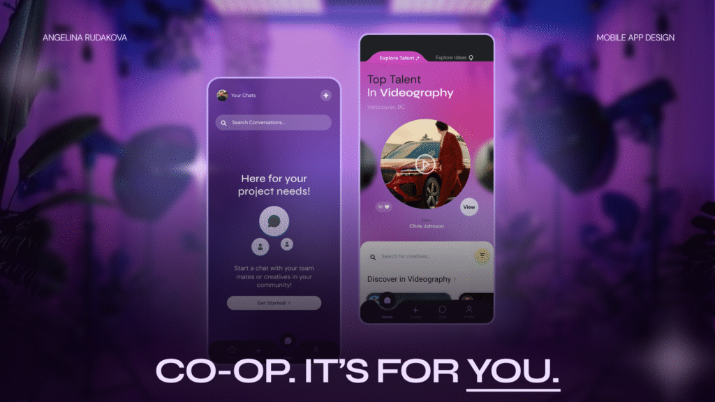
Co-Op is a social networking platform that connects creatives across disciplines to collaborate on passion projects.
The app is designed to empower entry-level creatives, newcomers, and career pivoters to share ideas, build portfolios, and find like-minded collaborators.
Opportunity
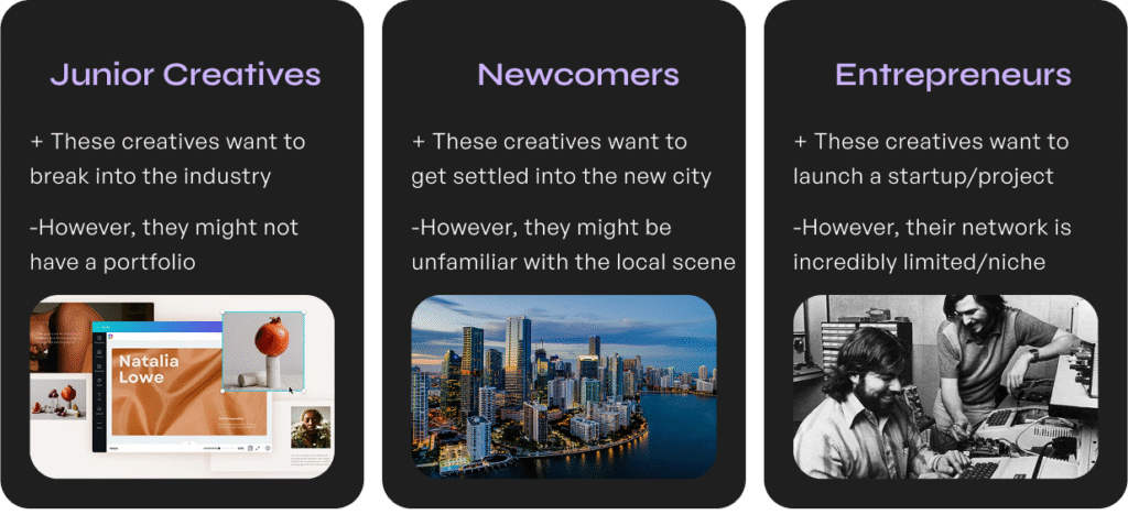
Breaking into creative industries is harder than ever.
Meanwhile, many projects never see the light of day because talented people can’t find each other. I wanted to change that.
Research and Discovery
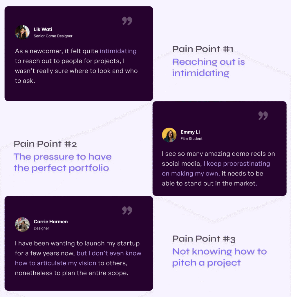
Over 3 phases of user research, I interviewed students, early-career creatives, and industry professionals.
I ran numerous rounds of usability testing and concept testing, using:

Observation-based usability testing
Jobs to be Done Framework
Kano-style feature evaluation
Key Interview Insights
User Flow
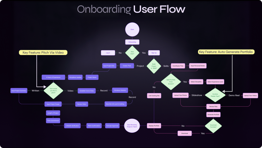
The flow below has gone through vigorous iterations, addressing the key friction points that stand in the way of users beginning their creative work.
Style Guide + Branding
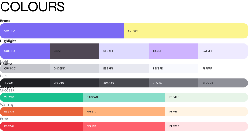
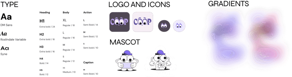
I wanted to encapsulate the feeling of novelty and playfulness that would resonate with my target creative demographic. Thus, my UI featured gradient colours in its backgrounds, lots of playful animations, combined with modern typography.
Components
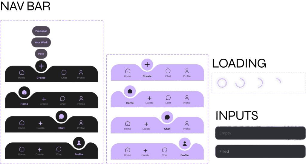
Taking the gradient background into account was a major accessibility consideration. Thus, the majority of me components accounted for dark and light background options. The icons and buttons were treated with glassmorphism effects to stay true to the brand identity.

Key Screens
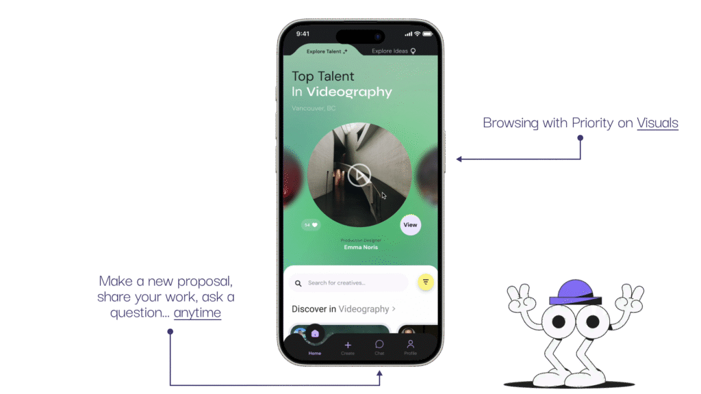
The home page instills a sense of community by highlighting other creatives based on talent, location and interests.
Toggle Creator and Contributor modes:
In the higher fidelity round of iterations, I conducted a total of 7 usability tests with senior and junior creatives. One pointed out that the core of my service is to encourage creatives to branch out, thus, the ability to switch modes: “looking for talent” and “exploring ideas” should be made easier.
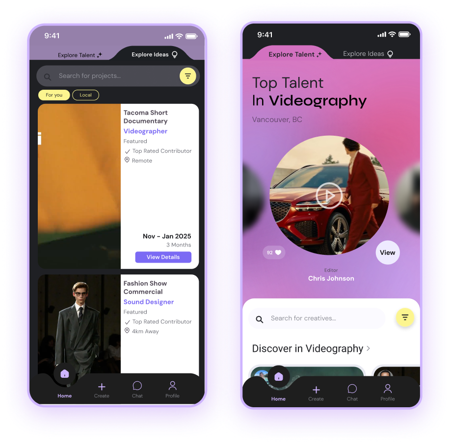
I modified my home page to effectively switch views at the top of the page. Upon additional testing, it was reported that the toggle feature:
– “Encouraged exploration”
– Made users consider pitching a project of their own.
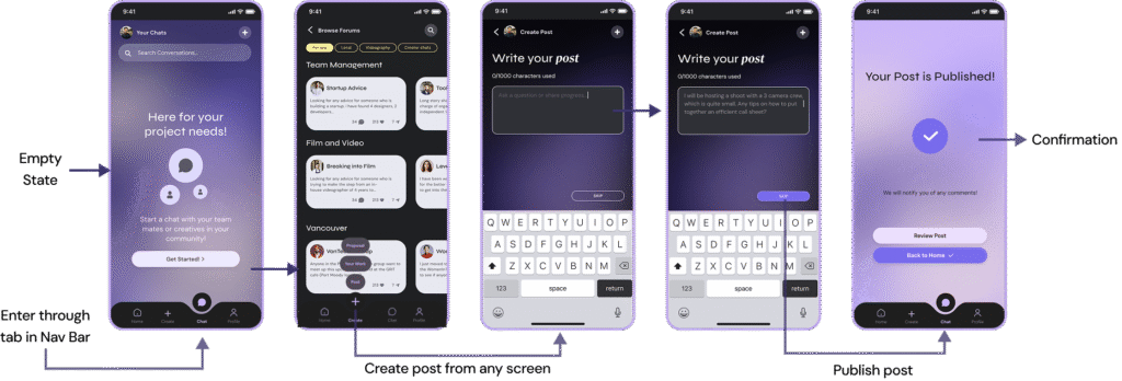
Forum + Chatting Feature
A student user tester brought the idea of having a community hub to allow for both contributors and creators to ask questions, create forums, and receive project management tips. This became a secondary “nice to have” feature:
Try it for Yourself!
Click the phone screens below to view Co-Op’s key features in action!
Reflections
What makes Co-Op special isn’t just the features, it’s the heart behind it. Inspired by a personal story, fuelled by rigorous testing, and shaped by peers, this project reflects everything I value as a designer: empathy, clarity, and collaboration.
As my dad once told me, great work happens not because of how many people are on your team, but because of how well you know and support one another. Co-Op is here to make that connection easier.
Tools Used
- Figma
- Notion
- Google Forms
- Miro & FigJam
- Adobe Premiere (for motion design)
Core Values:
- Accessibility
- Trust
- Clarity
- Playful professionalism
Up Next
I’m currently seeking developers and funding to bring Co-Op to life beyond the showcase. If you’re a creative, a technologist, or just someone who believes in the power of collaboration, let’s talk.