Late Bloomer
Layla Hasanovic
See it On Campus: Level 2
PROJECT OVERVIEW
A subscription box that bridges the gap between seriousness and silliness, encouraging personal expression and creativity.
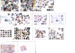
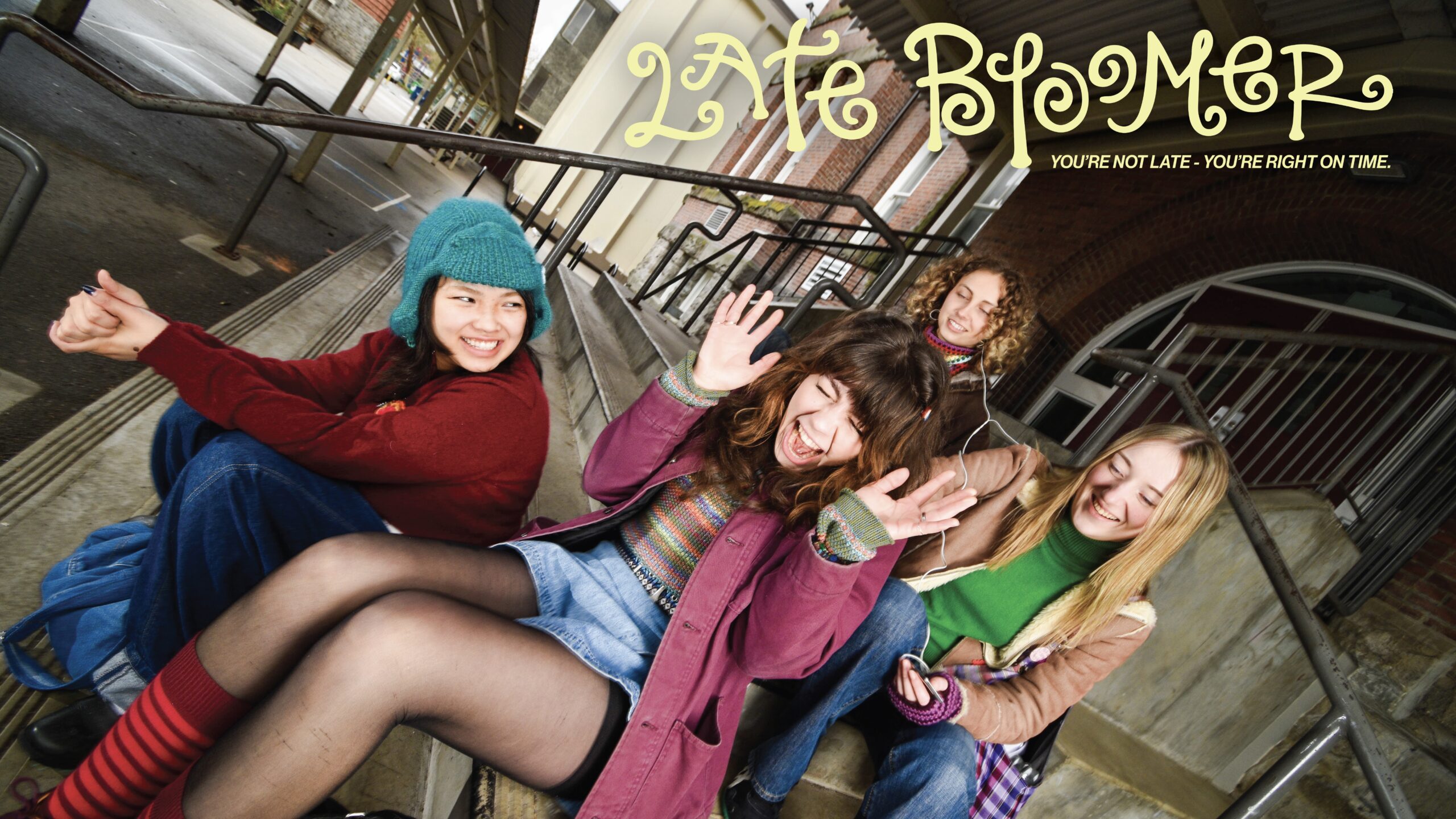
Late Bloomer is an arts and crafts subscription box and magazine created to explore nostalgia, creativity, and the complexities of growing up through thoughtful DIY projects and storytelling.
The concept evolved as a personal design response to my initial thesis question: How does yearning for childhood simplicity shape our adult experience? My research led me to examine the tension between youthful creativity and the often rigid expectations of adulthood, recognizing a collective longing to reconnect with the playfulness, spontaneity, and creative fearlessness that defined our childhoods.
This exploration inspired me to create a quarterly subscription box featuring a thoughtfully curated magazine, original crafting patterns, and carefully selected supplies designed to encourage mindful creativity. Each issue invites subscribers to slow down, reflect, and express themselves through hands-on making, offering an opportunity to embrace crafting as a form of self-care and personal expression.
At its core, Late Bloomer bridges the gap between adult responsibilities and past playfulness, challenging societal pressures to outgrow creative instincts and instead advocating for reclaiming these joyful, empowering parts of our identities.
BRANDING GUIDELINES
The visual identity system of Late Bloomer aims to
evoke playfulness and personal creativity.
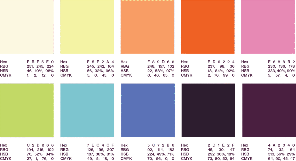
Late Bloomer’s visual identity is vibrant, playful, and intentionally nostalgic, drawing inspiration from early 2010s colour palettes and aesthetics. The palette reflects the playful yet thoughtful essence of the brand. Rounded shapes, playful stickers, and expressive graphics consistently emphasize the brand’s focus on embracing creativity as a joyful, mindful experience.
Primary Logo
The logo was intentionally created to capture the playful and whimsical essence at the brand’s heart. Beginning with hand-drawn lettering to ensure authenticity and a sense of nostalgia, the design features charmingly uneven letterforms and playful curls that evoke the imperfect beauty of handcrafted arts and crafts. Digitally refined to balance legibility and personality, the logo remains distinctly youthful yet sophisticated, effortlessly embodying the brand’s ethos of embracing one’s inner child.

Secondary Logo

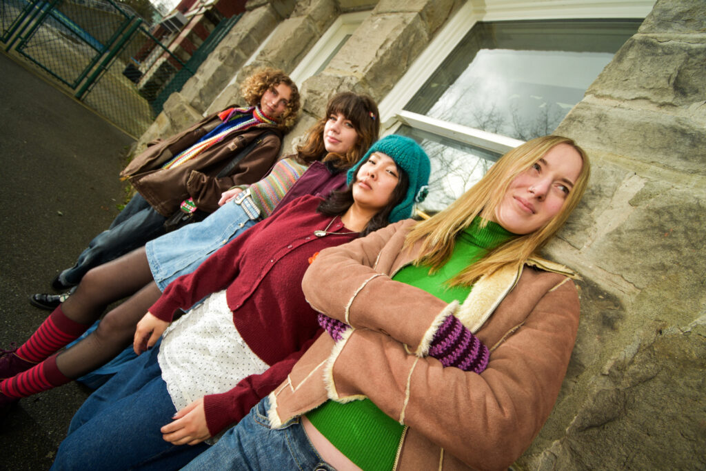
Colour Palette + Typography
Talking about the visual identity of the entire magazine and box.

PART I: THE MAGAZINE
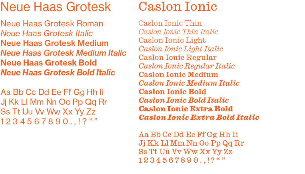
The visual identity system of Late Bloomer aims to evoke nostalgia, encourage creative play, and celebrate personal expression through vibrant and whimsical design elements.
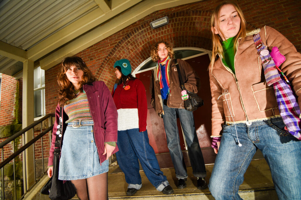
The Late Bloomer magazine visual identity embraces a joyful palette inspired by early 2010s aesthetics, incorporating bright pastels paired thoughtfully with softer cream and deep plum accents to create a sense of warmth and approachability. The primary logo, featuring playful, hand-drawn lettering with gently whimsical flourishes, captures the magazine’s essence by balancing youthful creativity with modern refinement. This combination of cheerful, nostalgic typography and curated colours is carried throughout the magazine’s layout and accompanying sticker designs, reinforcing the overarching theme of reconnecting with playful creativity, slowing down, and finding joy in the process of making.
View the digitized version here!
PART II: SUBSCRIPTION BOX
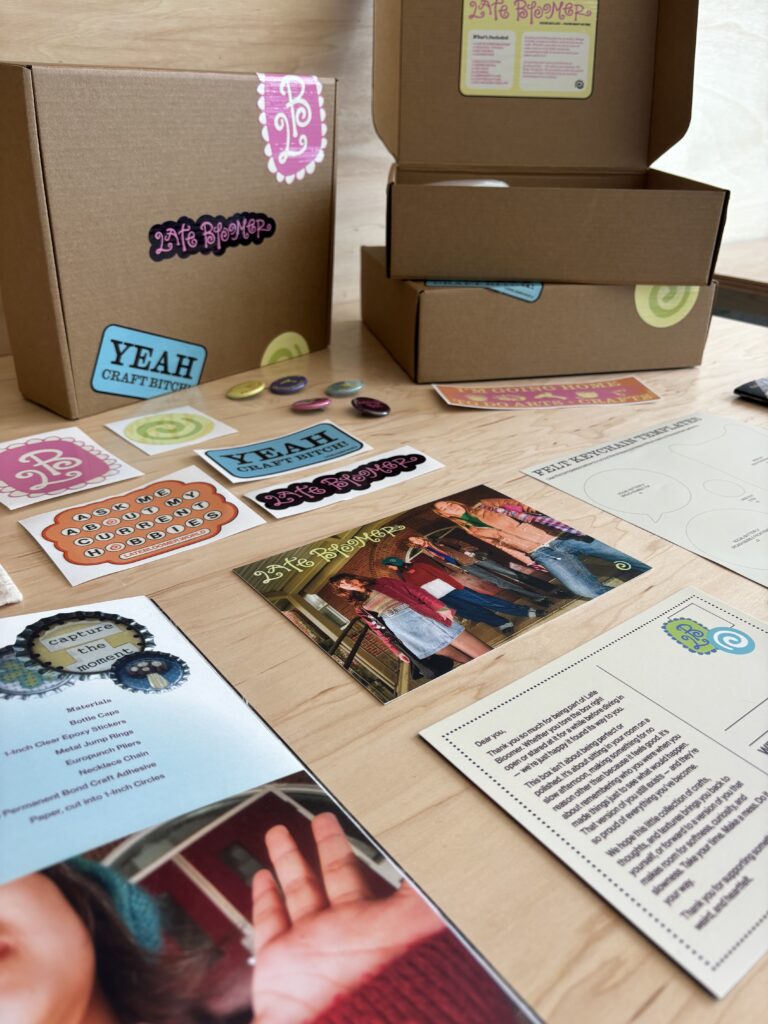
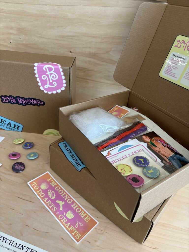
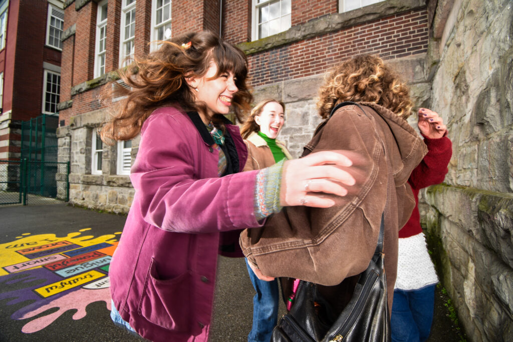
The Late Bloomer subscription box aims to inspire creativity, spark nostalgia, and encourage mindful crafting through thoughtfully curated DIY experiences.
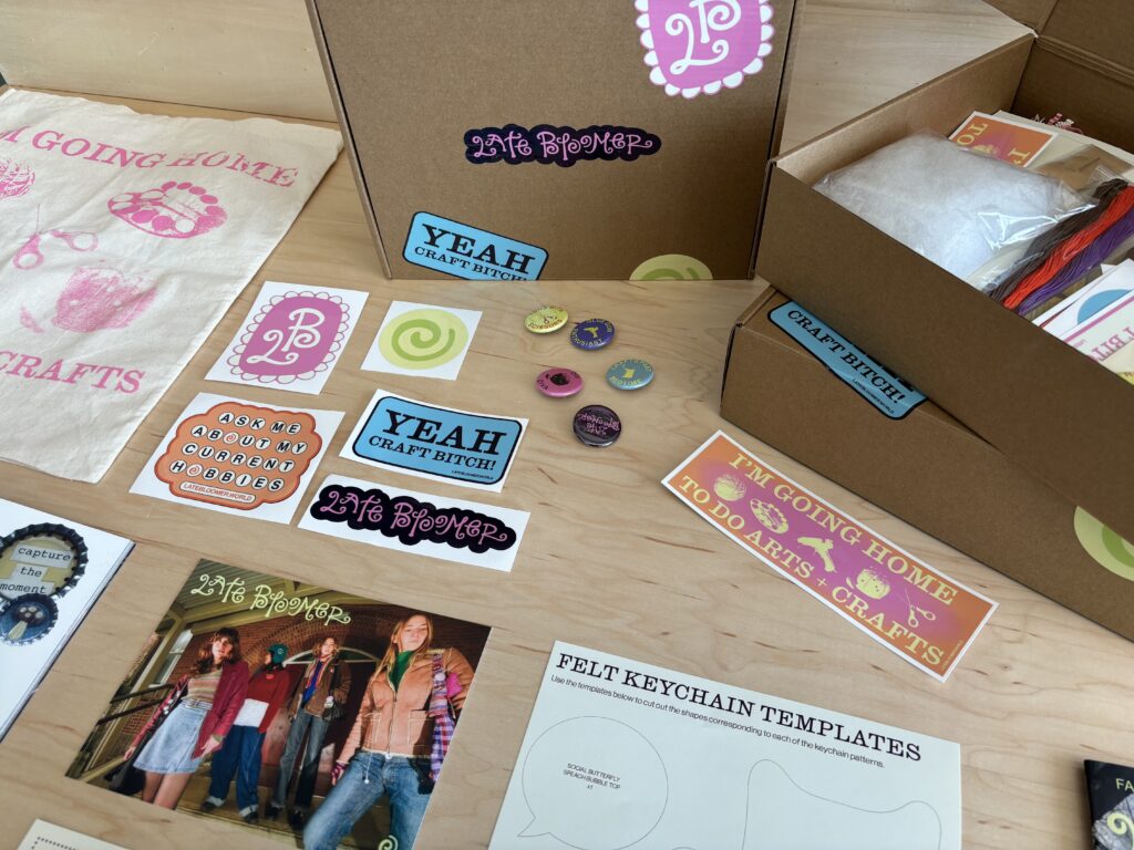
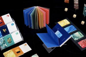
Each box is carefully designed to reflect Late Bloomer’s playful yet intentional aesthetic, incorporating bright, nostalgic colours, whimsical illustrations, and handcrafted typography that echoes the spirit of joyful creativity. Inside, subscribers will find beautifully packaged craft materials, exclusive sticker sheets, interactive activities, and a printed magazine filled with engaging stories, patterns, and interviews. This combination of tactile and visual elements invites subscribers to slow down, reconnect with themselves, and rediscover the simple joy of creating by hand.