In-Yeon 인연
Clare Yeon Lee
See it On Campus: Level 2
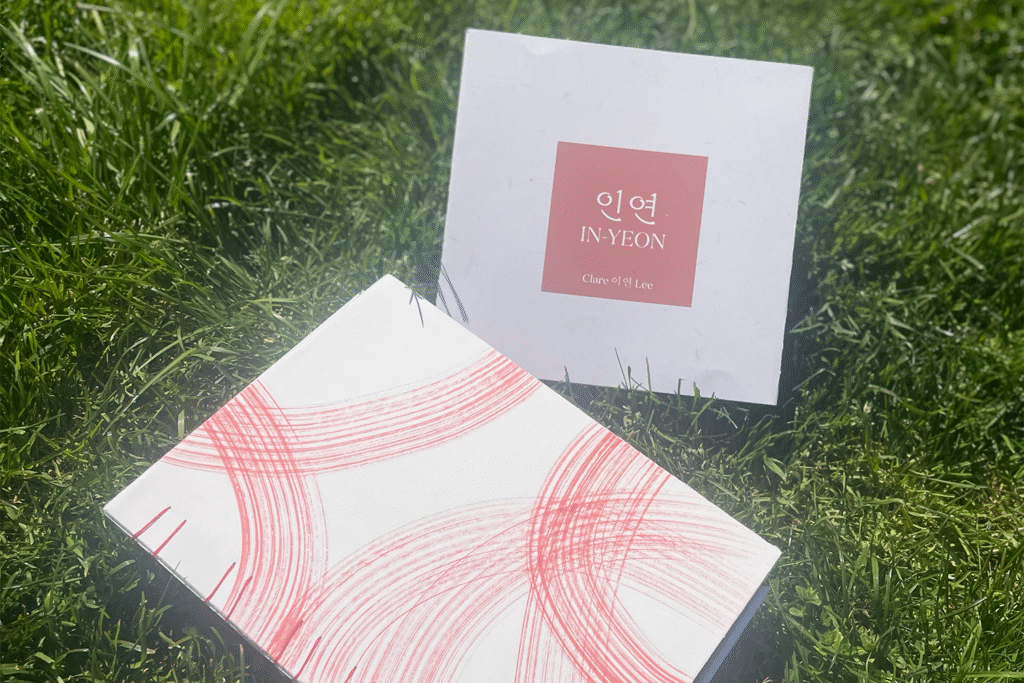
What is In-Yeon?
In-Yeon describes a type of connection between people. It’s deeper than connection and has a fate-like quality to it. Through my archives, I want to uncover the In-yeon that ties my family together; how our stories and experiences intertwine and overlap. With the uncovering of familial sentiments, I have discovered how our letter writing practice has brought my family closer together; both emotionally and physically, strengthening our In-Yeon.
Familial Archives
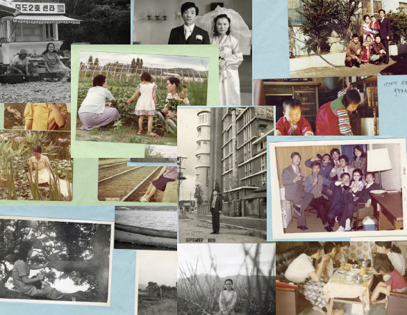
My inspiration and motivation for this project came from the extensive collection of photos and letters my family has kept through generations. From 1960’s to now, this archive the story of my family; the story of an immigrant family, the story of love and hardship. I wanted to honour the love and sacrifices my family had made to give me the life and opportunities I have now.
Writing
The writing Focusing on family stories and the In-Yeon that is connects our experiences, love and thoughts by exploring family sentiments and archives. I stared off by finding familial stories and letters that are meaningful or personally relevant through conversations with family and research. Through the process of research, I wrote out oral stories and added personal anecdotes. I kept the focus on highlighting key themes in each stories and the In-Yeon that ties each story together. The final steps included bridging the stories together.
All of my written work was translated in Korean for my family. I changed the words and some of the narration to fit the Korean language and to add more depth. The way I express certain concepts and emotions are different in Korean and is reflected in the text itself.
Publication
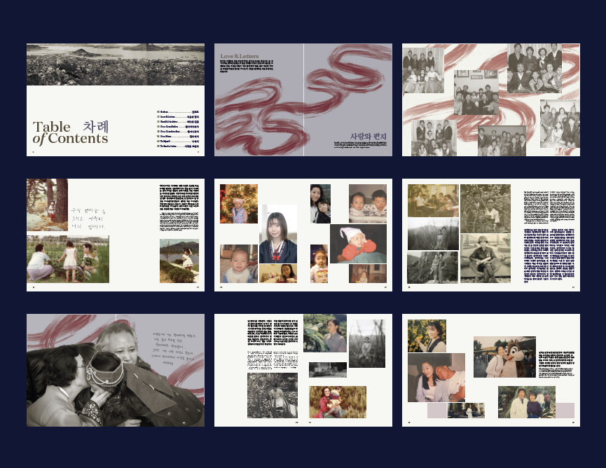
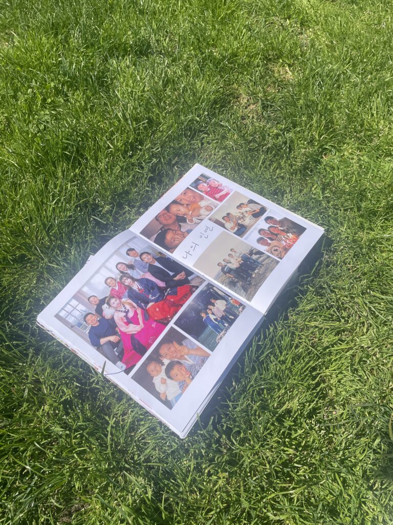
The design of the layouts were inspired by the albums that inspired the work. Photos are the main visuals with the text complimenting them. I chose images based on their importance to myself, my family and the stories they represent. Many images did not make the public version of the publication but are in my personal copy for my family.
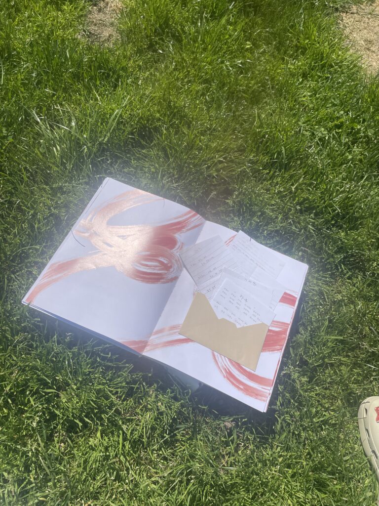
Red paint strokes serve as a visual representation of the In-Yeon that runs through the stories; they were heavily inspired by the red string of fate in many Asian folklores.
I added in the letters as physical letters to be opened from an envelope. The physicality of the letters is important as they are physical documents of the In-Yeon in my family.
Binding, Cover and Dust Jacket
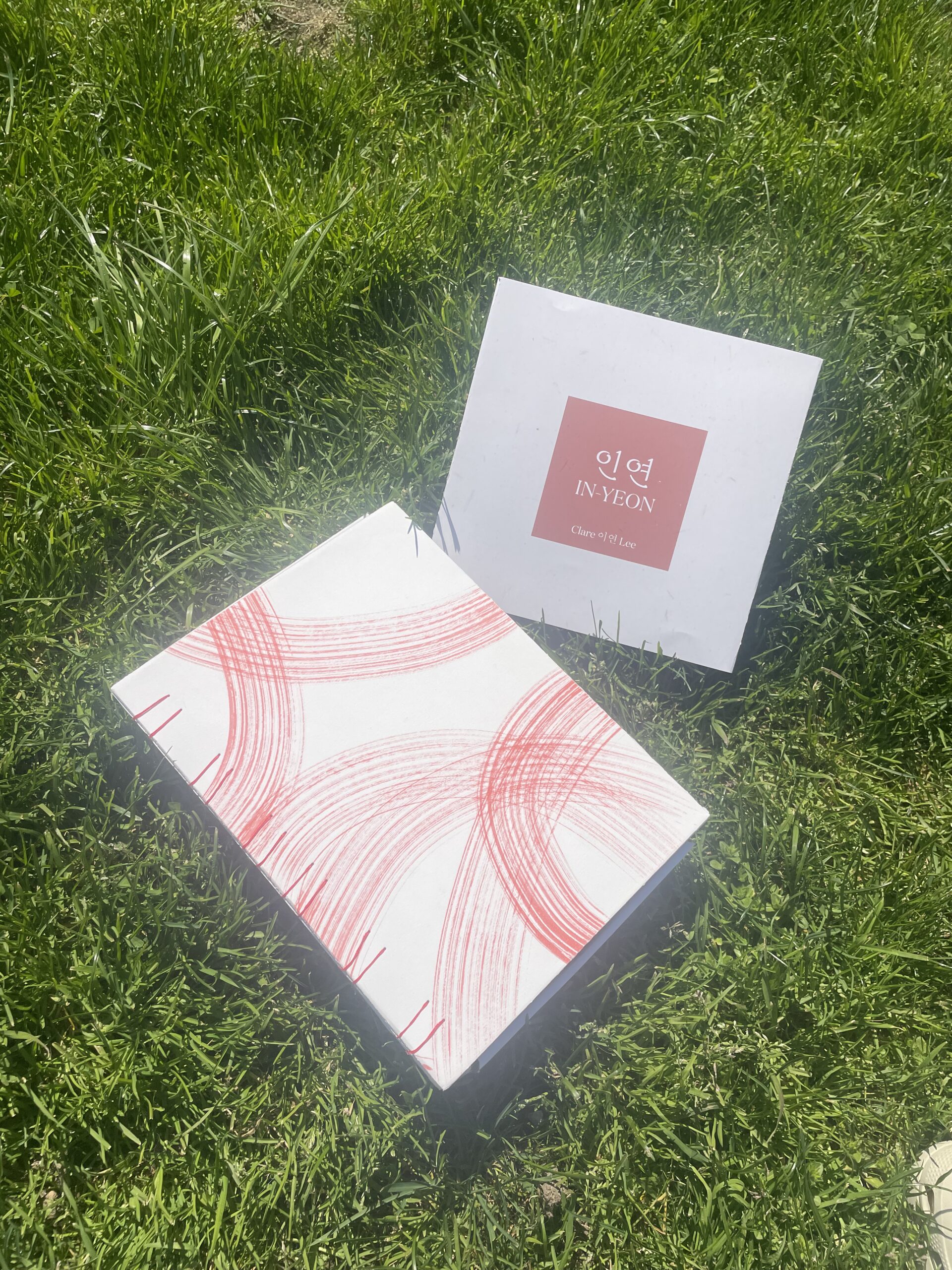
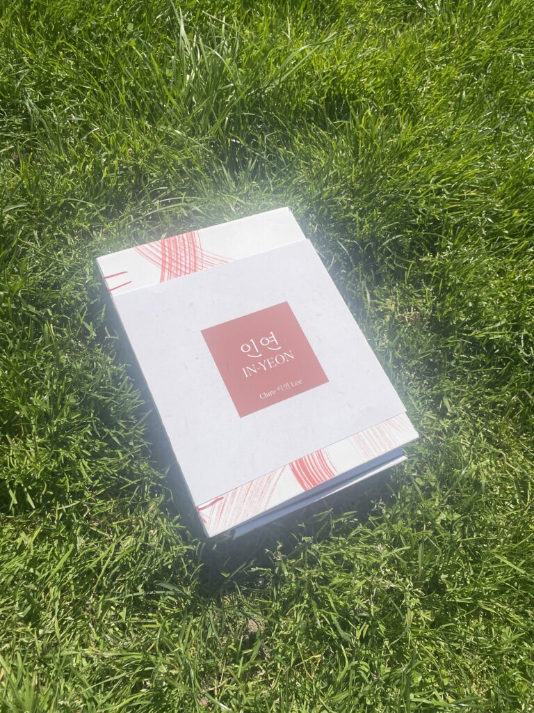
I opted for coptic binding for this project. It kept the red thread visible and was more stable while visually pleasing than other options. There’s also a glue binding for additional support and reinforcement.
The cover is red ink on Stonehenge paper. The intent was to replicate the brushstrokes inside the publication. I wanted to keep the actual cover simple with a pattern instead of a typographic cover to create a similar look to the albums that serve as the inspiration.
The dust jacket contains all the information that would originally be found on the cover; title and name. I kept it minimal with a red square to compliment the red throughout the project and a textured off-white/tan color similar to the color of pages.