Concepts for Better Transit Wayfinding
Jordan Beaumont
See it On Campus: Level 2
Project Overview: More Than Just Getting Around
This project really started from a simple place: a love for transit and a desire to make it better for everyone. Public transport, to me, isn’t just about moving people; it represents some of the best ideals I hope for in the world. It’s built *specifically* to benefit all people, a shared space where paths cross daily. It’s equalizing, practical, and carries a history of people trying to make the world better for each other.
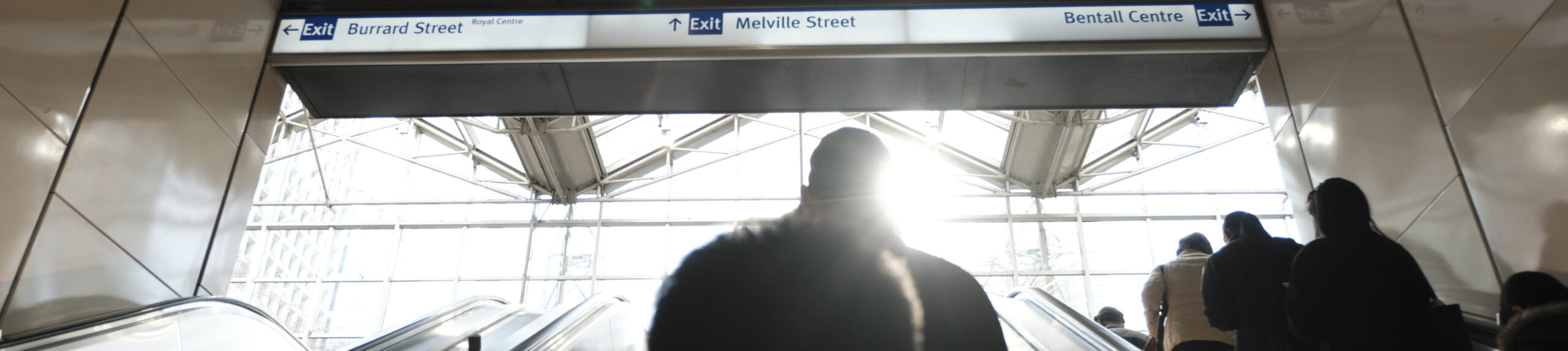
Did you know the average Canadian transit user spends over 40 minutes on transit *each way*, every day? That’s a significant chunk of life! This time commitment highlights how crucial the transit experience is and how much it shapes our perception of a city.

Initially, I approached this thinking about Translink’s “brand.” I felt frustrated that it wasn’t quite connecting with users, that the identity felt a bit weak. But I quickly realized I was falling into the same trap – focusing on the *brand* instead of the core function. After a key conversation with my instructor, it clicked: the focus needed to be on **wayfinding**. How do people actually *find their way*? The identity, the “brand,” should emerge naturally from a system that excels at helping people navigate.
Discovery: Learning from the World and the System
Looking at What We Have
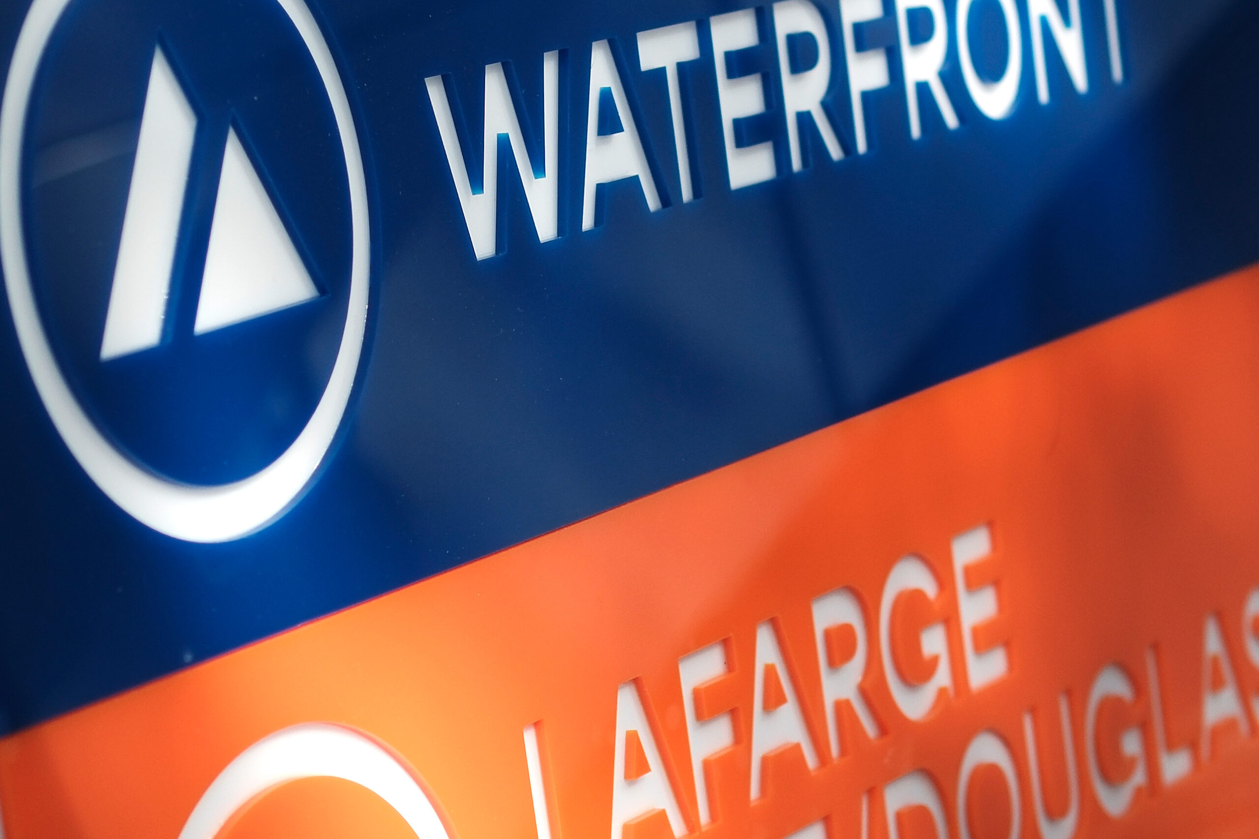
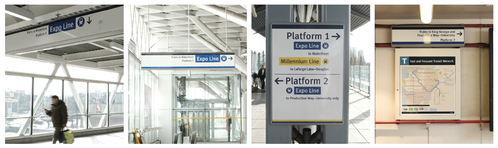
To understand the challenge, I spent time in some of Translink’s busiest stations, like Waterfront and Lougheed Town Centre. I captured photos of areas where the current system felt like it could be improved. What I observed was often a heavy reliance on text, sometimes confusing information hierarchy (why is the platform number bigger than the destination?), and signage placement that didn’t always feel optimal for high-traffic areas. That tiny blue sign in a packed walkway? It felt like a missed opportunity.
 Guidance from “Wayshowing”
A huge influence came from the book “Wayshowing,” recommended by Bonne Zabolotney. It offered incredible insights into how we mentally process navigation. One key concept was the “hierarchy” of place – we understand locations from broad (like “Lower Mainland”) down to specific (like a particular station or address). Effective wayfinding needs to respect this mental hierarchy.

Another vital idea was the “cognitive map” – our internal mental representation of an environment. A good wayfinding system shouldn’t just give directions; it should help users build their *own* robust cognitive map of the transit network, making them more confident navigators over time. This inspired me to explore more iconographic approaches. The book also outlined various strategies people use to navigate, like “track following,” which became a significant addition to my system.
Inspiration Everywhere
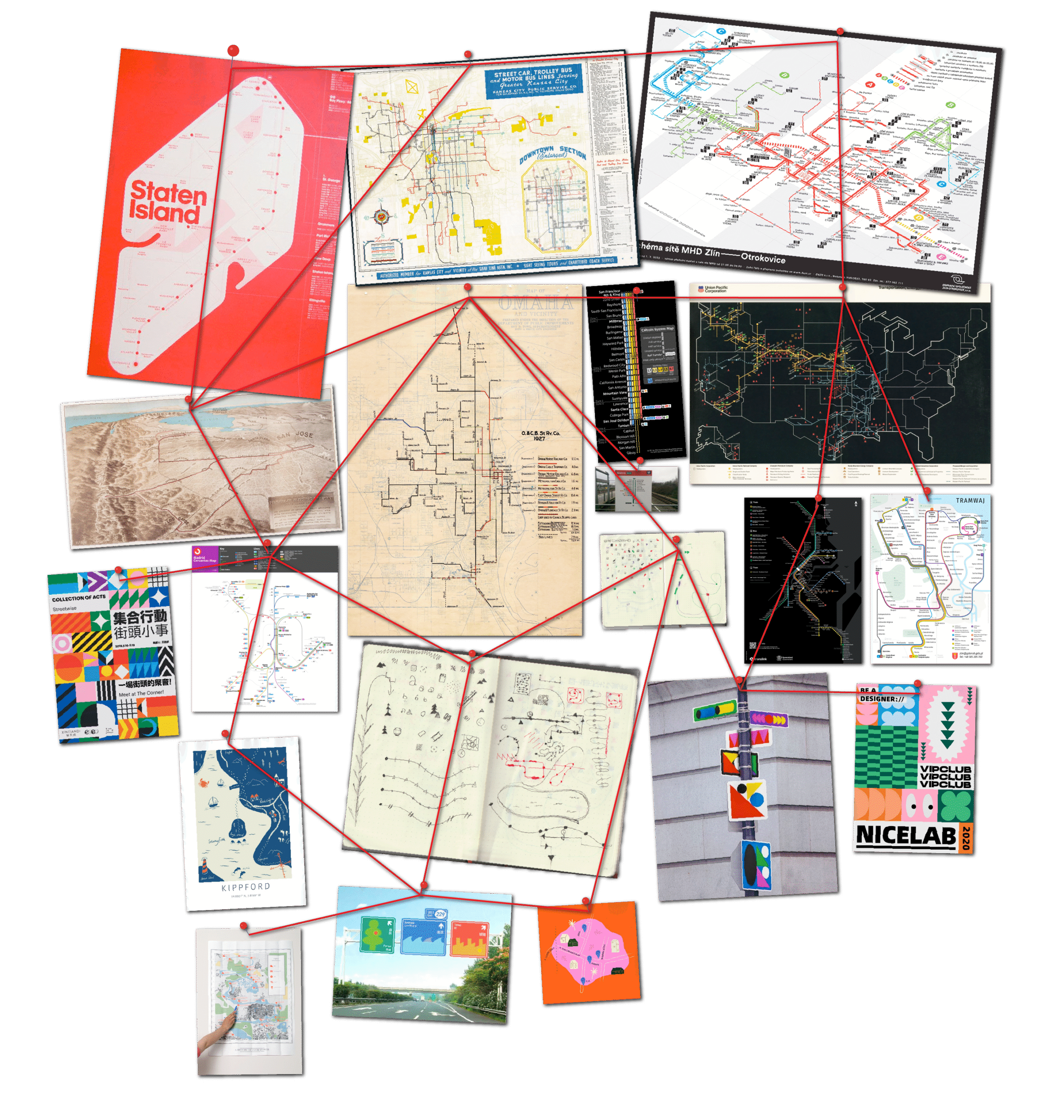
I looked beyond traditional transit design. Contemporary mapping styles, especially those that reinterpret geography rather than strictly adhering to it, caught my eye. I played with grid systems to bring consistency to angles and scaling, aiming for better readability. I also drew inspiration from art and design using patterns and textures, wondering how these could imbue transit spaces with more personality. And importantly, the clever use of object-based icons at Schipol Airport (using things like seagulls or wooden shoes for parking zones) made me reconsider how icons could function – not just as abstract symbols, but as memorable, tangible identifiers.
How My Approach Differs: Service First, Brand Second
So, what makes this proposed system different? It fundamentally shifts the priority. Traditional transit identities sometimes feel like they’re trying to build a corporate “brand.” My approach argues that for a public service like transit, the primary goal isn’t brand recognition in a competitive sense – it’s **service delivery**. Its job is simply to help people get from A to B, efficiently and clearly.
This philosophy led to three guiding principles for the redesign:
- Accessibility: How can we make signage more accessible, especially for non-English speakers? This naturally benefits everyone by offering multiple ways to understand information (colour, icon, shape, placement).
- Efficiency: How can we decrease the time users spend trying to figure out relevant travel info, particularly in busy areas?
- Experience: Can we make using transit more pleasant, maybe even a little fun? (Okay, this one’s subjective, but important!)
Instead of relying heavily on text like the current system, my approach integrates multiple layers of communication. It uses colour more boldly, introduces unique pictograms, utilizes environmental clues like floor markings, and adopts a more direct, human communication style. The “brand” becomes recognizable through this consistent design language, not necessarily through a traditional logo plastered everywhere.
What Exactly *Is* a Wayfinding System?
It’s easy to think of wayfinding as just “signs.” But it’s so much more than that. At its heart…
It’s a wayfinding system.
A wayfinding system is the complete set of cues and tools that help people orient themselves in physical space and navigate from place to place. This includes signs, yes, but also maps, colours, architectural features, lighting, landmarks, floor markings, and even audible information. It’s about understanding the environment, anticipating user needs, and providing the right information, in the right place, at the right time.
For transit, this means designing a system that considers that hierarchy of place we talked about – helping someone understand if they need information about the whole network, a specific line, the next station, or just which side of the platform to stand on. It’s about empowering users to build that cognitive map, making them feel confident and reducing the stress often associated with navigating unfamiliar environments. The identity *is* the clarity and usability of the wayfinding.
The Four Core Elements of My System
Based on the research and goals, my proposed wayfinding system is built on four interconnected elements:
1. Colour Relationships
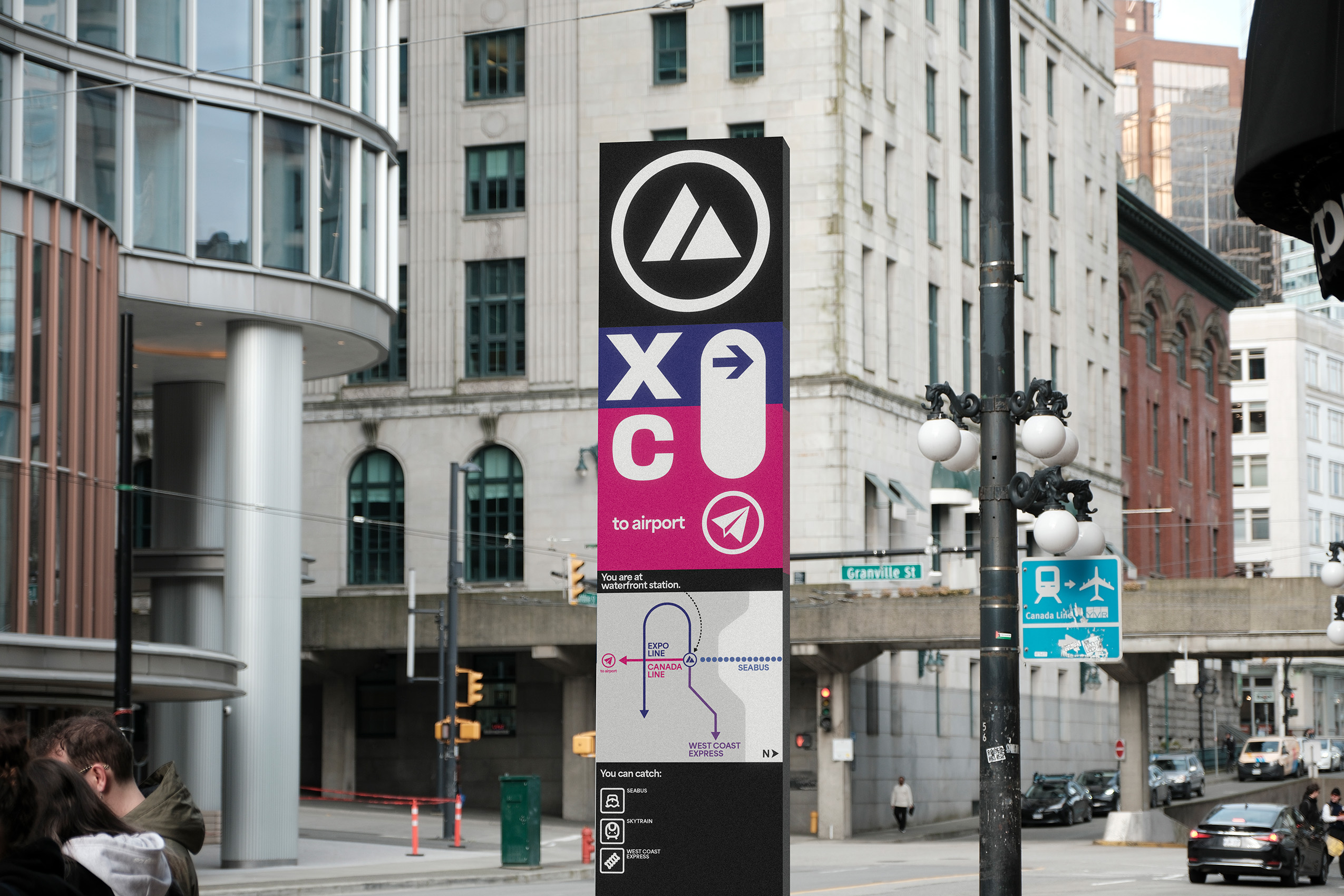
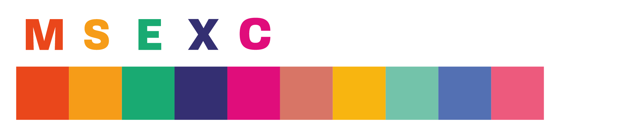
Colour is a powerful, immediate identifier. I tweaked the existing line colours to be brighter and louder, adding secondary shades for flexibility in different contexts (like dark text on a light background or vice-versa). Most importantly, each line gets a distinct letter-symbol (M, S, E, X, C for Millennium, Surrey Extension, Evergreen Extension, Expo, Canada Line) used alongside its colour. This creates a strong visual shorthand, reducing reliance on reading the full line name. Colour is used boldly on signs and environmental elements to clearly distinguish lines and directions, especially at transfer points.
2. Pictographs
This is one of the biggest departures. Inspired by systems like Schipol’s, I propose unique pictograms for each major station. What do they mean? It doesn’t strictly matter! Their purpose is to be memorable and quickly recognizable, offering a language-agnostic way to identify locations. You might not remember the name “Lafarge Lake-Douglas,” but you might remember the ‘tree’ icon. This aids recall and helps users build associations and stronger cognitive maps. They add personality and can even become navigational landmarks in themselves.
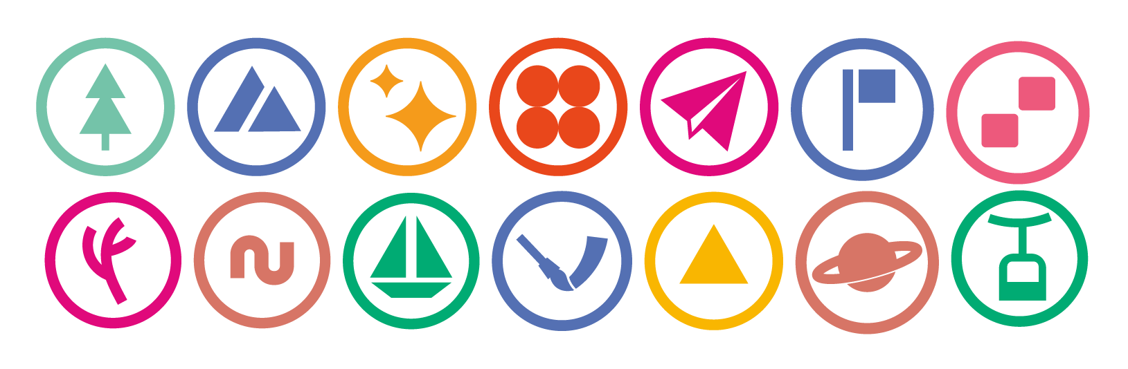
3. Environmental Clues
Wayfinding shouldn’t be confined to signs hanging overhead. I incorporated “track following” concepts using floor markings. Coloured lines with directional arrows guide users along platforms or through transfer points – you can understand where to go even if you’re looking down at your phone. Patterns derived from the pictograms could be used on columns or walls, reinforcing location identity subtly. It’s about making the entire environment part of the navigation system.
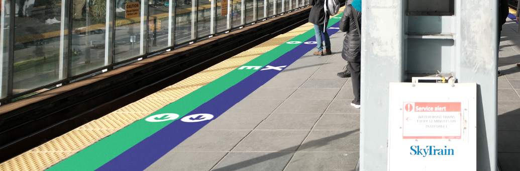
4. Communication Language & Hierarchy
How information is presented matters. I introduced different map “fidelities.” In high-traffic areas where quick decisions are needed, a low-fidelity map shows only immediate connections, oriented to the direction you’re facing. In quieter areas, a medium-fidelity map offers more network detail. The language used is more direct and human – an “active voice” like “You are at Waterfront Station” feels clearer and less institutional than just the station name. Contextual signage uses natural language, like “This side is for disembarking.” Information hierarchy is crucial; signs prioritize the most needed information (like destination and line) first.
Looking Ahead: Finding My Way
Working on this project has been an incredibly rewarding journey. Diving deep into the complexities of how people navigate, perceive space, and interact with public systems has solidified my passion for this field. It blends graphic design, user experience, psychology, and urbanism in a way I find fascinating.
Moving forward, I’m eager to continue exploring and pursuing wayfinding design. Creating systems that not only function efficiently but also enhance the human experience of moving through the world feels like meaningful work. Thank you for taking the time to explore my thesis project!