(s)kin
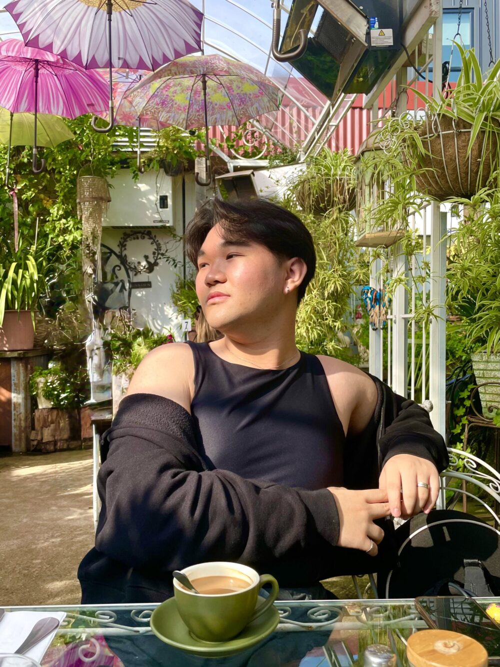
Brandon Chan
See it On Campus: Level 2
PROJECT OVERVIEW
Creating a brand and bespoke packaging through beauty as the evocation of emotion.
(s)kin is a brand and packaging system born out of my Capstone project: Thinking Outside (& Inside) The Box.
The project concept was a result of the blend of two original concepts, the first being Eye of the Beholder; a topic centred around beauty and ugliness in design. Originating as a course topic by instructor Abigail Woods from my semester abroad at the Royal Melbourne Institute of Technology, this topic encourages deeper thinking and conversations surrounding how we as designers work in this space and influence the definition of beauty according to societal norms.
This was combined with the original Thinking Outside (& Inside) The Box which was born out of hobby and interest. The original idea for this topic was more focused on exploring packaging as an experience vs. an extension of a product. A major inspiration for this topic is K-pop albums, where sales of these albums have boomed into a billion-dollar industry due to packaging and inclusions that elevate the product beyond just a CD and into an experience, taking music into a physical experience for fans across the genre.
With a heavy research-based topic and a design-based topic, I thought, “Why not combine the two?” Thus, this project was born: Thinking Outside (& Inside) The Box now aims to target two things: to facilitate the shift and the perception of packaging as not just an extension of a product, but as an experience and to offer and create a new standard of elevated packaging experiences to the middle market and the every day. Exploring beauty through the evocation of emotion serves as a contextual background with research and creation centred around people’s lived experiences and opinions.
THE BRAND
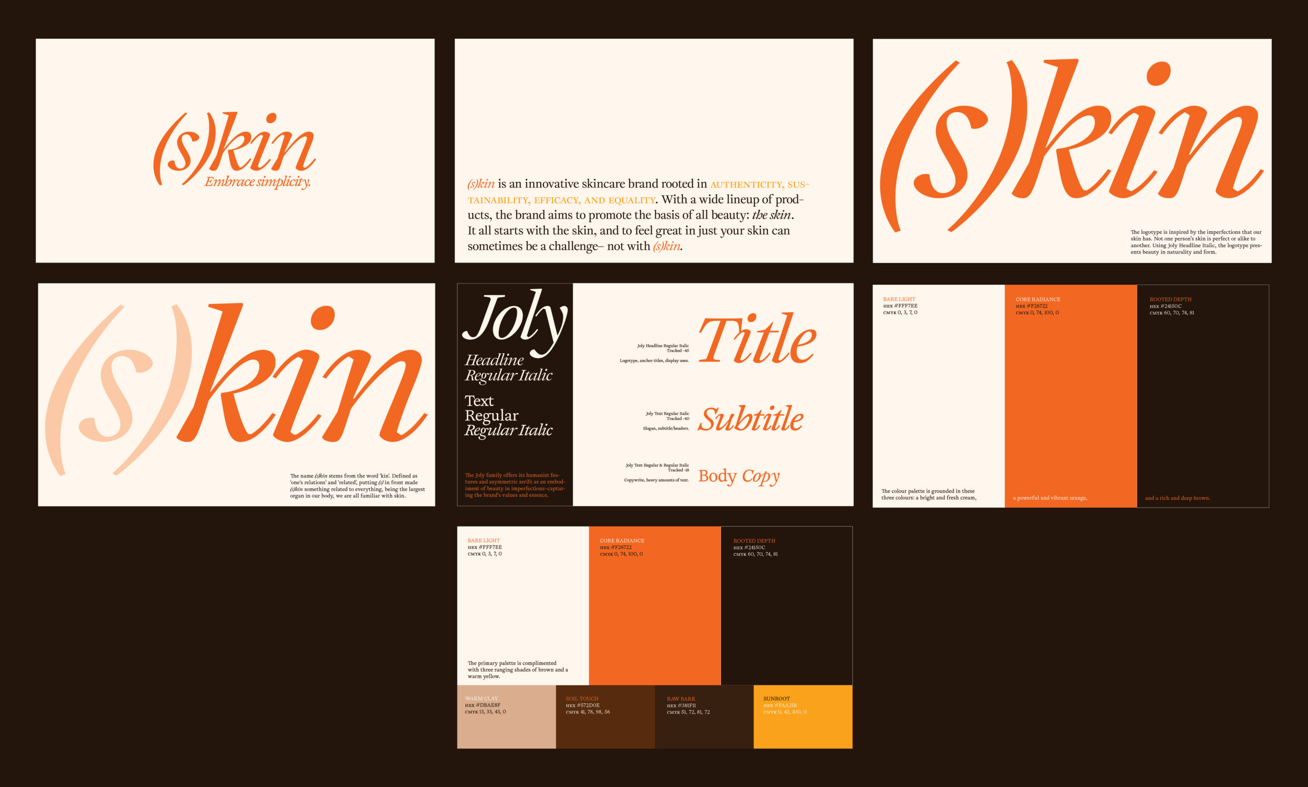
(s)kin is an innovative skincare brand rooted in authenticity, sustainability, efficacy, and equality. With a wide lineup of products, the brand aims to promote the basis of all beauty: the skin. It all starts with the skin, and to feel great in just your skin can sometimes be a challenge– not with (s)kin.
Beginning with brand values, I researched several different industry leaders and found their core values and ideas that they align with. With these in mind, I identified the four values the brand would align with: authenticity, sustainability, efficacy, and equality. From this, the name, (s)kin, was decided. Stemming from the word “kin”, it is defined as ‘one’s family and relations’ and ‘related’, putting (s) in front made (s)kin something related to everything, being the largest organ in our body, we are all familiar with skin.
Visually, the brand began to take shape in examples of natural and organic typography, deep earth tones, bright warm reds, and refreshing shades of green and white. From the beginning, I knew I wanted this brand to feel bare, stripped of ornaments, raw–something that truly felt authentic and real, to resonate with consumers and, most importantly, make it feel believable. Simplicity, warmth, and elegance are all key concepts the final branding has taken on.
The logotype is inspired by the imperfections that our skin has. Not one person’s skin is perfect or alike to another. Using Joly Headline Italic, the logotype presents beauty in naturality and form.
For typeface, the Joly family offers its humanist features and asymmetric serifs as an embodiment of beauty in imperfections–capturing the brand’s values and essence.
The colour palette is grounded in three colours: a bright and fresh cream, a powerful and vibrant orange, and a rich and deep brown. Alongside the primary palette is a secondary palette with three complimenting ranging shades of brown and a warm yellow.
THE PACKAGE
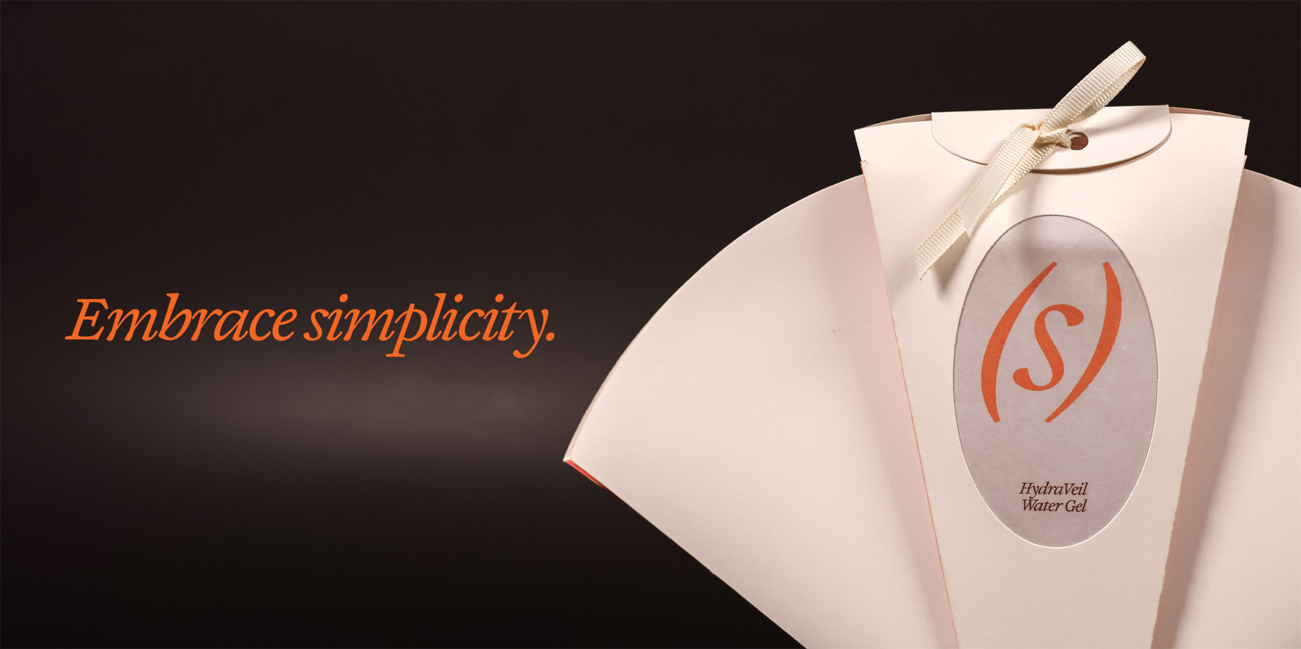
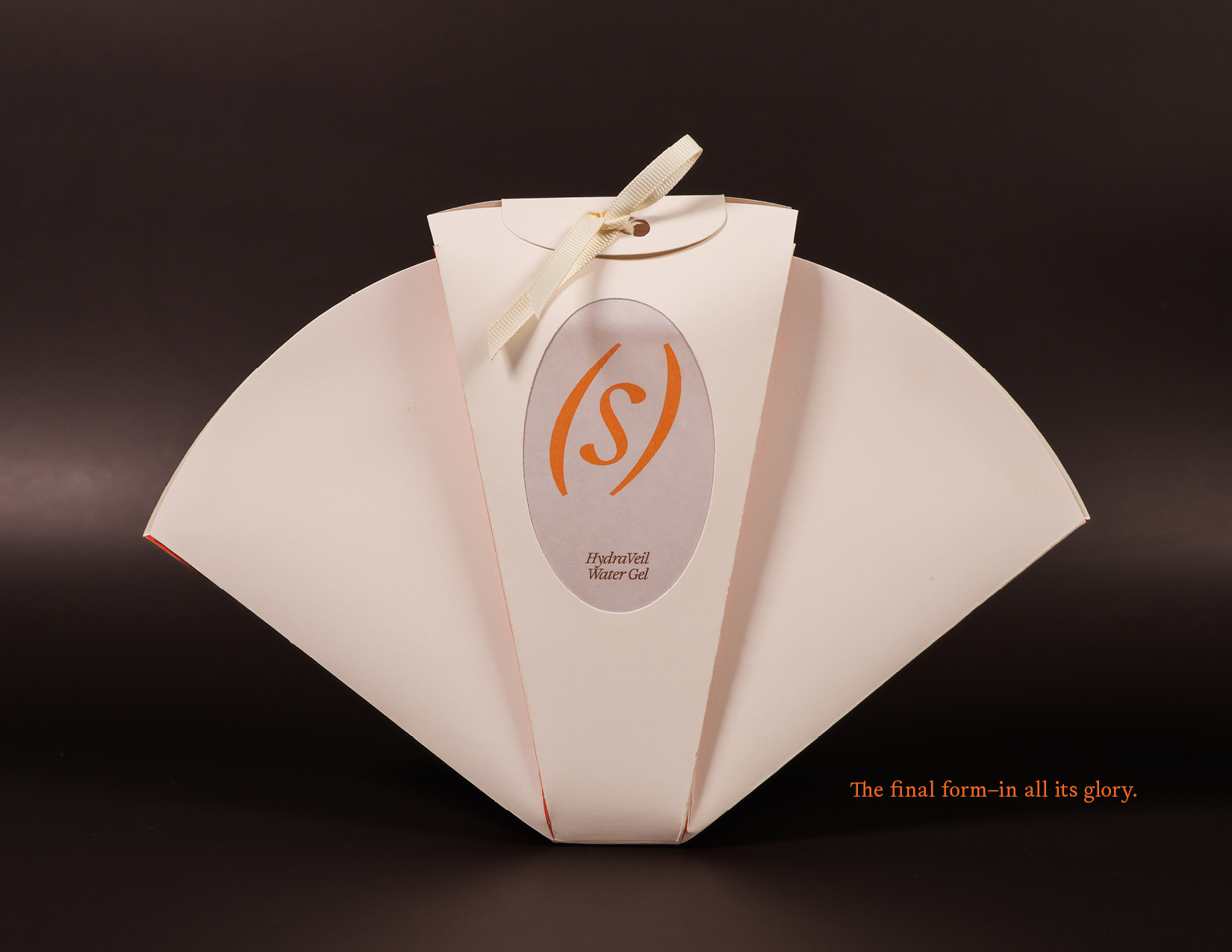
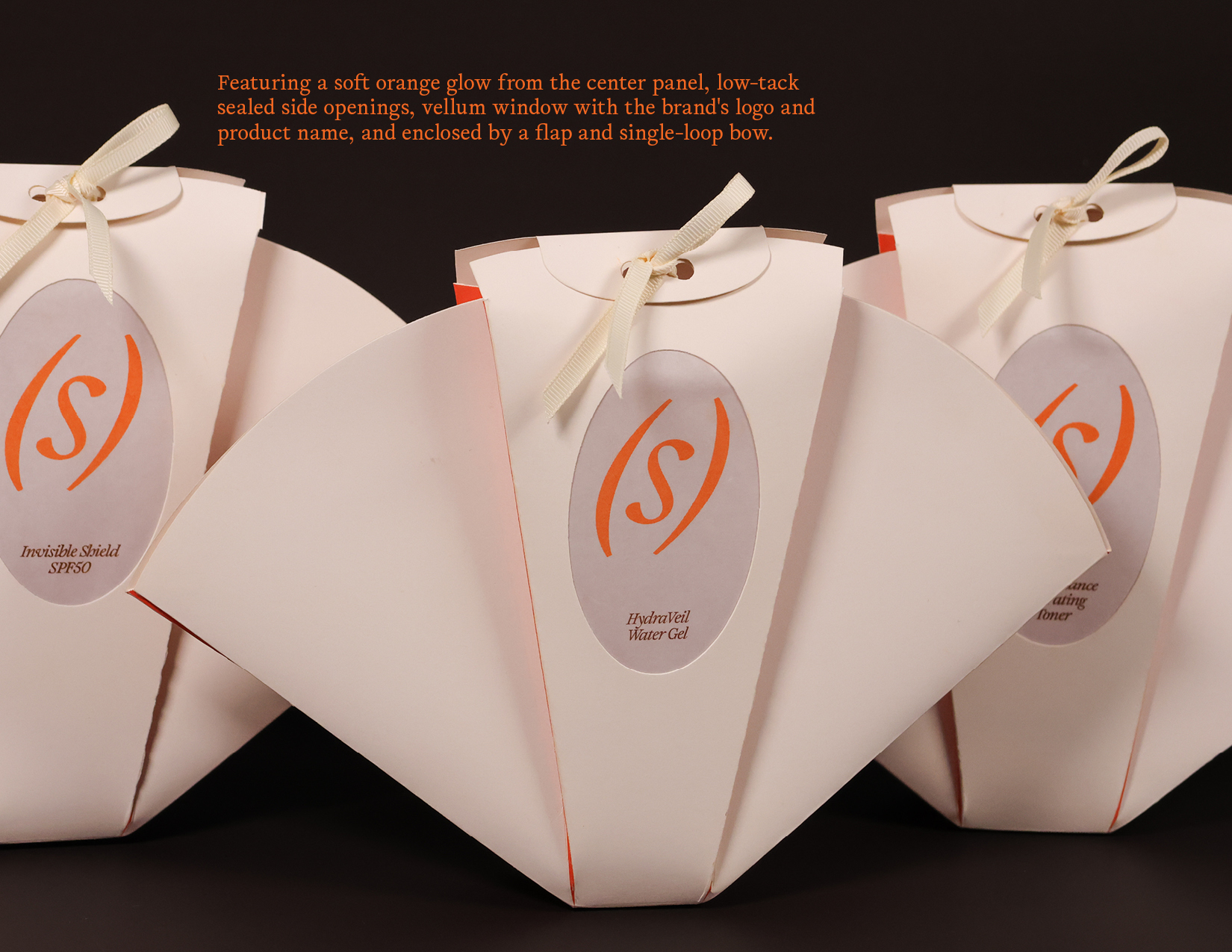
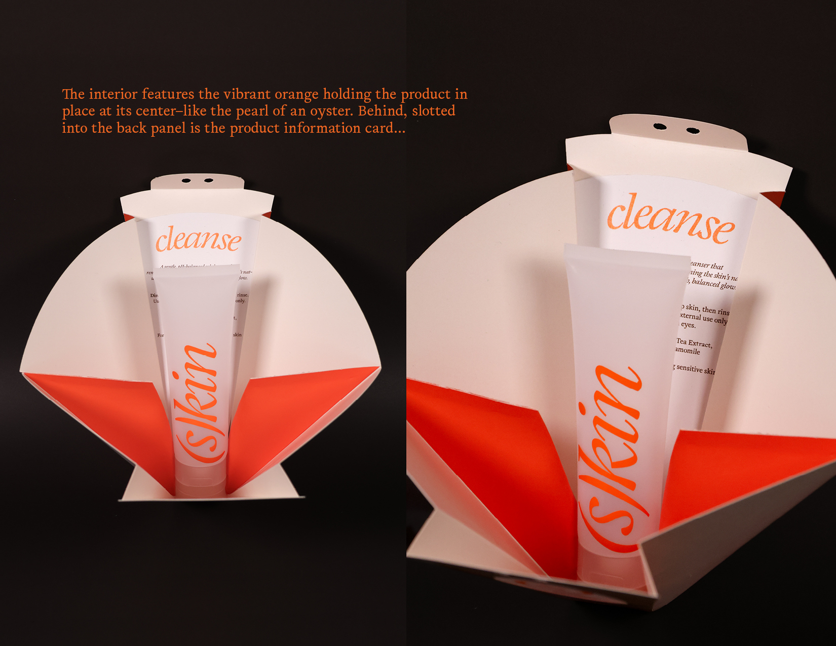
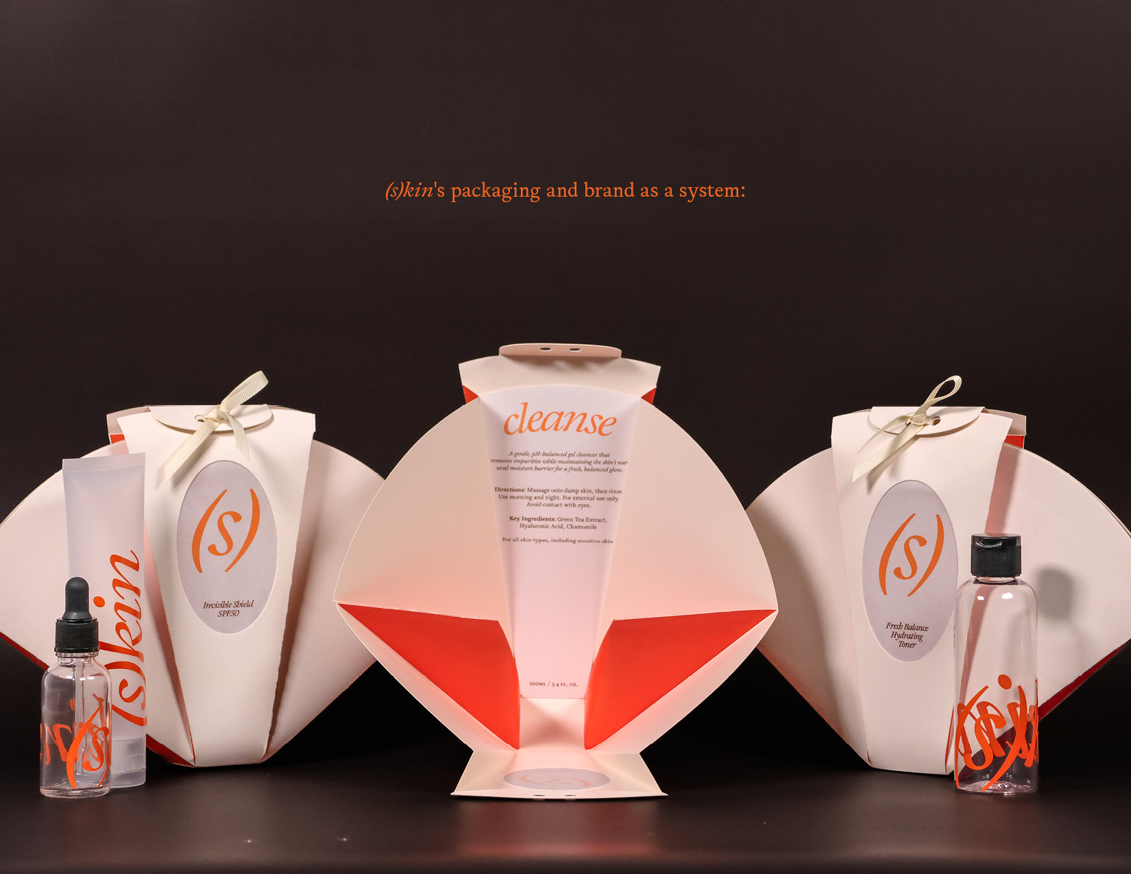
Inspired by the shape of a clamshell, (s)kin‘s packaging is a love letter to those who appreciate beautiful forms, while also providing a functional and satisfying product.
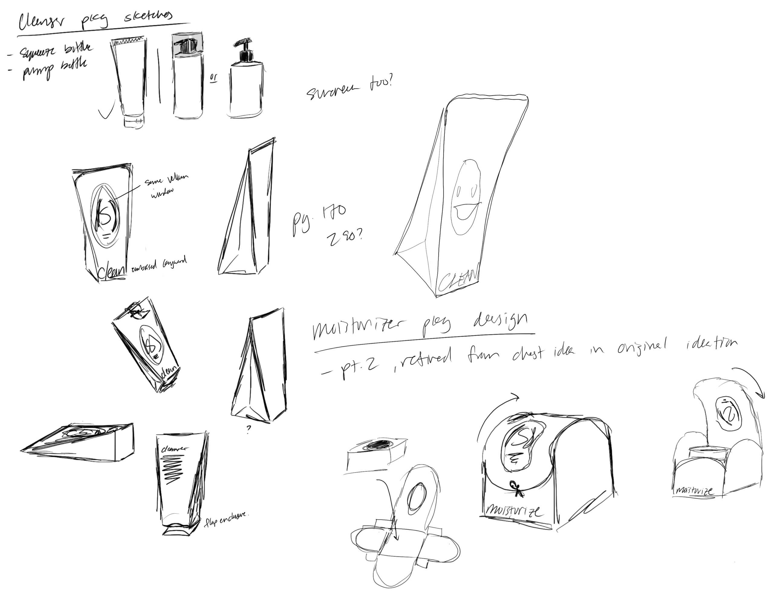
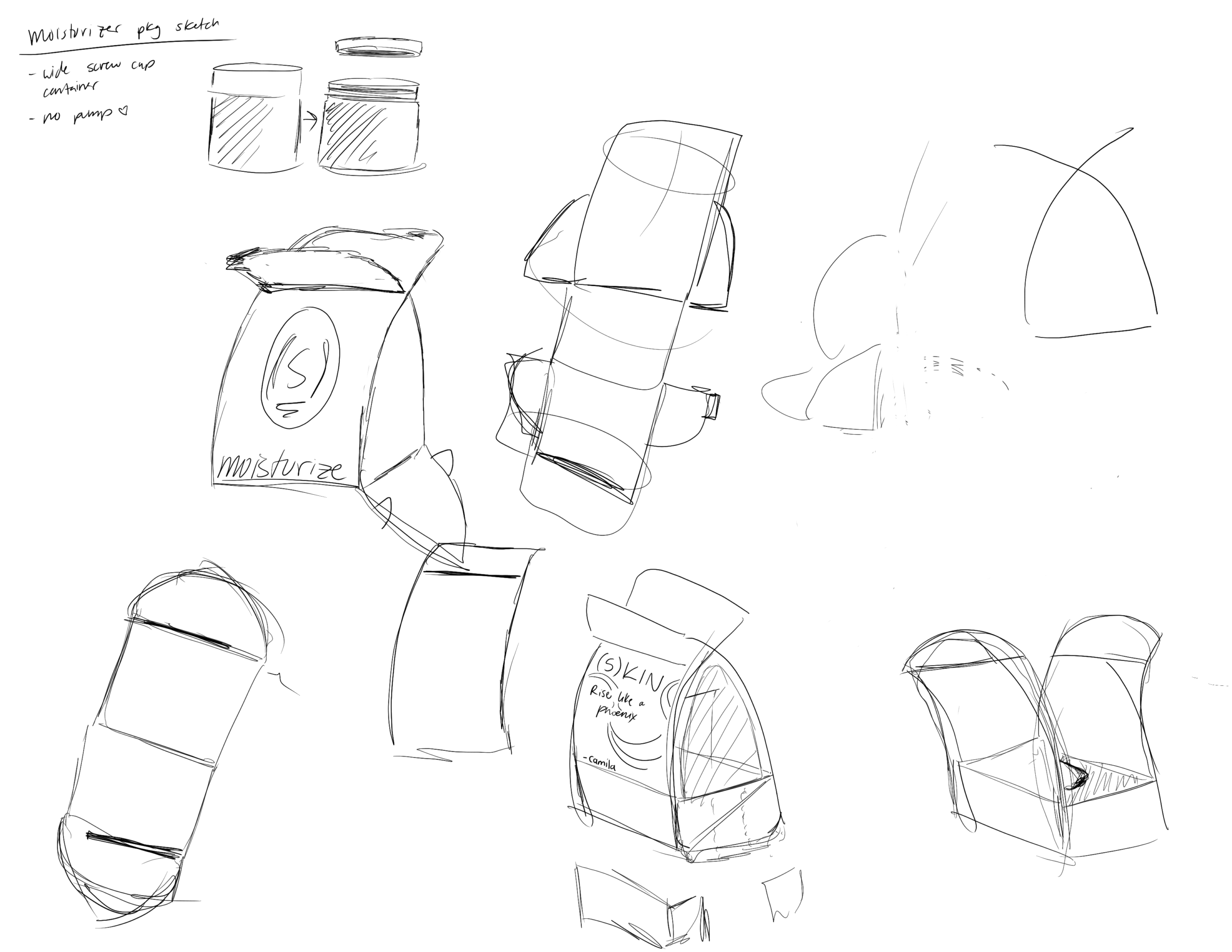
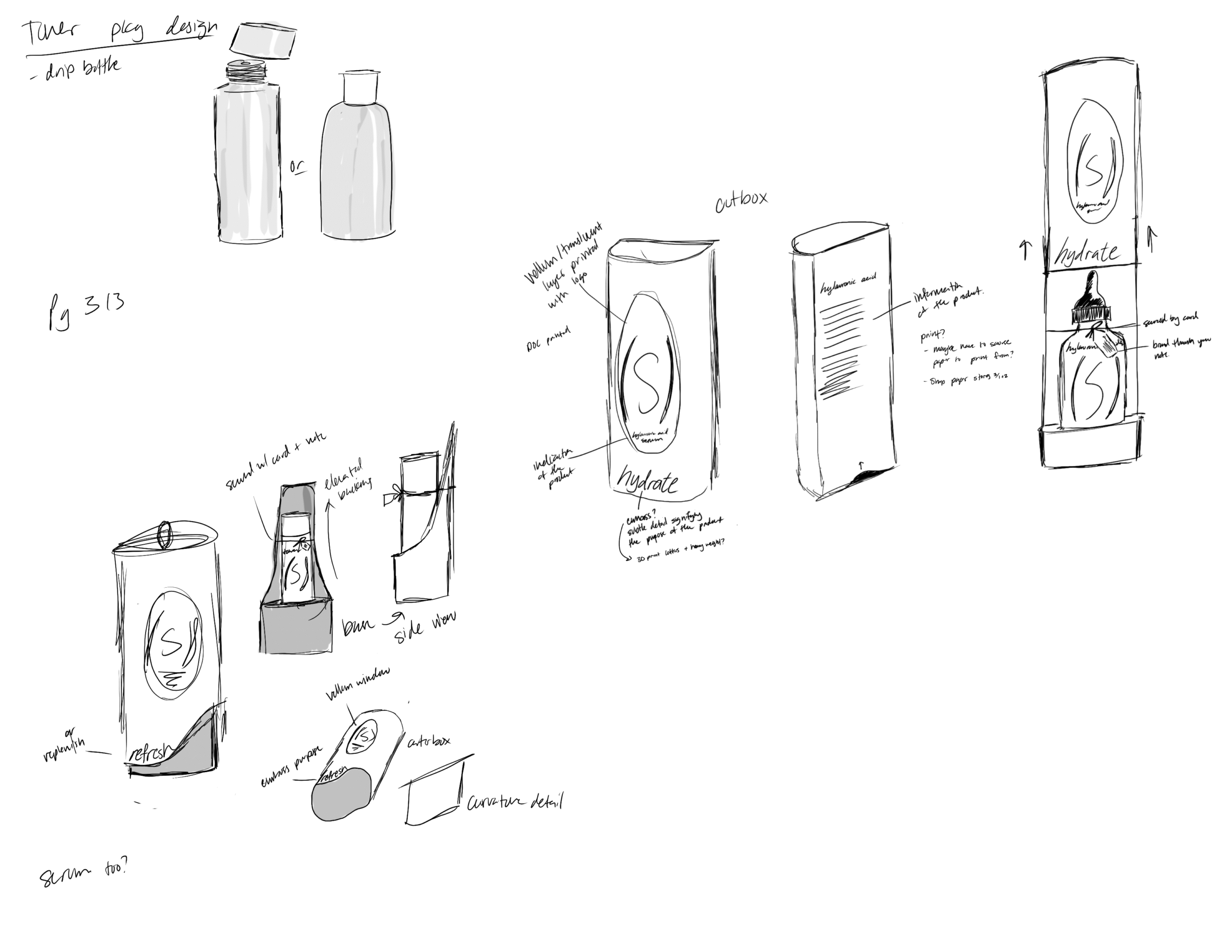
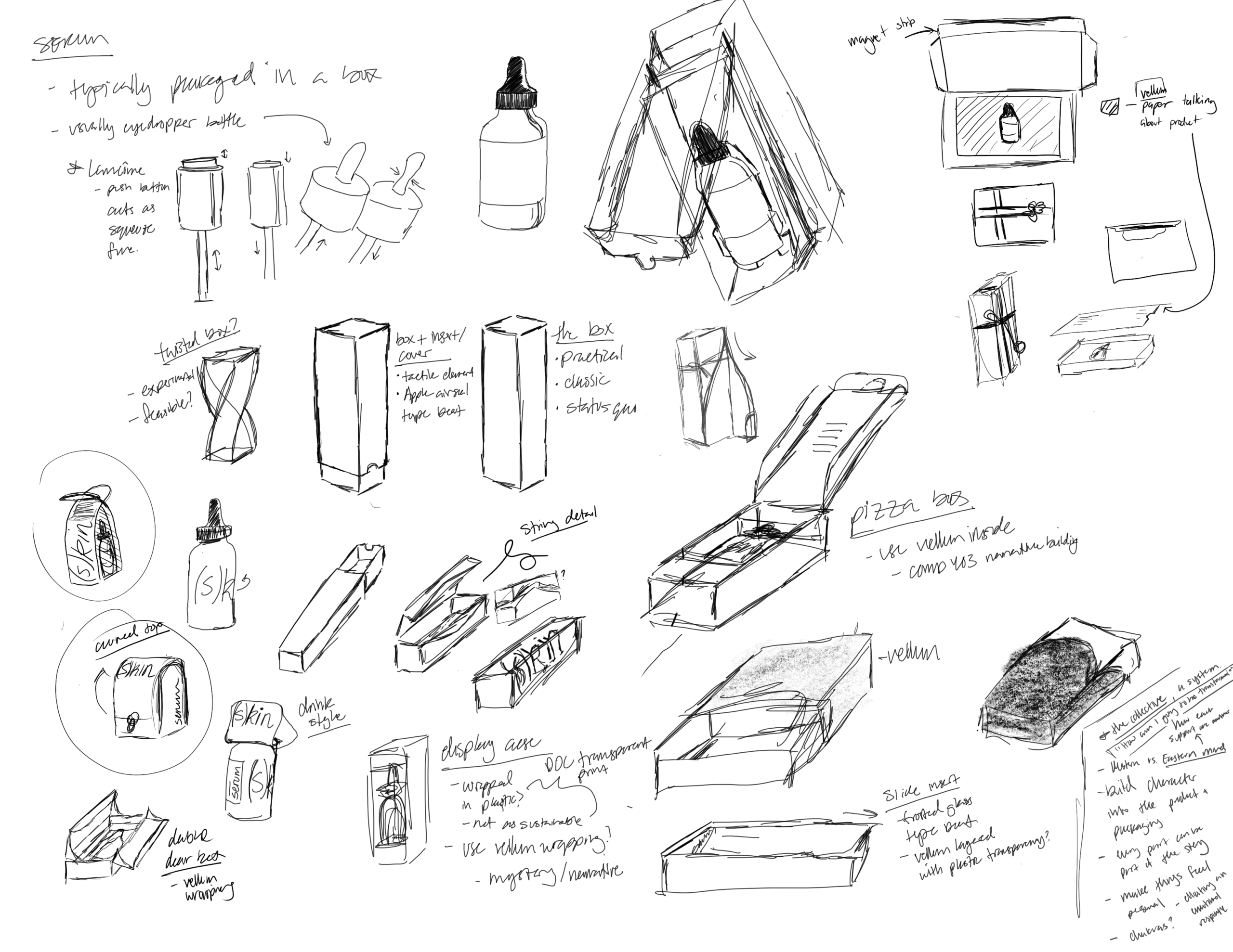
The above sketches show the development of physical designs for five packages for various skincare products: cleaner, toner, serum, moisturizer, and sunscreen. Through my sketches, some notable details I was looking to implement across all package designs include:
- An oval vellum window with the logo and product printed on.
- An organic line or curve implemented in the silhouette.
- A string or twine enclosure to secure the product.
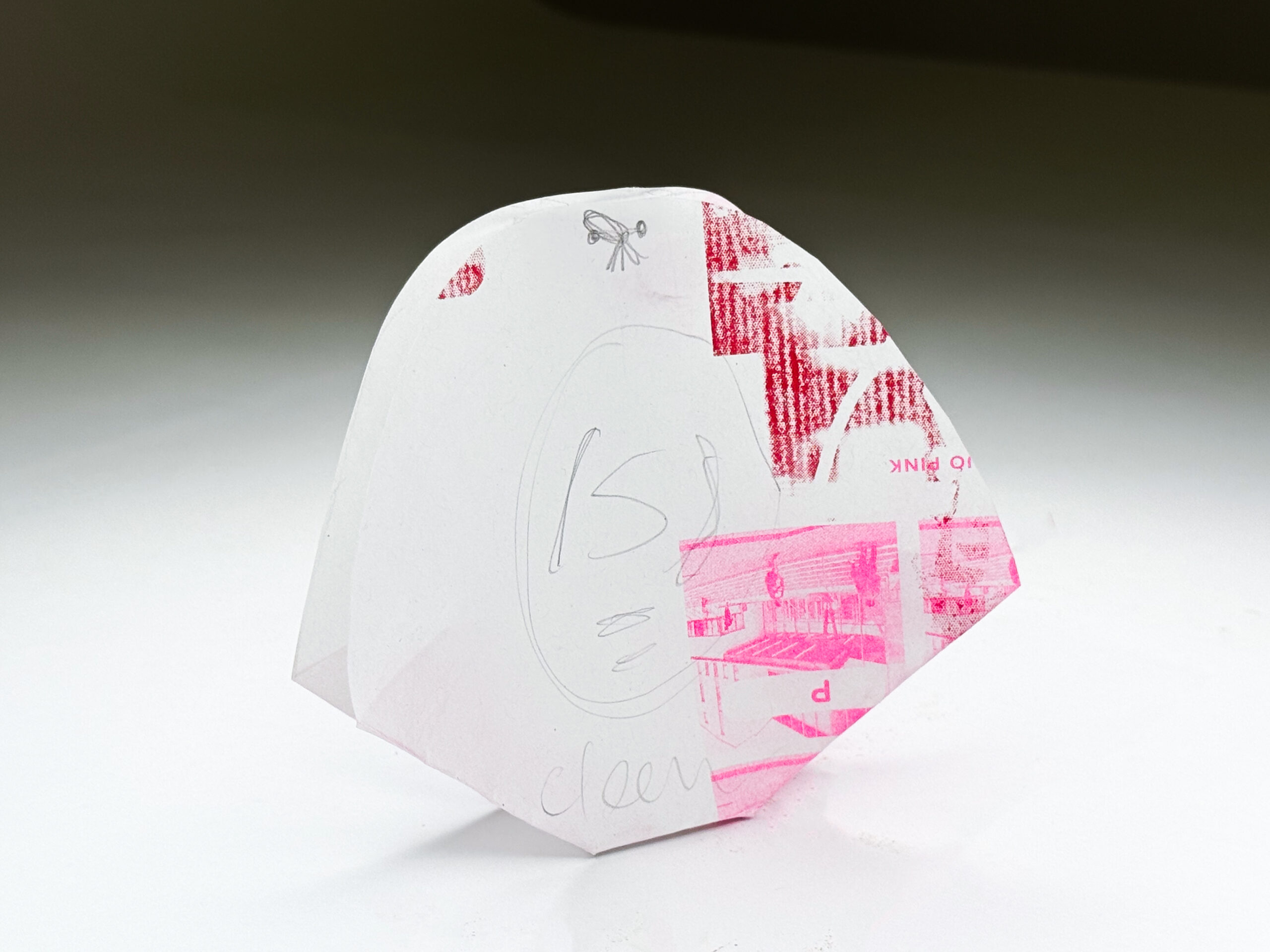
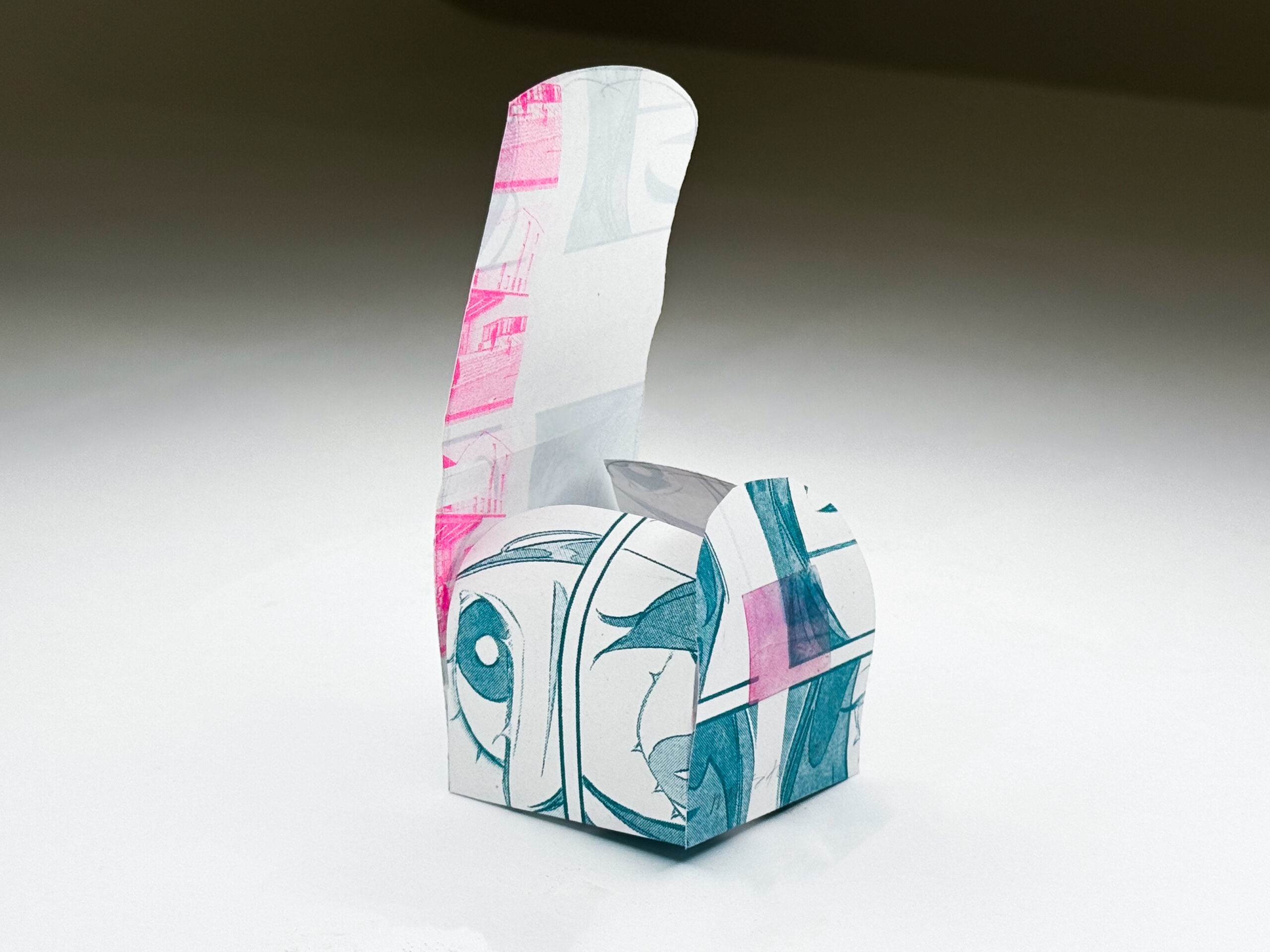
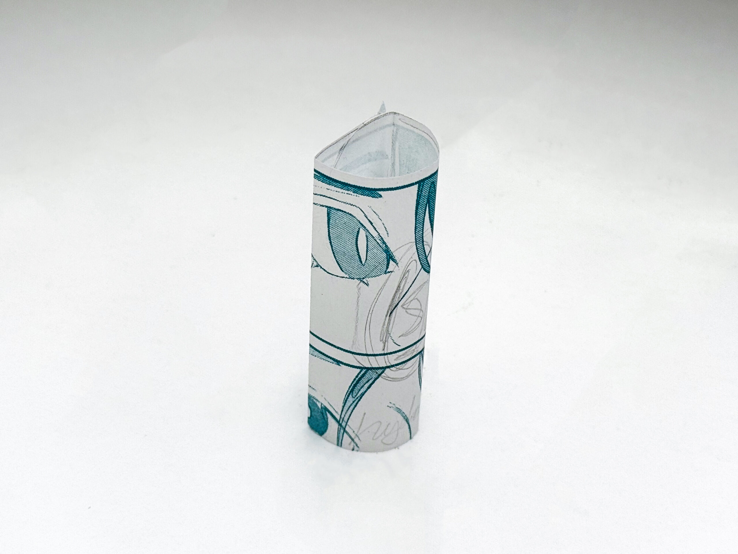
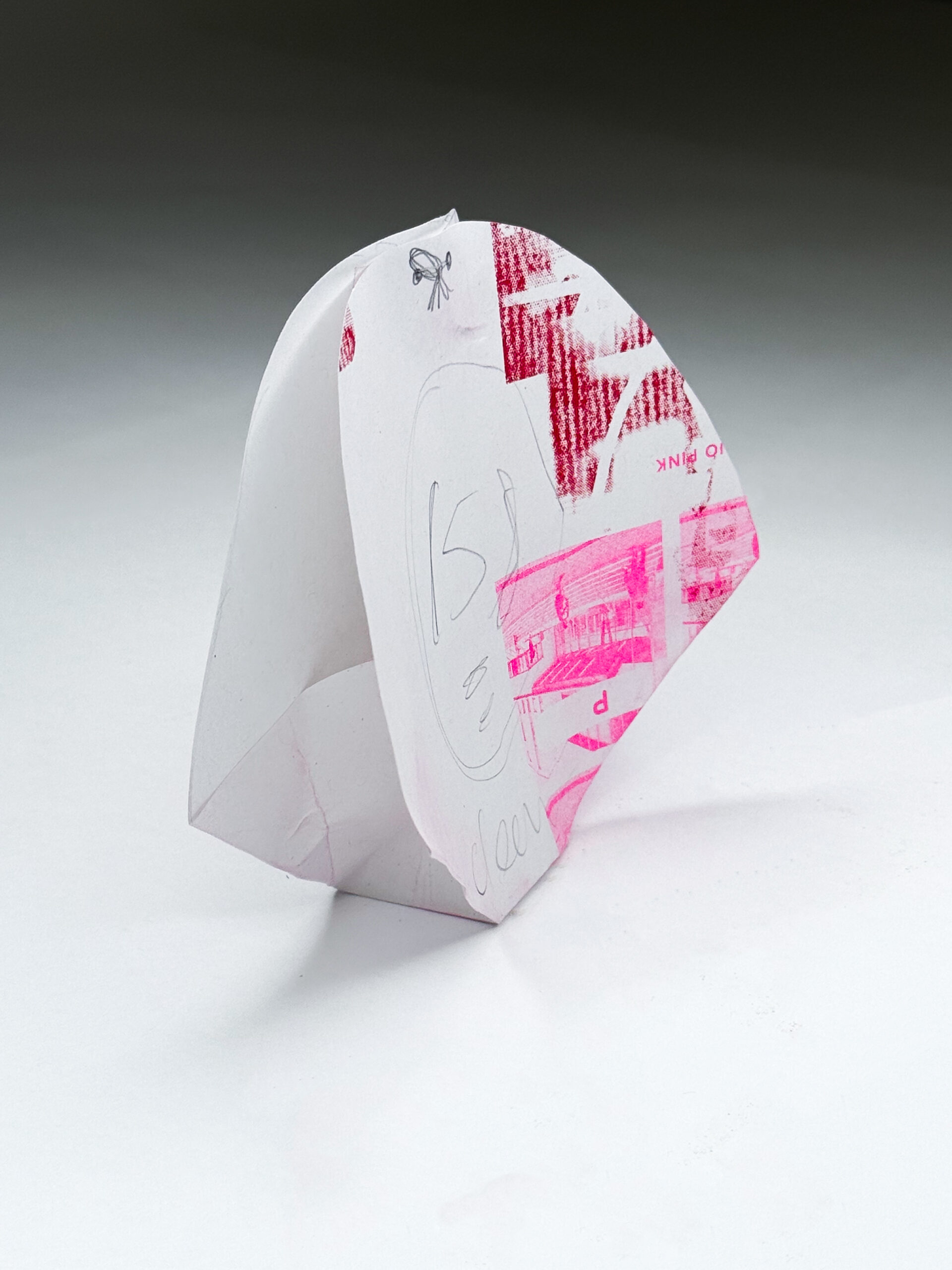
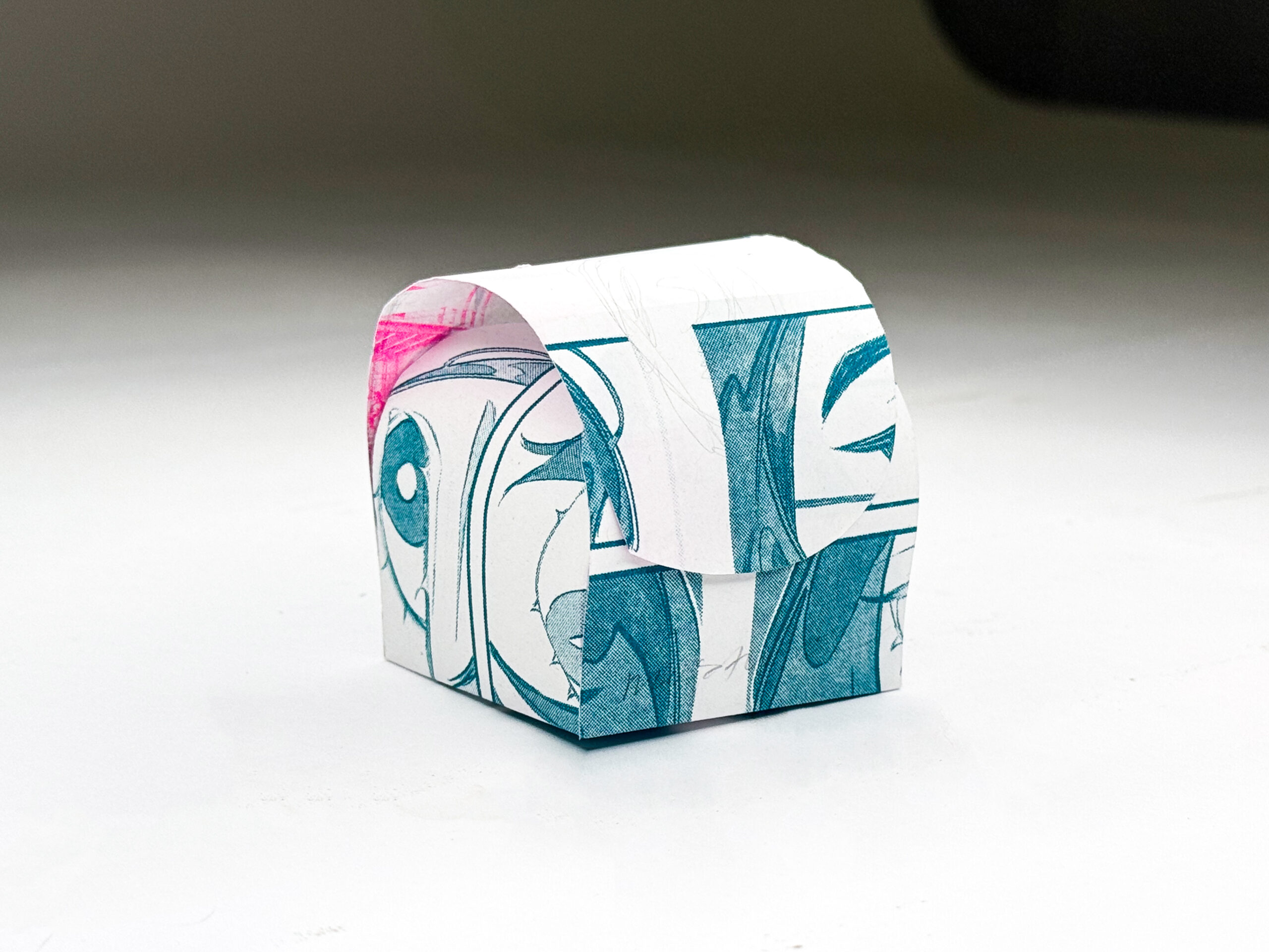
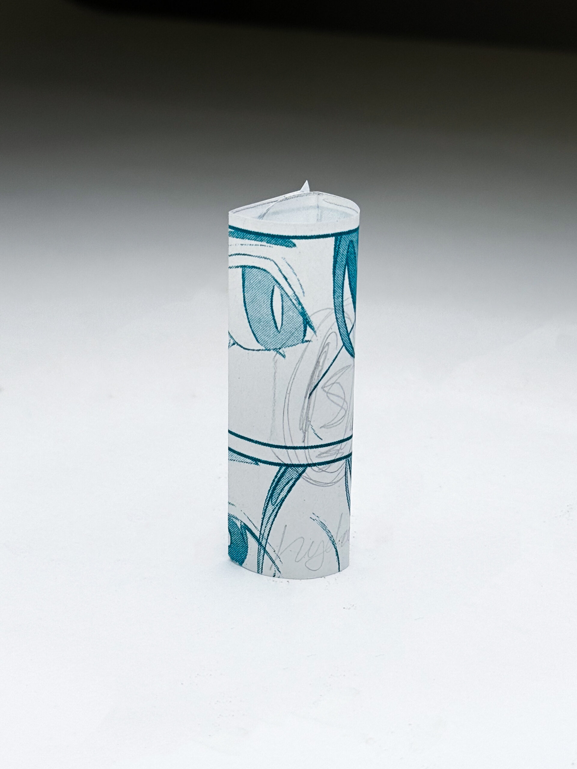
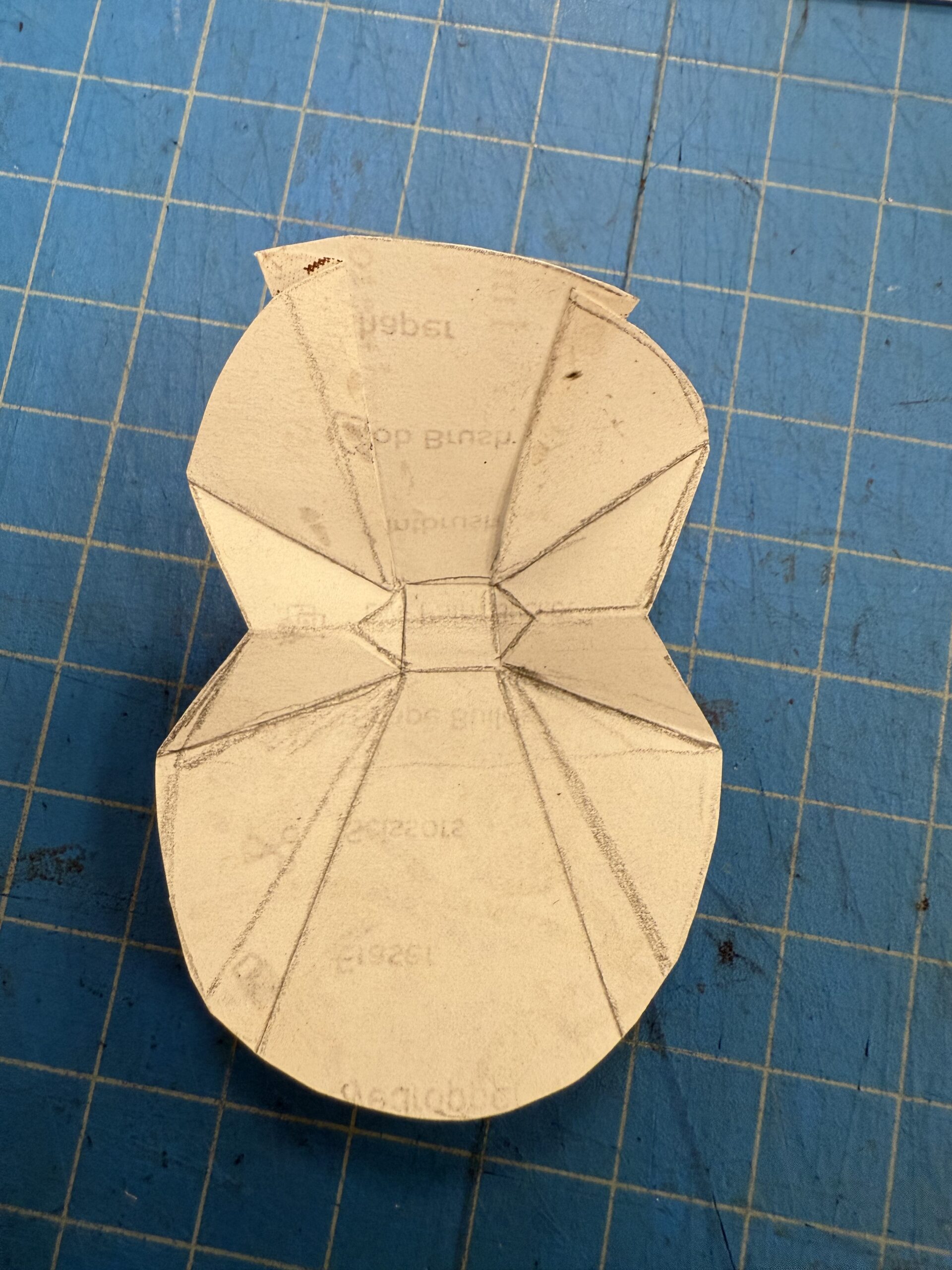
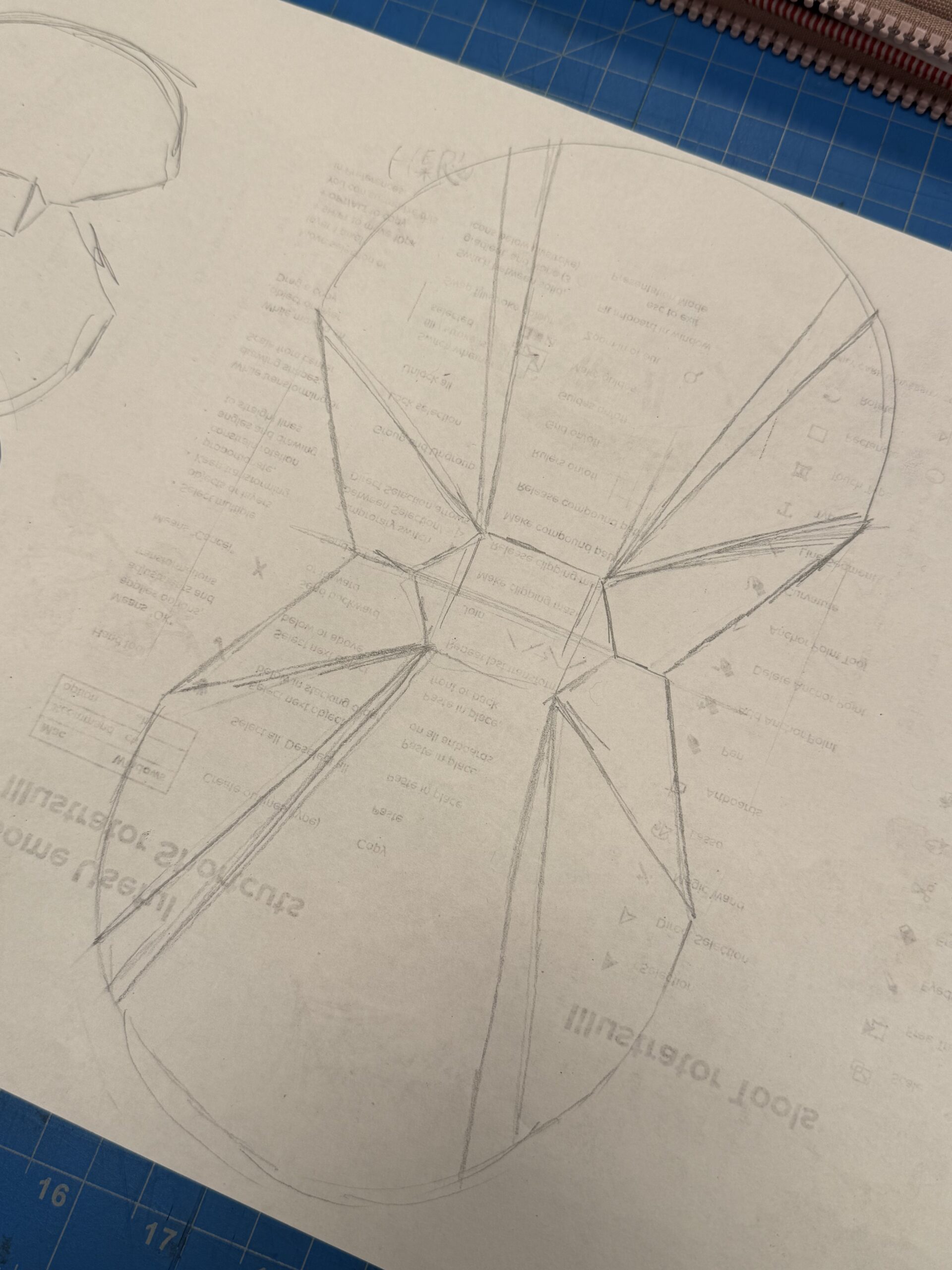
Over the majority of the semester, my time was spent prototyping, creating, returning back to the drawing board, refolding, and refining designs.
I continued to explore the clamshell form with further refinement and the decision for brand cohesion and recognition to streamline the packaging line to just take this form. My goal was to make, design, and most importantly, play, with the idea of unconventional packaging that still offered functionality and satisfaction in the opening experience of a package as well as extending the brand into a physical space.
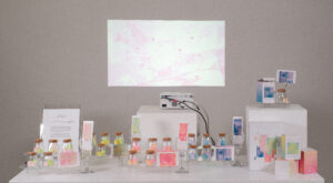
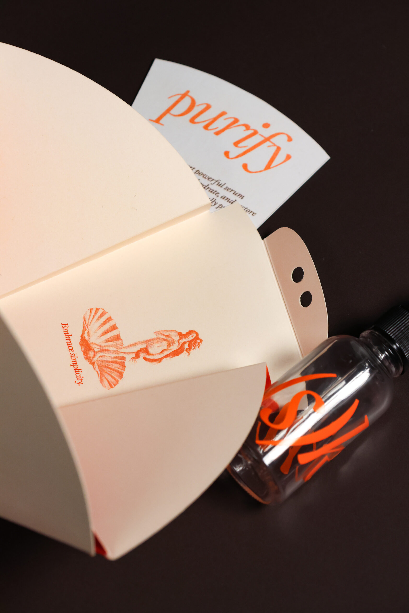
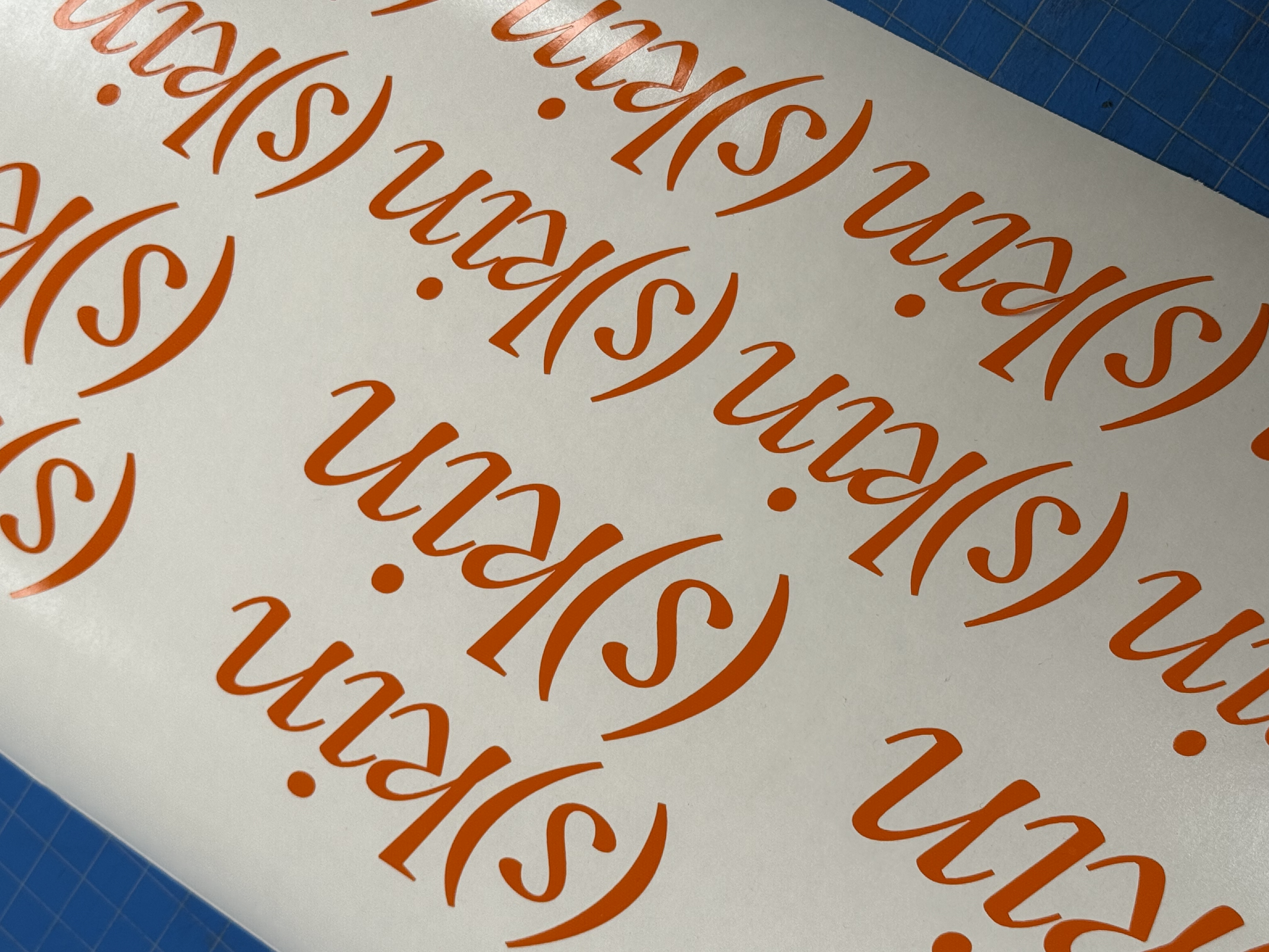
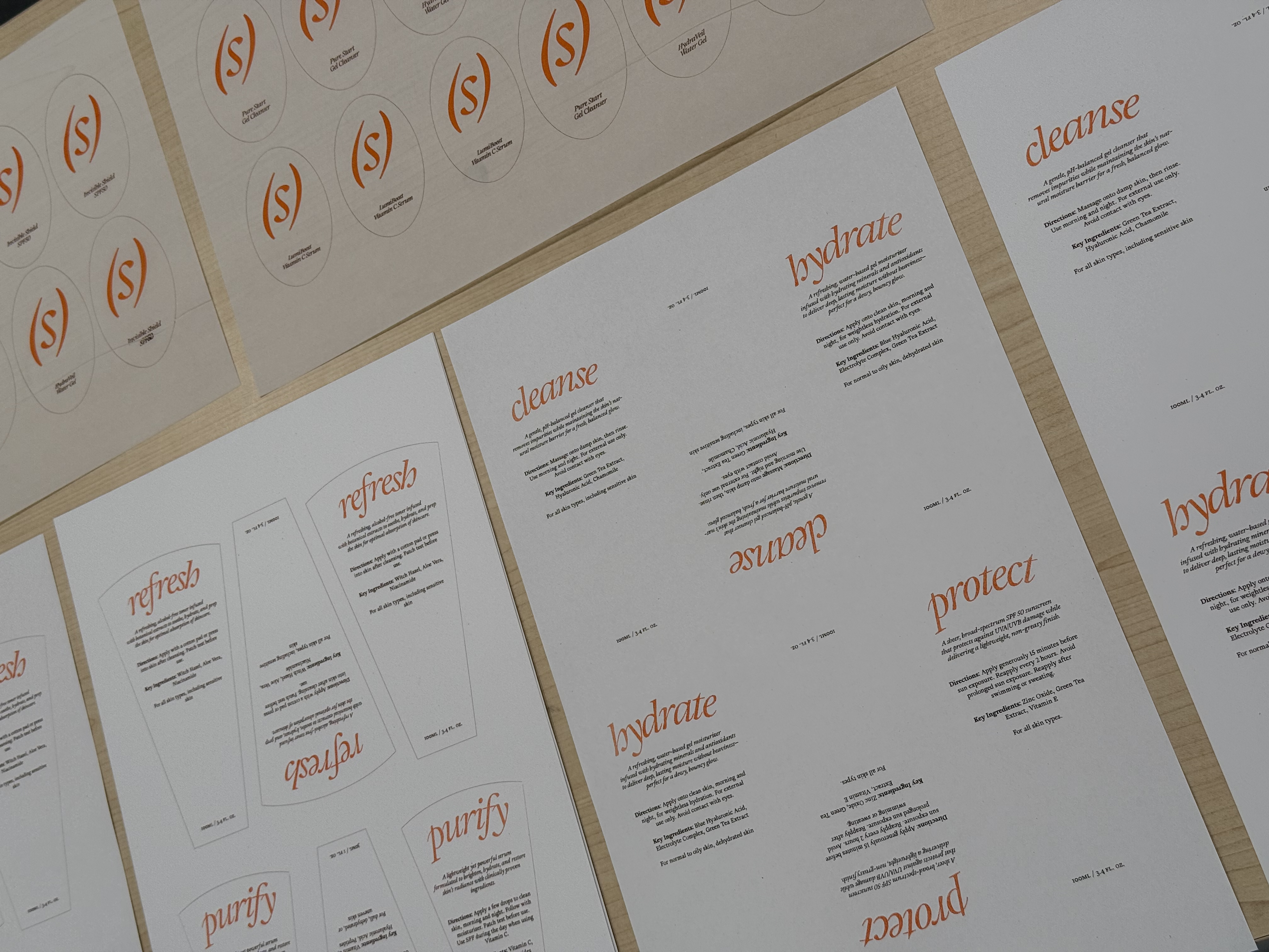
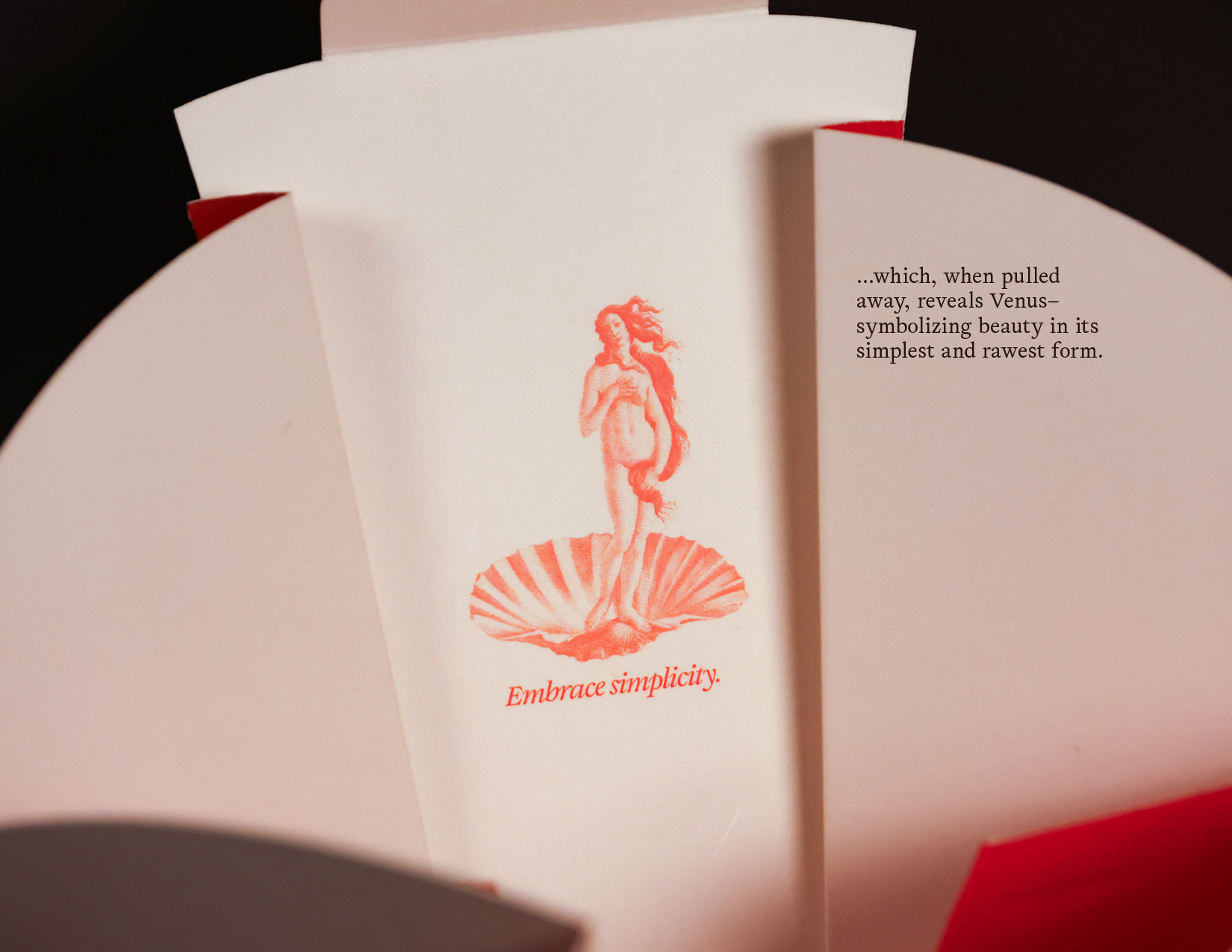
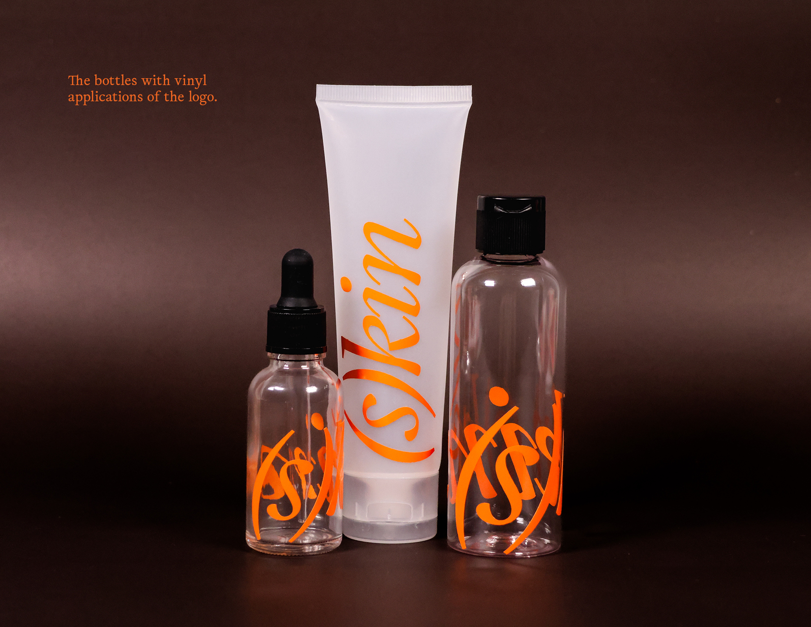
Alongside the packaging, I designed and produced a series of printed assets which include the vinyl labels for the bottles, the product information cards detailing the ingredients, purpose, and directions of the product, and the vellum windows with the brand’s logo and product name. The latter two were risograph printed to tie into the visual language carried over from the typeface, brand story, and core values.
THE OUTCOME
SPECIAL THANKS
Thank you–to Nadia Beyzaei: for being my first instructor at the start of the year and pushing me to do so much with this project from its conception. Without you, this project and its values would not be where it is today. To Gabe Wong: for continuing Nadia’s zealous ambition for my project and pushing me to do so much as well to bring this project into the physical world. To my family, friends, and classmates for fostering an incredible community of designers, creatives, and makers who pushed me to continue to do my best and bring this project to fruition.
Overall, thank you to the Emily Carr community and resources for helping me come this far. All the technicians, faculty, staff, and students continue to play a pivotal role in this ever-changing industry and sphere.